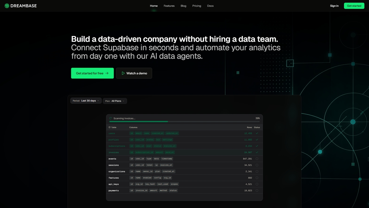
Dreambase
An AI-native analytics platform that connects directly to your Supabase database, providing instant dashboards, reports, and actionable insights …
An AI-native analytics platform that connects directly to your Supabase database, providing instant dashboards, reports, and actionable insights with minimal setup.
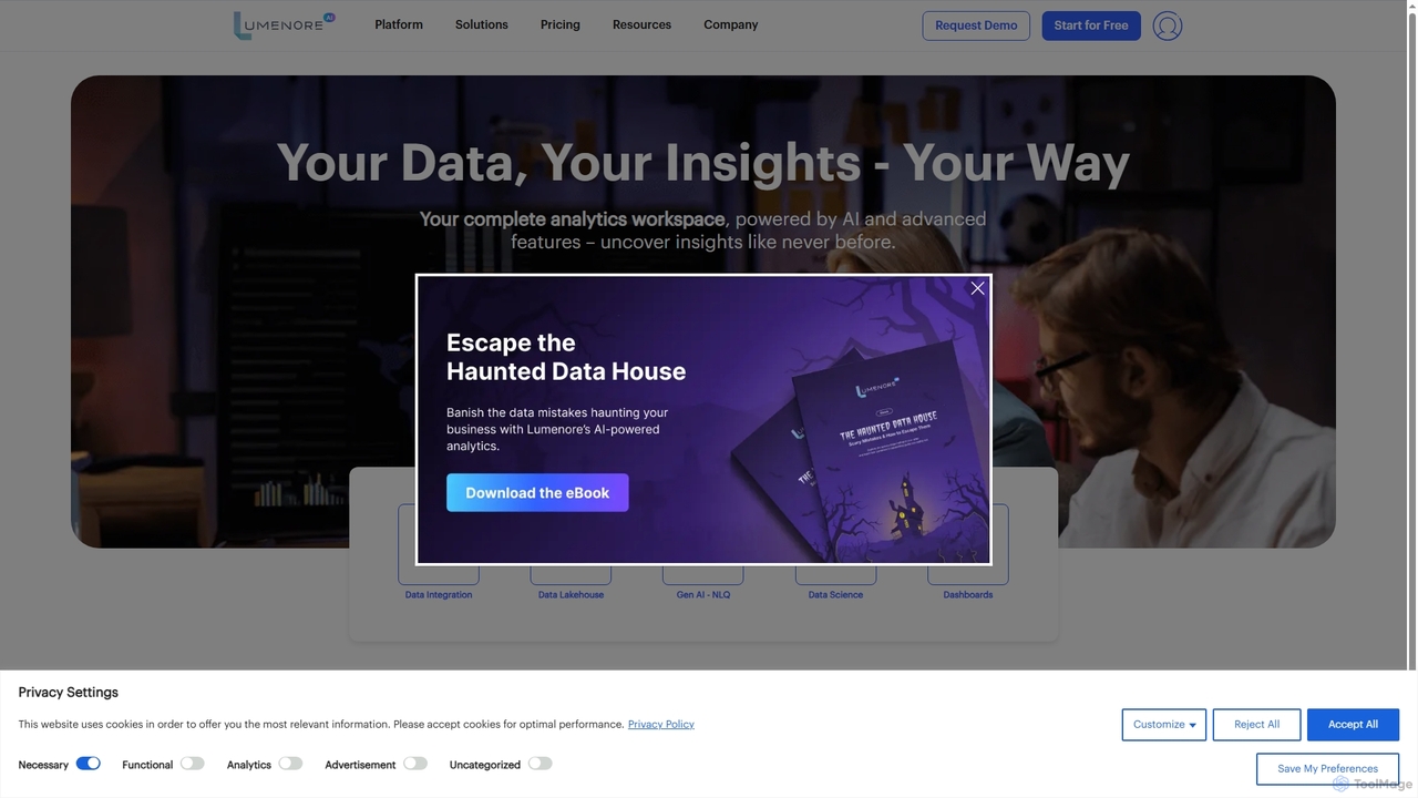
Lumenore
Lumenore is an AI-powered, no-code business intelligence and data analytics platform designed to transform complex data into actionable …
Lumenore is an AI-powered, no-code business intelligence and data analytics platform designed to transform complex data into actionable insights. It offers a complete analytics workspace with advanced features like Gen AI-powered Natural Language Query (NLQ), automated insights, and data storytelling, enabling businesses to make faster, informed decisions without requiring deep technical expertise.
About Data Visualization
AI Data Visualization tools are a class of software that transforms complex datasets into intuitive graphical representations. They leverage machine learning algorithms to automatically identify patterns, suggest optimal chart types, and generate interactive dashboards. This enables users, from business analysts to researchers, to quickly uncover insights, communicate findings effectively, and make data-driven decisions. Unlike traditional BI tools, AI-powered versions can often handle natural language queries and predict future trends based on historical data.
Core Features
- Automated Chart Suggestion: The AI analyzes data structure and suggests the most effective chart types like bar, line, or scatter plots.
- Interactive Dashboards: Users can drill down, filter, and explore data in real-time through dynamic visual interfaces.
- Natural Language Query (NLQ): Generate visualizations by asking questions in plain language, such as "show last quarter's sales by region".
- Predictive Analytics Visualization: Display forecasted trends and potential outcomes based on integrated machine learning models.
- Anomaly Detection: Automatically highlight unusual data points or significant deviations from trends within visualizations.
Use Cases
These tools are widely used in business intelligence for tracking KPIs, in marketing for analyzing campaign performance, and in scientific research for interpreting experimental results. They empower teams to move from raw data to actionable insights without extensive data science expertise.
How to Choose
When selecting a tool, consider its integration capabilities with your data sources (e.g., SQL databases, cloud storage), the level of customization available for charts, its ease of use for non-technical users, and its scalability to handle large datasets. Also, evaluate the sophistication of its AI features, such as the accuracy of its automated insights and NLQ understanding.
Data VisualizationUse Cases
Creating an Interactive Sales Performance Dashboard
A sales manager needs to monitor real-time metrics like revenue, conversion rates, and regional performance. By connecting an AI visualization tool to data sources like Salesforce, they can use drag-and-drop features or natural language queries (e.g., "what were our top 5 products last month?") to build a comprehensive dashboard. The AI automatically suggests the best charts, such as a map for regional sales and a bar chart for product performance. This results in a live dashboard that provides a clear overview of sales health, enabling quick identification of underperforming areas and reducing manual reporting time by hours each week.
Analyzing Marketing Campaign ROI
A digital marketer wants to understand the effectiveness of various channels like social media, email, and PPC. They can import data from Google Ads, Facebook Ads, and email platforms into an AI visualization tool. The tool's AI can automatically visualize the customer journey, create attribution models, and generate charts comparing cost-per-acquisition (CPA) across channels. This provides a clear, data-backed view of which channels deliver the highest return on investment, enabling smarter budget allocation and optimization of future campaigns for better performance.
Visualizing Customer Segments for Product Development
A product manager needs to identify distinct user groups based on behavior and demographics to inform feature development. By feeding user activity data into an AI visualization tool, the AI can perform clustering analysis. It then presents these segments as interactive scatter plots or bubble charts, visually highlighting the key characteristics and needs of each group. This allows the product manager to move beyond simple averages and gain a clear, visual understanding of their user base, leading to more targeted feature prioritization and personalized user experiences.
Monitoring Supply Chain Logistics in Real-Time
A logistics coordinator needs to track shipments, inventory levels, and delivery times across a global network. By integrating data from IoT sensors, GPS trackers, and inventory systems, an AI visualization tool can create a live map. This map can show shipment locations with color-coded alerts for potential delays or issues identified by the AI's anomaly detection. This provides a centralized, visual command center for proactive supply chain management, helping to reduce delivery delays and optimize inventory levels through immediate, actionable insights.
Presenting Scientific Research Findings
An academic researcher needs to communicate complex experimental data in an understandable format for publications and presentations. Instead of static charts, they can use an AI visualization tool to upload large datasets and generate sophisticated, interactive visuals like heatmaps, network graphs, or 3D scatter plots. The AI can help identify hidden correlations and patterns that might be missed manually. This results in more compelling and clear visual aids that make complex findings more accessible and impactful to peers and the public.
Financial Forecasting and Budget Analysis
A financial analyst needs to analyze historical financial data to forecast future performance and identify budget variances. By connecting an AI visualization tool to accounting software, they can go beyond simple spreadsheets. The tool's predictive analytics feature can generate forecast charts, such as revenue projections with confidence intervals. It can also create waterfall charts to visually break down budget-to-actual variances, making it easy to spot which departments or projects are over or under budget. This leads to more accurate financial forecasts and clearer communication of financial performance to stakeholders.