Genis
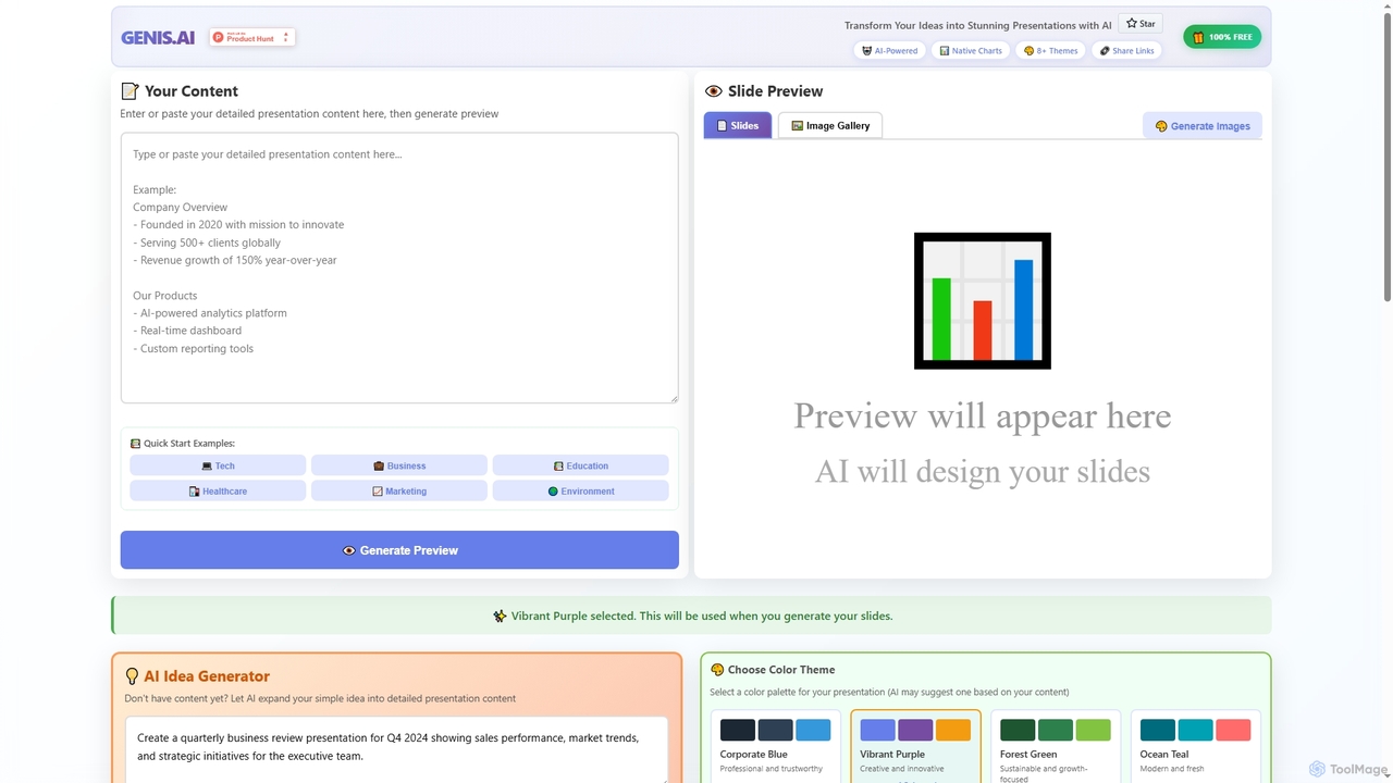
Genis is a free AI-powered presentation generator that transforms ideas and content into stunning, professional slides in seconds. …
Genis is a free AI-powered presentation generator that transforms ideas and content into stunning, professional slides in seconds. It offers native charts, diverse themes, and flexible AI model integration, including free access to Amazon Bedrock, making high-quality presentation creation accessible to everyone.
The Pudding
The Pudding is an award-winning digital publication that creates insightful visual essays on cultural topics. It leverages data …
The Pudding is an award-winning digital publication that creates insightful visual essays on cultural topics. It leverages data journalism, interactive visualizations, and AI-powered analysis to explain complex ideas in an engaging and accessible way, covering subjects from music and film to social trends.
About Data Visualization
Data Visualization tools are AI-powered platforms designed to transform complex datasets into intuitive, interactive, and insightful visual representations. Leveraging advanced algorithms, these tools automate the creation of charts, graphs, and dashboards, enabling users to quickly identify patterns, trends, and anomalies. They empower businesses, researchers, and analysts to make data-driven decisions by presenting information in an easily digestible format, significantly enhancing understanding and communication.
Core Features
- Automated Chart Generation: Automatically suggests and creates optimal charts and graphs based on data characteristics and user queries.
- Natural Language Querying (NLQ): Allows users to ask questions about their data in plain language and receive visual answers instantly.
- Anomaly Detection: AI algorithms identify unusual patterns or outliers in data that might indicate critical issues or opportunities.
- Predictive Visualization: Generates visualizations that forecast future trends and outcomes based on historical data analysis.
- Interactive Dashboards: Creates dynamic and customizable dashboards that allow users to explore data from multiple perspectives.
Applicable Scenarios
AI Data Visualization tools are invaluable for business intelligence analysts seeking to uncover market trends, marketing teams tracking campaign performance, and scientific researchers needing to present complex experimental results. They are also widely used by financial institutions for risk assessment and by healthcare providers for patient data analysis.
How to Choose
When selecting an AI Data Visualization tool, consider its compatibility with your existing data sources, the variety and customizability of visualization types offered, and its ease of use for non-technical users. Evaluate its integration capabilities with other business intelligence platforms, the robustness of its AI features like NLQ and anomaly detection, and its pricing model relative to your budget and scale of data.
Data VisualizationUse Cases
Real-time Business Performance Monitoring
A CEO or department head uses an AI data visualization tool to monitor key performance indicators (KPIs) across sales, marketing, and operations in real-time. The tool automatically updates dashboards, highlights significant deviations from targets, and provides AI-driven insights into underlying causes, enabling swift strategic adjustments and informed decision-making.
Optimizing Marketing Campaign ROI
A marketing analyst leverages AI data visualization to track the performance of various digital campaigns across different channels. The tool visualizes ad spend, conversion rates, and customer engagement, automatically identifying underperforming campaigns or segments. This allows the analyst to reallocate budget effectively and maximize return on investment.
Exploring Complex Scientific Datasets
A research scientist utilizes AI data visualization to explore vast and intricate experimental datasets, such as genomic sequences or climate models. The tool helps in identifying hidden correlations, visualizing multi-dimensional data, and generating publication-ready charts, accelerating discovery and facilitating clearer communication of findings to peers.
Predicting Financial Market Trends
A financial analyst employs AI data visualization to analyze historical stock prices, trading volumes, and economic indicators. The tool generates predictive charts that forecast potential market movements, identifies emerging patterns, and helps in assessing investment risks. This supports more strategic portfolio management and timely trading decisions.
Enhancing Customer Journey Analysis
A product manager uses AI data visualization to map out customer journeys on a website or application. By visualizing user clicks, navigation paths, and feature engagement, the tool reveals pain points, popular features, and drop-off rates. This insight guides product development, leading to improved user experience and higher retention.
Streamlining Supply Chain Logistics
An operations manager applies AI data visualization to monitor global supply chain data, including inventory levels, shipping routes, and delivery times. The tool visualizes potential bottlenecks, predicts demand fluctuations, and identifies inefficiencies in logistics. This enables proactive adjustments, reducing costs and improving overall operational resilience.