Dashup
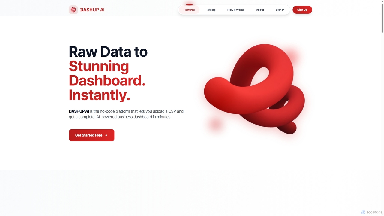
Dashup is a no-code AI platform that instantly transforms raw CSV data into stunning, interactive business dashboards. Simply …
Dashup is a no-code AI platform that instantly transforms raw CSV data into stunning, interactive business dashboards. Simply upload your file, choose a template, and let the AI suggest key metrics and visualizations. No SQL or technical skills required. Go from spreadsheet to actionable insights in minutes, making data-driven decisions faster and easier.
About Data Visualization
Data Visualization tools are applications that transform raw data into graphical representations like charts, graphs, and interactive dashboards. As a key part of the no-code and low-code ecosystem, they empower users to explore, analyze, and present complex datasets without writing any code. These platforms use intuitive drag-and-drop interfaces and often leverage AI to suggest the most effective chart types or uncover hidden patterns. They are essential for business intelligence, market analysis, and data storytelling, enabling anyone to make informed, data-driven decisions.
Core Features
- Interactive Dashboards: Build dynamic, real-time dashboards that users can filter and explore.
- No-Code Interface: Create complex visualizations using simple drag-and-drop actions, no programming required.
- Multiple Data Source Connectors: Connect directly to databases, spreadsheets, cloud services, and APIs to pull in live data.
- AI-Powered Insights: Automatically identifies trends, anomalies, and correlations within your data.
- Variety of Chart Types: Offers a comprehensive library of charts, from basic bars and pies to advanced maps and Sankey diagrams.
Use Cases
These tools are widely used across various departments. Marketing teams use them to track campaign performance and customer behavior. Sales managers monitor KPIs and regional performance in real-time. Financial analysts create reports on revenue and expenses, while operations teams visualize supply chain logistics. Essentially, any role that relies on data for decision-making can benefit from these accessible visualization platforms.
How to Choose
When selecting a Data Visualization tool, first consider its data connectivity options to ensure it supports your existing data sources. Evaluate the ease of use and the intuitiveness of its no-code interface for your team's technical skill level. Examine the library of available chart types to confirm it meets your reporting needs. Finally, assess its collaboration features for sharing dashboards and its pricing model based on the number of users and data volume.
Data VisualizationUse Cases
Creating a Business Performance Dashboard for Executives
An executive or department head needs a real-time, high-level overview of key business metrics like revenue, customer acquisition cost (CAC), and churn rate. Using a no-code data visualization tool, they can connect directly to multiple data sources such as Salesforce, Google Analytics, and financial software. They can then build a consolidated, interactive dashboard that displays these KPIs in an easy-to-digest format, with charts that update automatically. This allows for faster, data-driven decision-making without relying on manual reports from an analytics team.
Creating Interactive Sales Performance Dashboards
A sales manager needs to track quarterly performance across different regions without relying on the IT department. Using an AI Data Visualization tool, they connect their CRM data source, like Salesforce. The AI suggests a geographic map for regional sales, a bar chart for top performers, and a trend line for sales over time. The manager assembles these into a single interactive dashboard. Now, stakeholders can self-serve, filtering by date, region, or product line to uncover insights instantly, reducing weekly report generation time by over 70%.
Creating an Interactive Sales Performance Dashboard
A sales manager needs to track quarterly metrics like revenue, deals closed, and performance by representative. Instead of manually compiling reports in spreadsheets, they connect a no-code data visualization tool directly to their CRM (e.g., Salesforce). Using a drag-and-drop interface, they build a dashboard with a map showing regional sales, a bar chart for individual rep performance, and a line chart for revenue trends. This dashboard updates in real-time and can be shared with the entire team, providing instant insights for weekly meetings and strategic planning without any IT support.
Analyzing Marketing Campaign ROI
A marketing manager is running multiple digital campaigns across platforms like Google Ads, Facebook, and email. To understand the overall return on investment (ROI), they use a data visualization tool to pull data from all these sources into a single view. The tool's AI can suggest visualizations that compare cost-per-click (CPC), conversion rates, and customer lifetime value (CLV) for each channel. This allows the manager to quickly identify high-performing campaigns and reallocate budget away from underperforming ones, optimizing marketing spend without needing a data scientist.
Analyzing Marketing Campaign Effectiveness
A digital marketer needs to present the results of a multi-channel campaign to stakeholders. Instead of static spreadsheets, they use a data visualization tool to connect APIs from Google Ads, Facebook Ads, and Google Analytics. The tool helps them create a unified dashboard showing key metrics like click-through rate (CTR), cost per acquisition (CPA), and conversion rates across all channels. Using natural language query, the marketer can ask "compare CPA of Facebook vs Google for the last 30 days" and get an instant bar chart, enabling faster, data-driven decisions for future budget allocation.
Analyzing Marketing Campaign ROI
A digital marketer wants to understand the effectiveness of various channels (social media, email, PPC). They use a data visualization tool to integrate data from Google Analytics, Facebook Ads, and their email platform. The tool's AI feature automatically suggests creating a funnel visualization to track the customer journey from first touch to conversion. They also build a pie chart showing the contribution of each channel to lead generation. This allows them to clearly see which channels have the highest ROI and reallocate their budget accordingly, optimizing marketing spend for better results.
Tracking Sales Pipeline and Forecasting
A sales team lead needs to monitor their team's pipeline health and forecast quarterly revenue. They connect their CRM (e.g., HubSpot) to a data visualization tool. Within minutes, they can create a funnel chart showing deal stages, a bar chart displaying sales performance by representative, and a time-series graph forecasting future sales based on historical data. They can interactively filter by region or product line, identifying bottlenecks in the sales process and providing targeted coaching to their team, leading to more accurate forecasts and improved sales outcomes.
Monitoring Operational KPIs for a Logistics Company
An operations manager at a logistics firm needs to monitor key performance indicators (KPIs) like on-time delivery rates, fleet fuel efficiency, and warehouse capacity. They connect their internal database and IoT sensor data to a visualization tool. The tool generates a real-time dashboard with a map tracking fleet locations, gauges for fuel levels, and charts showing delivery statuses. The AI's anomaly detection feature automatically alerts the manager to a sudden drop in on-time delivery rates in a specific region, allowing for immediate investigation and problem-solving.
Visualizing Customer Feedback for Product Development
A product manager needs to analyze thousands of customer survey responses to prioritize new features. Manually reading through them is inefficient. By uploading the survey data (e.g., a CSV file) into a visualization tool, they can use its natural language processing capabilities. The tool automatically generates a word cloud highlighting the most frequently mentioned terms and a bar chart categorizing feedback into themes like 'UI improvement', 'bug report', or 'feature request'. This provides a clear, data-backed overview of customer sentiment, enabling the product team to make informed decisions on the development roadmap.
Analyzing Customer Behavior on an E-commerce Site
An e-commerce analyst wants to understand user journeys and identify points of friction on their website. They use a data visualization tool to connect to their website analytics platform. They can create path analysis charts to see common navigation routes, heatmaps to visualize where users click most, and cohort analysis charts to track the behavior of different user groups over time. These visual insights help them pinpoint confusing navigation, underperforming product pages, and opportunities to optimize the checkout process, ultimately leading to higher conversion rates.
Visualizing Financial Data for Investor Reports
A financial analyst at a startup is preparing a quarterly report for investors. To make the data more digestible, they import financial statements from a CSV file into a visualization tool. The tool automatically suggests a waterfall chart to show changes in cash flow and a pie chart for expense breakdown. They embed these interactive charts into a web-based report. Investors can now hover over chart elements to see exact figures and use filters to view data for specific periods, providing a much richer and more transparent experience than a static PDF report.
Monitoring Real-Time Operational Metrics
An operations manager at a logistics company needs to monitor key metrics like on-time delivery rates, fleet fuel efficiency, and warehouse inventory levels. They connect their visualization tool to various real-time data sources, including GPS trackers and inventory management systems. They build a central dashboard featuring a live map of their fleet, gauges for inventory levels that change color when low, and trend lines for delivery performance. This allows for proactive management, enabling them to identify and address potential bottlenecks or delays before they become critical issues, thereby improving overall efficiency.
Monitoring Real-time Operational Metrics
An operations manager in a logistics company needs to monitor key metrics like delivery times, vehicle locations, and warehouse inventory levels in real-time. By connecting their operational databases and IoT sensor data to a visualization tool, they can build a live dashboard. This dashboard might feature a map tracking the fleet, gauges showing inventory capacity, and time-series charts for delivery performance. Any deviation from the norm is immediately visible, allowing the manager to proactively address issues, reroute drivers, or manage stock levels to prevent delays and improve efficiency.
Analyzing User Behavior on a SaaS Platform
A product manager for a SaaS application wants to understand how users interact with new features. They connect product usage data from tools like Mixpanel or Amplitude to a data visualization platform. They build a dashboard to track feature adoption rates, user session duration, and identify drop-off points in user funnels. The AI can help identify correlations, for instance, showing that users who engage with a specific new feature have a 20% higher retention rate. This insight directly informs the product roadmap and user onboarding improvements.
Generating Financial Reports for Stakeholders
A financial analyst at a startup needs to create monthly reports for investors. Instead of spending hours formatting data in Excel, they connect their accounting software (e.g., QuickBooks) to a data visualization tool. Using pre-built templates, they instantly generate professional-looking charts for revenue growth, cash flow, and burn rate. They can add annotations to explain specific trends or anomalies. The final report can be exported as a PDF or shared via a secure link, saving significant time and presenting financial data in a clear, digestible format that stakeholders can easily understand.
Creating Data Stories for Client Reports
A consultant at a digital agency needs to present monthly performance results to a client who isn't a data expert. Instead of sending a spreadsheet, they use a data visualization tool to create a compelling data story. They build a series of annotated charts and graphs that walk the client through key findings, highlighting successes and areas for improvement. The visual narrative makes complex information accessible and persuasive. They can then share a link to the interactive report or export it as a PDF, enhancing client communication and demonstrating the agency's value more effectively.
Embedding Live Data Charts in a Public Website
A non-profit organization focused on climate change wants to display real-time environmental data on its website. A communications specialist, with no coding skills, uses a data visualization tool to connect to public APIs for air quality and temperature data. They design several charts and a map, customizing the colors and fonts to match the organization's branding. Using a simple embed code provided by the tool, they place these live, interactive visualizations directly onto their website, providing visitors with engaging and up-to-date information to support their cause.
Presenting Academic Research Data
A university researcher has collected a large dataset from an experiment and needs to present the findings in a publication. The complex data is difficult to interpret in a table. They use a data visualization tool to upload their dataset and create advanced charts like scatter plots with regression lines to show correlations, and box plots to display data distribution. The ability to customize colors, labels, and titles ensures the visuals align with the publication's standards. They can then export these high-resolution graphics, making their research findings more compelling and easier for peers to understand.