
Assistant-ui
Libraries
AI TOOL COMPARISON
What is the difference, and which fits your workflow? Compare features, usage, pricing models and traffic side by side.
Libraries
Design Systems
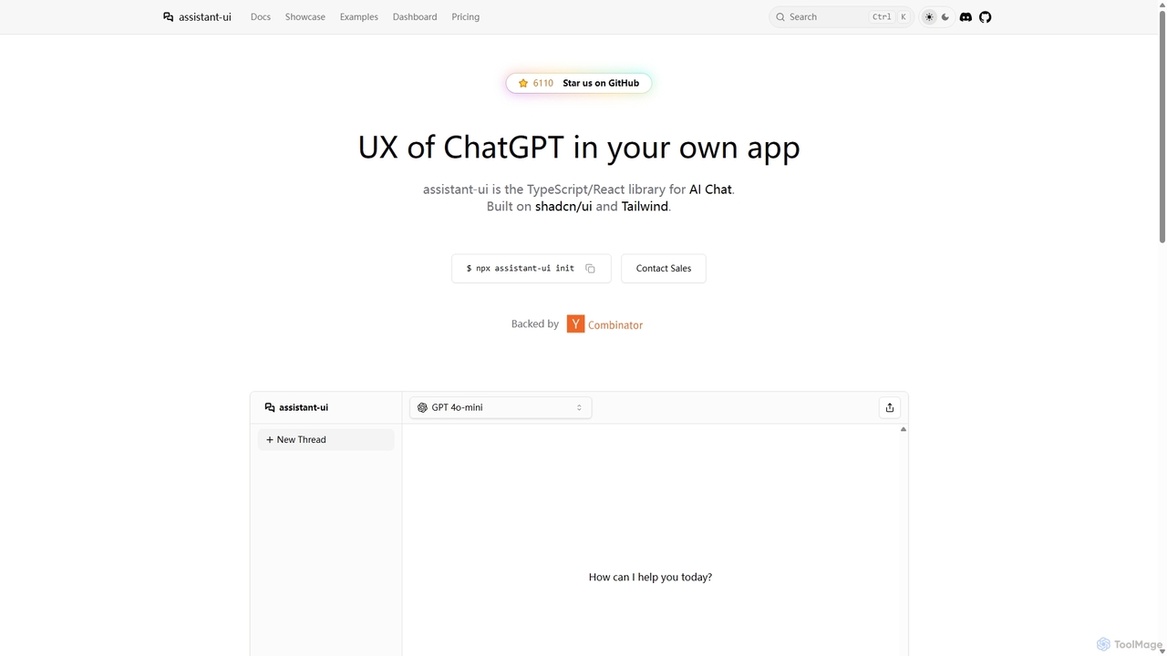
Assistant-ui is an open-source TypeScript/React library for rapidly building high-quality, customizable AI chat interfaces. Built on shadcn/ui and Tailwind CSS, it provides developers with pre-built components to integrate a ChatGPT-like experience into any application, supporting various backends and advanced features like generative UI.
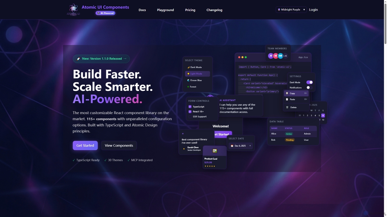
AtomicComponents is an AI-powered React component library designed for building modern, scalable, and accessible user interfaces faster. It offers over 115 highly customizable components, 30 built-in themes, and seamless integration with AI assistants like Claude and GitHub Copilot via its Model Context Protocol (MCP) server.
Compare product focus, pricing models and audiences. Highlighted rows indicate different listed information; unknown pricing does not mean free.
| Quick facts | Assistant-ui | AtomicComponents |
|---|---|---|
| Pricing model | Freemium | Freemium |
| Product type | Web | Web |
| Primary focus | Libraries | Design Systems |
| Audience and roles | Frontend Developer · Full-Stack Developer · Product Manager · Software Developer · Startup Founder · UI/UX Designer | Frontend Developer · Product Manager · Software Developer · Technical Lead · UI/UX Designer · Web Developer |
| Categories | Libraries · No Code & Low Code | Design Systems · Code Generation · Frontend Frameworks · Ui Components |
| Added | Sep 24, 2025 | Dec 13, 2025 |
| Updated | Nov 19, 2026 | Nov 19, 2026 |
Explore the listed product descriptions, features and workflows. Taxonomy labels alone are not feature evaluations.
Assistant-ui is a powerful open-source TypeScript/React library designed to help developers effortlessly build sophisticated, conversational AI interfaces. It provides a comprehensive suite of pre-built, customizable UI components that replicate the polished user experience of leading platforms like ChatGPT. Built on the modern foundations of shadcn/ui and Tailwind CSS, it allows for deep customization to match any application's branding and style.
The core mission of Assistant-ui is to significantly reduce the development time required to create production-ready chat UIs. Instead of building complex features like message streaming, message branching, editing, and markdown rendering from scratch, developers can leverage Assistant-ui's components to get a feature-rich interface running in hours, not weeks. The library is backend-agnostic, seamlessly integrating with the Vercel AI SDK to support a wide array of LLM providers, including OpenAI, Anthropic, Google Gemini, Azure, AWS Bedrock, and even local models via Ollama.
Integrating Assistant-ui into a project is straightforward for React developers. The process typically involves these steps:
npx Assistant-ui@latest init. This command intelligently sets up the necessary dependencies and components.Thread and ThreadList. Wrap your application or the chat section with the AssistantRuntimeProvider, which manages the state and communication with your backend API.Assistant-ui is versatile and can be used to build a wide range of AI-powered applications:
The primary advantage of Assistant-ui is its ability to accelerate development. Developers can save hundreds of hours by using its production-ready components. The UX is professionally designed, ensuring a high-quality, intuitive experience for end-users. Its open-source nature provides transparency and flexibility, while the optional cloud backend offers a scalable path for projects that require persistence. The strong community and detailed documentation make it easy for developers to get started and find support.
Assistant-ui follows a freemium model, clearly separating the open-source library from its managed cloud service:
AtomicComponents is a cutting-edge React component library that redefines UI development by integrating AI-powered assistance with unparalleled customization. Built with TypeScript and adhering to Atomic Design principles, it provides developers with a robust toolkit of over 115 production-ready components, ranging from foundational atoms to complex organisms. This library is engineered for consistency, scalability, and maintainability, ensuring a unified design language across applications while significantly accelerating the development process.
To begin using AtomicComponents, developers first install the package into their React 18+ TypeScript project via npm or yarn. Components can then be imported and utilized directly in their application code, leveraging extensive configuration options and 30 built-in themes for rapid UI construction. For enhanced productivity, developers can integrate AtomicComponents with AI assistants like Claude Desktop or GitHub Copilot. This involves configuring the Model Context Protocol (MCP) server within their development environment (e.g., VS Code). Once connected, AI assistants can be queried using natural language to discover components, retrieve detailed props, access usage examples from Storybook, and even browse theme styles, streamlining the coding workflow.
AtomicComponents is ideal for frontend developers and teams looking to build modern, high-quality React applications with increased efficiency. It's perfectly suited for projects requiring a consistent design language, rapid prototyping, and scalable UI architecture. Companies can leverage it to accelerate the development of complex web applications, internal tools, and customer-facing platforms. Furthermore, its AI integration makes it invaluable for developers who utilize AI coding assistants to streamline component discovery, code generation, and documentation lookup, fostering a more intelligent development workflow. Non-commercial projects can also benefit from its comprehensive features under the MIT license.
The primary advantage of AtomicComponents lies in its unique blend of deep customization and AI-powered assistance, making it the most configurable React component library on the market. It significantly boosts developer productivity by providing battle-tested, type-safe, and accessible components that can be composed quickly. The AI integration, powered by the MCP server, offers context-aware assistance, allowing developers to interact with the library's documentation through natural language, reducing manual searches and accelerating code generation. This leads to faster development cycles, improved code quality, easier maintenance, and a consistently unified user experience across all applications.
AtomicComponents offers transparent pricing with both monthly and yearly options (saving 10% annually), alongside a 30-day money-back guarantee. Plans include:
Payment methods accepted include all major credit cards (Visa, MasterCard, American Express) and various Stripe payment methods like Apple Pay and Google Pay. Users can upgrade or downgrade their plans at any time from their dashboard; upgrades are prorated and take effect immediately, while downgrades take effect at the end of the billing cycle.
Their taxonomy shows where the products overlap and where each one has a more distinct focus. Unknown fields are shown explicitly and are never filled with assumptions.
Traffic is shown on the same scale so differences in market visibility are not visually understated.
Both charts share the same months and vertical scale. Each tool identifies its latest reporting month; missing months are left blank, not counted as zero. Regional and source visit counts are estimates calculated from the reported shares.
| Country/region | Percentage | Estimated visits |
|---|---|---|
| 🇺🇸United States | 40.8% | 31.9K |
| 🇮🇳India | 21.16% | 16.6K |
| 🇨🇳China | 14.97% | 11.7K |
| 🇷🇺Russia | 14.13% | 11.1K |
| 🇩🇪Germany | 8.94% | 7K |
| Source type | Percentage | Estimated visits |
|---|---|---|
| Direct | 79.17% | 61.9K |
| Referral | 20.83% | 16.3K |
No data available
Ratings, comments, favorites, and likes are community signals—not a substitute for product fit.
AtomicComponents is an AI-powered, highly customizable React component library built with TypeScript and Atomic Design principles. It offers over 115 production-ready components and 30 built-in themes to accelerate UI development and ensure consistency.
AtomicComponents uses its Model Context Protocol (MCP) server to provide AI assistants like Claude and GitHub Copilot direct, real-time access to all component documentation, props, examples, and 30 theme styles. This enables natural language queries for component discovery and code generation within your IDE.
The free plan includes full access to the component library, all 30 themes, and community support. It is available for non-commercial organizations and projects under the MIT License.
Yes, you can change your plan at any time from your dashboard. Upgrades are prorated and take effect immediately, while downgrades take effect at the end of your current billing cycle.
AtomicComponents accepts all major credit cards (Visa, MasterCard, American Express) and supports various payment methods through Stripe, including Apple Pay and Google Pay.
This page is assembled from ToolMage product listings, taxonomy, traffic statistics and on-site user feedback. It is not a hands-on test or an independent review.