
AtomicComponents
Design Systems
AI TOOL COMPARISON
What is the difference, and which fits your workflow? Compare features, usage, pricing models and traffic side by side.
Design Systems
Web Development
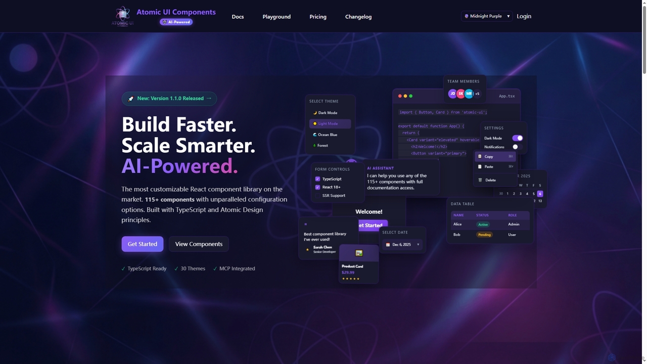
AtomicComponents is an AI-powered React component library designed for building modern, scalable, and accessible user interfaces faster. It offers over 115 highly customizable components, 30 built-in themes, and seamless integration with AI assistants like Claude and GitHub Copilot via its Model Context Protocol (MCP) server.
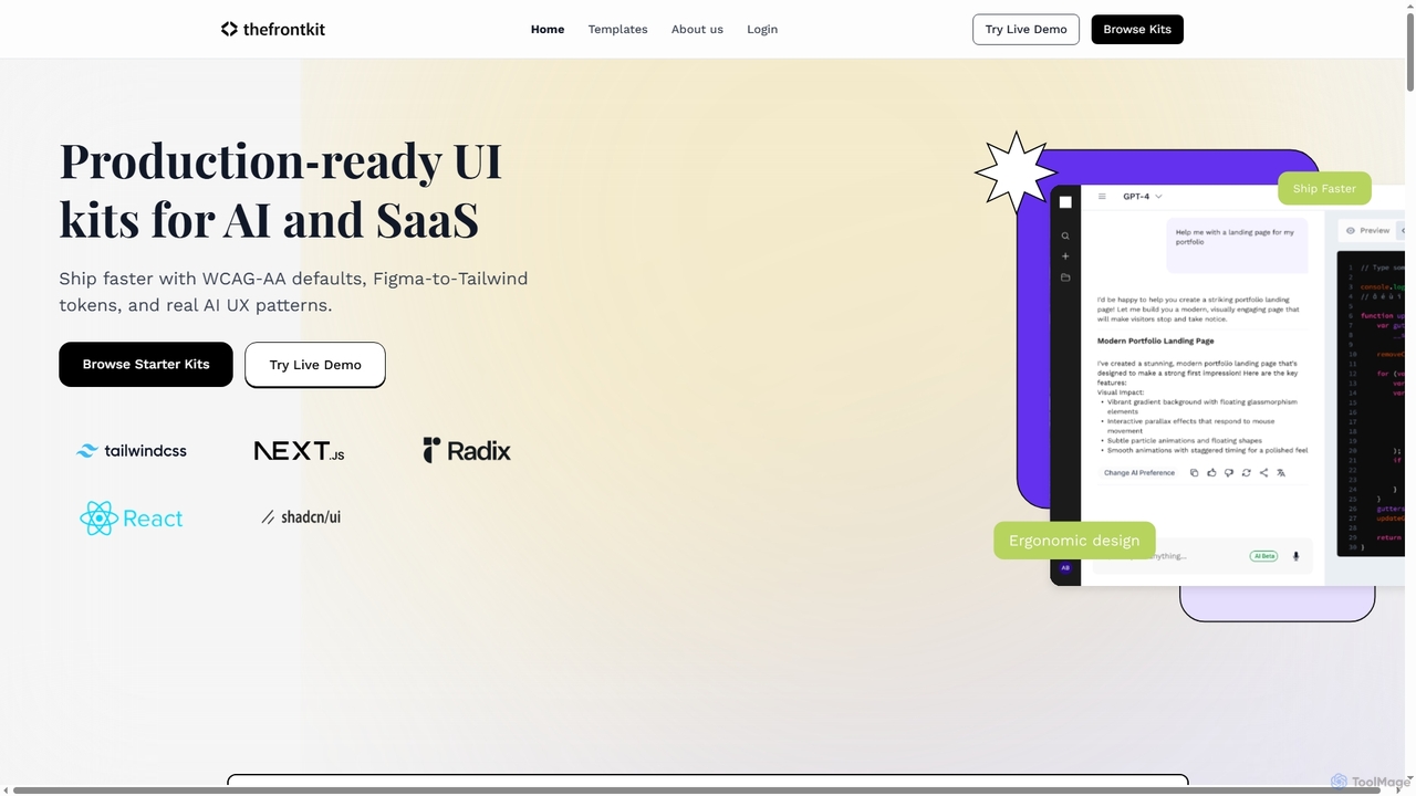
Thefrontkit provides production-ready UI kits for AI and SaaS applications, designed to accelerate development with WCAG-AA defaults, Figma-to-Tailwind token synchronization, and essential AI UX patterns. It offers structured, accessible UI components built with React and TailwindCSS, complete with Figma files and comprehensive documentation, enabling teams to ship faster and focus on product innovation.
Compare product focus, pricing models and audiences. Highlighted rows indicate different listed information; unknown pricing does not mean free.
| Quick facts | AtomicComponents | Thefrontkit |
|---|---|---|
| Pricing model | Freemium | Paid |
| Product type | Web | Web |
| Primary focus | Design Systems | Web Development |
| Audience and roles | Frontend Developer · Product Manager · Software Developer · Technical Lead · UI/UX Designer · Web Developer | Agency Owner · Frontend Developer · Indie Hacker · Product Manager · SaaS Founder · Software Developer · UI/UX Designer |
| Categories | Design Systems · Code Generation · Frontend Frameworks · Ui Components | Web Development · User Interface · Design Systems · Frontend Frameworks · Ui Kits |
| Added | Dec 13, 2025 | Dec 15, 2025 |
| Updated | Nov 19, 2026 | Nov 19, 2026 |
Explore the listed product descriptions, features and workflows. Taxonomy labels alone are not feature evaluations.
AtomicComponents is a cutting-edge React component library that redefines UI development by integrating AI-powered assistance with unparalleled customization. Built with TypeScript and adhering to Atomic Design principles, it provides developers with a robust toolkit of over 115 production-ready components, ranging from foundational atoms to complex organisms. This library is engineered for consistency, scalability, and maintainability, ensuring a unified design language across applications while significantly accelerating the development process.
To begin using AtomicComponents, developers first install the package into their React 18+ TypeScript project via npm or yarn. Components can then be imported and utilized directly in their application code, leveraging extensive configuration options and 30 built-in themes for rapid UI construction. For enhanced productivity, developers can integrate AtomicComponents with AI assistants like Claude Desktop or GitHub Copilot. This involves configuring the Model Context Protocol (MCP) server within their development environment (e.g., VS Code). Once connected, AI assistants can be queried using natural language to discover components, retrieve detailed props, access usage examples from Storybook, and even browse theme styles, streamlining the coding workflow.
AtomicComponents is ideal for frontend developers and teams looking to build modern, high-quality React applications with increased efficiency. It's perfectly suited for projects requiring a consistent design language, rapid prototyping, and scalable UI architecture. Companies can leverage it to accelerate the development of complex web applications, internal tools, and customer-facing platforms. Furthermore, its AI integration makes it invaluable for developers who utilize AI coding assistants to streamline component discovery, code generation, and documentation lookup, fostering a more intelligent development workflow. Non-commercial projects can also benefit from its comprehensive features under the MIT license.
The primary advantage of AtomicComponents lies in its unique blend of deep customization and AI-powered assistance, making it the most configurable React component library on the market. It significantly boosts developer productivity by providing battle-tested, type-safe, and accessible components that can be composed quickly. The AI integration, powered by the MCP server, offers context-aware assistance, allowing developers to interact with the library's documentation through natural language, reducing manual searches and accelerating code generation. This leads to faster development cycles, improved code quality, easier maintenance, and a consistently unified user experience across all applications.
AtomicComponents offers transparent pricing with both monthly and yearly options (saving 10% annually), alongside a 30-day money-back guarantee. Plans include:
Payment methods accepted include all major credit cards (Visa, MasterCard, American Express) and various Stripe payment methods like Apple Pay and Google Pay. Users can upgrade or downgrade their plans at any time from their dashboard; upgrades are prorated and take effect immediately, while downgrades take effect at the end of the billing cycle.
Thefrontkit offers a suite of production-ready UI kits specifically engineered for modern AI and SaaS product development. These kits are built to help developers and product teams launch applications faster by providing a robust, accessible, and scalable frontend foundation. With a strong emphasis on accessibility (WCAG-AA compliance out of the box), seamless design-to-code synchronization via Figma Variables mapped to Tailwind v4 tokens, and integrated AI-specific UX patterns, Thefrontkit eliminates the grunt work of styling and ensures a high-quality user experience from day one.
To use Thefrontkit, developers purchase a starter kit (e.g., SaaS Starter Kit) which includes React and TailwindCSS code, Figma files, and documentation. The kits provide a structured app shell, modular components, and pre-built UI flows for common functionalities like authentication, settings, tables, and forms. Users integrate these components into their Next.js, Remix, or any React setup, wiring their own backend logic and data services. The included documentation and setup guides facilitate quick integration and customization based on token-driven theming.
Thefrontkit is ideal for SaaS founders needing a robust app scaffold, AI product teams aiming for strong UX patterns and accessible defaults, and agencies delivering Next.js applications that require a repeatable, high-quality system. It's perfect for building SaaS dashboards, internal tools, and polished AI applications where speed, accessibility, and design consistency are critical. It helps indie developers quickly move from an empty repository to a usable, production-grade UI.
The primary advantage of Thefrontkit is its ability to significantly reduce development time by providing pre-built, accessible, and scalable UI foundations. It ensures design-development synchronization, eliminating inconsistencies and rework. The baked-in WCAG-AA compliance guarantees an inclusive product from the start, while AI-specific UX patterns cater directly to the needs of modern AI applications. Its modular architecture and version-controlled updates ensure long-term maintainability and effortless scaling, allowing teams to focus on core product innovation rather than repetitive frontend tasks.
Thefrontkit offers various licensing options for its SaaS Starter Kit, categorized by user count and scope:
All purchases include 1 year of updates. Users can upgrade from Design-only or Code-only to Full (Design + Code) within 12 months by paying only the difference.
Their taxonomy shows where the products overlap and where each one has a more distinct focus. Unknown fields are shown explicitly and are never filled with assumptions.
Traffic is shown on the same scale so differences in market visibility are not visually understated.
Both charts share the same months and vertical scale. Each tool identifies its latest reporting month; missing months are left blank, not counted as zero. Regional and source visit counts are estimates calculated from the reported shares.
No data available
| Country/region | Percentage | Estimated visits |
|---|---|---|
| 🇺🇸United States | 40.06% | 2.7K |
| 🇮🇳India | 18.15% | 1.2K |
| 🇮🇩Indonesia | 17.42% | 1.2K |
| 🇵🇰Pakistan | 12.89% | 877 |
| 🇻🇳Vietnam | 11.48% | 781 |
Ratings, comments, favorites, and likes are community signals—not a substitute for product fit.
AtomicComponents is an AI-powered, highly customizable React component library built with TypeScript and Atomic Design principles. It offers over 115 production-ready components and 30 built-in themes to accelerate UI development and ensure consistency.
AtomicComponents uses its Model Context Protocol (MCP) server to provide AI assistants like Claude and GitHub Copilot direct, real-time access to all component documentation, props, examples, and 30 theme styles. This enables natural language queries for component discovery and code generation within your IDE.
The free plan includes full access to the component library, all 30 themes, and community support. It is available for non-commercial organizations and projects under the MIT License.
Yes, you can change your plan at any time from your dashboard. Upgrades are prorated and take effect immediately, while downgrades take effect at the end of your current billing cycle.
AtomicComponents accepts all major credit cards (Visa, MasterCard, American Express) and supports various payment methods through Stripe, including Apple Pay and Google Pay.
You can purchase a starter kit directly from the Thefrontkit website. For example, the SaaS Starter Kit page provides 'Buy now' buttons for Solo, Team, and Agency licenses, offering options for Figma File, Design + Code, or Next.js + Tailwind (Code-only) packages.
A starter kit purchase typically includes React + Tailwind code for pages and components, Figma files with variables linked to the token system, example tests and configuration for accessibility (a11y) on key flows, and 1 year of updates. Specific inclusions may vary slightly by package (e.g., Figma File only, Code-only, or Design + Code).
Thefrontkit offers Solo (1 person, unlimited internal projects, no client delivery), Team (10 people), and Agency (unlimited people, client delivery allowed) licenses. Each license type has options for Figma File, Design + Code, or Next.js + Tailwind (Code-only) packages.
Yes, the starter kits are designed for customization. They include token-based theming, clear naming, and a scalable structure. The documentation and setup guides provide information on usage patterns and token-based customization.
The SaaS Starter Kit includes core pages and layout (app layout with responsive sidebar and topbar), login and basic auth screens, a dashboard starter with empty state, settings pages for profile and preferences, data tables with sorting/pagination/keyboard navigation, form primitives with validation/inline errors, and system pieces like toast notifications and a token pack with light/dark modes.
This page is assembled from ToolMage product listings, taxonomy, traffic statistics and on-site user feedback. It is not a hands-on test or an independent review.