ToolMage
Sign in

Best 2 Data Visualization AI tools for Developer Tools

Popular Data Visualization AI tools in Developer Tools include Rerun and Explo, helping you work more efficiently.

Rerun
Freemium

Rerun

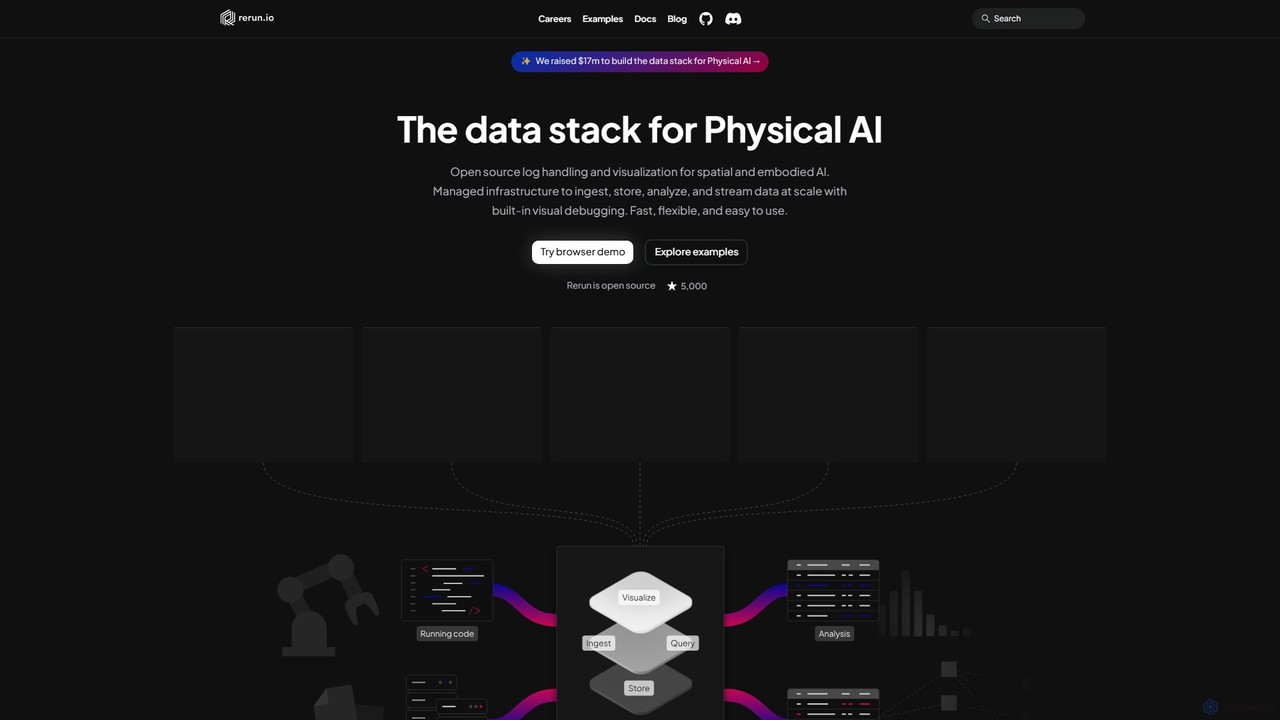
Rerun is an open-source data stack for Physical AI, providing powerful logging and visualization tools for multimodal, time-series data. Designed for robotics, computer vision, and spatial computing, it helps developers understand and debug complex systems with SDKs for Python, Rust, and C++.

Machine Learning
Visits 94.2KFavorites 134Likes 149
Explo
Freemium

Explo

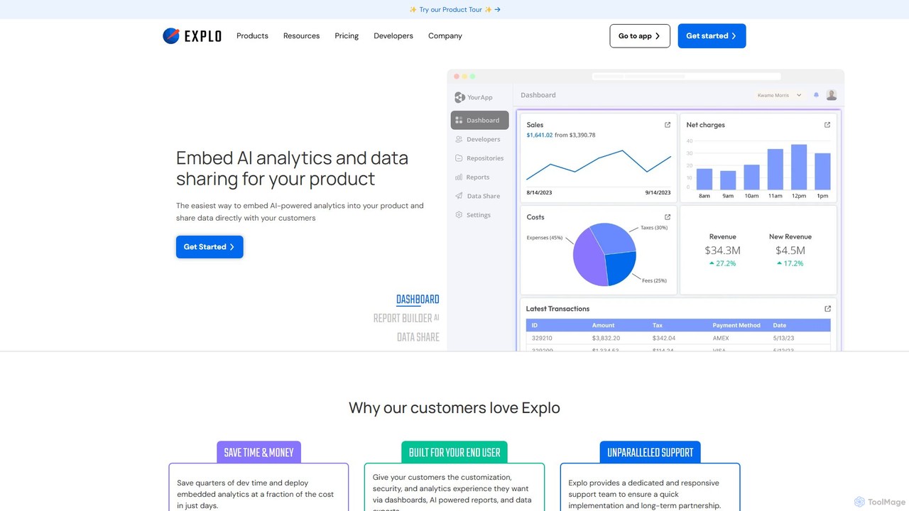
Explo is a powerful platform for creating and embedding customer-facing analytics and dashboards directly into any application. It allows businesses to connect their databases, build beautiful, customizable data visualizations, and share insights with their users seamlessly. With AI-powered features like a dashboard builder and reporting, Explo helps SaaS, E-commerce, and Fintech companies enhance their product value by providing native, white-labeled analytics experiences without extensive development effort.

Business Intelligence
Visits 64.3KFavorites 132Likes 132

About Data Visualization

Data Visualization tools are AI-powered solutions that transform raw, complex data into intuitive, interactive visual representations. These tools leverage artificial intelligence to automate chart generation, identify patterns, and provide actionable insights, making data analysis more accessible and efficient. They enable developers, data scientists, and business analysts to quickly understand trends, anomalies, and relationships within datasets, facilitating data-driven decision-making and effective communication of findings.

Core Features

  • Automated Chart Generation: AI intelligently suggests and creates the most appropriate charts and graphs based on data characteristics.
  • Natural Language Query (NLQ): Users can ask questions in plain language to generate visualizations and receive insights.
  • Interactive Dashboards: Dynamic and customizable dashboards with AI-driven drill-downs and anomaly highlighting.
  • Predictive Visualization: Tools that visualize future trends and potential outcomes based on historical data and AI models.
  • Data Storytelling: AI assists in crafting compelling narratives around data, guiding users through key insights and findings.

Applicable Scenarios

Data Visualization tools are essential for roles requiring deep data understanding. Data scientists use them to explore complex datasets for model training, while developers integrate them into applications for real-time performance monitoring. Business analysts leverage these tools to create dynamic reports and dashboards for stakeholders, transforming raw data into strategic insights.

How to Choose

When selecting a Data Visualization tool, consider its compatibility with your existing data sources and integration capabilities with developer environments. Evaluate the breadth and sophistication of its AI features, such as automated insights and natural language processing. Assess the level of interactivity, customization options, and scalability to handle growing data volumes, ensuring it meets both current and future analytical needs.

Data Visualization use cases

1

Monitoring Application Performance

Developers and DevOps engineers utilize AI data visualization tools to monitor real-time application performance. By visualizing metrics like CPU usage, memory consumption, network latency, and error rates across various services, they can quickly identify bottlenecks, detect anomalies, and troubleshoot issues. This allows for proactive maintenance and ensures optimal application health and user experience.

2

Analyzing A/B Test Results

Product managers and marketing analysts leverage AI data visualization to interpret A/B test outcomes. By visualizing user behavior data, conversion rates, and engagement metrics across different test variations, they can quickly identify which version performs better and why. AI-driven insights can highlight statistically significant differences and suggest optimal design choices, leading to data-driven product improvements.

3

Exploring Complex Datasets for ML Models

Data scientists use AI data visualization to explore and understand complex, high-dimensional datasets before building machine learning models. Visualizing data distributions, correlations between features, and identifying outliers helps in feature engineering, data cleaning, and selecting appropriate models. AI can suggest relevant visualizations and highlight potential data quality issues, streamlining the data preparation phase.

4

Creating Interactive Reports for Stakeholders

Business analysts and project managers use AI data visualization tools to create dynamic, interactive reports and dashboards for various stakeholders. Instead of static charts, these tools allow for drill-downs, filtering, and personalized views, enabling stakeholders to explore data at their own pace. AI can automatically generate summaries and highlight key performance indicators, making complex information digestible for non-technical audiences.

5

Debugging and Troubleshooting Code

Software engineers can use AI data visualization to debug and troubleshoot complex codebases. By visualizing call stacks, variable states over time, memory usage patterns, or network traffic flows, they can quickly pinpoint the source of errors or performance issues. AI can help identify unusual patterns or anomalies in execution traces, significantly reducing the time spent on debugging and improving code quality.

6

Geospatial Data Analysis for Urban Planning

Urban planners and civil engineers utilize AI data visualization for geospatial analysis. By visualizing demographic data, traffic patterns, infrastructure layouts, and environmental factors on interactive maps, they can identify optimal locations for new developments, analyze the impact of policy changes, and predict future urban growth. AI-powered tools can highlight correlations and anomalies in spatial data, supporting smarter city planning and resource allocation.

Data Visualization FAQ

What are AI Data Visualization tools?

AI Data Visualization tools are software solutions that use artificial intelligence to automatically generate, enhance, and interpret visual representations of data. They go beyond traditional charting by offering features like intelligent chart suggestions, natural language query processing, and automated anomaly detection. These tools help users, especially developers and data scientists, to quickly uncover insights from complex datasets and communicate them effectively.

How do AI Data Visualization tools differ from traditional ones?

The primary difference lies in automation and intelligence. Traditional tools require manual selection of chart types and extensive configuration, while AI tools can automatically suggest optimal visualizations, detect patterns, and even generate insights using machine learning. AI-powered tools often include natural language interfaces, allowing users to simply ask questions to generate complex charts, significantly reducing the technical barrier and accelerating the analysis process.

What are the key benefits of using AI for data visualization?

Using AI for data visualization offers several key benefits. It significantly speeds up the analysis process by automating chart creation and insight generation. AI can uncover hidden patterns and anomalies that might be missed by human analysts, leading to deeper insights. It also makes data analysis more accessible to non-technical users through natural language interfaces, democratizing data exploration. Furthermore, AI can enhance data storytelling, making complex data more engaging and understandable for diverse audiences.

What should I consider when choosing an AI Data Visualization tool?

When choosing an AI Data Visualization tool, consider its data source compatibility and integration capabilities with your existing tech stack (e.g., APIs, databases, cloud platforms). Evaluate the specific AI features offered, such as natural language processing, automated insights, and predictive analytics. Assess the level of interactivity, customization options for dashboards, and the tool's scalability to handle your data volume. Finally, consider the user-friendliness, pricing model, and community support.

Can developers integrate AI Data Visualization into their applications?

Yes, many AI Data Visualization tools are designed with developers in mind, offering robust APIs, SDKs, and embedding options. Developers can integrate these tools into their custom applications, dashboards, or internal systems to provide advanced visualization capabilities directly to their users or teams. This allows for tailored data experiences, real-time data feeds, and the ability to leverage AI-driven insights within a proprietary environment, enhancing the value of their software solutions.