ToolMage
Sign in

Best 1 Visualization AI tools for Knowledge Management

Popular Visualization AI tools in Knowledge Management include Structurepedia, helping you work more efficiently.

Structurepedia
Freemium

Structurepedia

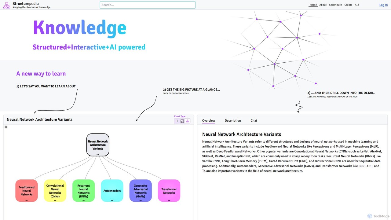
Structurepedia is an AI-powered knowledge platform that transforms complex topics into interactive, structured diagrams or "Knowledge Trees." It combines the features of a search engine and an encyclopedia to provide a visual, hierarchical way of learning, making it easier to grasp the big picture and drill down into details.

Learning
Visits 3.3KFavorites 87Likes 82

About Visualization

AI Visualization tools are applications designed to transform complex information and data from a knowledge base into intuitive visual formats. They leverage AI to automatically generate mind maps, concept graphs, and interactive charts, making it easier to understand relationships and uncover hidden insights. These tools are essential for structuring thoughts, analyzing research, and communicating complex ideas effectively within a knowledge management framework. They turn abstract information into tangible, explorable maps of knowledge.

Core Features

  • Automated Mind Mapping: Generates structured mind maps or concept maps directly from unstructured text, notes, or documents.
  • Knowledge Graph Generation: Identifies and visualizes entities and their relationships within a body of text to create interconnected knowledge graphs.
  • Interactive Data Charting: Creates dynamic and filterable charts, graphs, and dashboards from structured data to reveal trends and patterns.
  • Relationship Analysis: Maps connections, hierarchies, and dependencies between different pieces of information, such as notes, tasks, or files.
  • Visual Exploration Interface: Provides a canvas where users can dynamically interact with, rearrange, and explore visual elements to discover new connections.

Use Cases

These tools are widely used by researchers, students, strategists, and project managers. For example, a researcher can input dozens of academic papers to generate a concept graph of overlapping theories. A project team can visualize dependencies between tasks to identify potential bottlenecks. Individuals also use them to build a personal 'second brain' by visually connecting ideas and notes.

How to Choose

When selecting an AI Visualization tool, consider its data input capabilities (text, URLs, file uploads). Evaluate the variety of visualization types offered (mind maps, graphs, timelines). Assess collaboration features for team-based work and check for integrations with other knowledge management platforms like Notion or Obsidian. Finally, consider the balance between automation and manual control to ensure it fits your workflow.

Featured tool rankings

Visualization use cases

1

Mapping Complex Research Topics

For researchers and academics, synthesizing information from numerous sources is a primary challenge. By inputting research papers, articles, or text notes into an AI visualization tool, they can automatically generate a concept graph. This graph visually connects key authors, recurring themes, and supporting evidence, providing a bird's-eye view of the intellectual landscape. This process significantly accelerates literature reviews and helps identify novel research gaps or interdisciplinary connections that are not obvious from reading texts sequentially.

2

Structuring Team Brainstorming Sessions

Team leads and project managers often struggle to organize the chaotic output of a brainstorming session. Instead of manually transcribing and categorizing ideas from a whiteboard, they can feed the raw meeting notes into an AI visualization tool. The tool processes the text and generates a structured mind map, grouping related concepts, identifying main themes as central nodes, and branching out with specific ideas. This visual summary can be shared instantly, ensuring everyone is aligned and facilitating faster decision-making on next steps.

3

Building an Interactive Personal Knowledge Base

Lifelong learners and content creators use AI visualization tools to build a 'second brain'. They connect disparate notes, web clippings, book highlights, and random thoughts. The tool visualizes these items as nodes in a network, automatically suggesting or highlighting links between them. This allows the user to navigate their knowledge base visually, discover unexpected connections between topics, and see how small ideas contribute to larger concepts. It transforms a static archive of notes into a dynamic, explorable ecosystem of personal knowledge.

4

Visualizing Project Plans and Dependencies

Project managers can use AI visualization tools to create more intuitive and dynamic project plans than traditional Gantt charts. By inputting a list of tasks, deadlines, and responsible team members, the tool can generate an interactive graph that clearly shows dependencies, critical paths, and potential resource conflicts. Team members can click on tasks to see details, filter the view by person or deadline, and immediately understand how their work impacts the overall project timeline. This visual approach improves communication and helps proactively manage project risks.

5

Simplifying Complex System Architectures

For software developers and system architects, communicating a complex system's design can be challenging. They can use an AI visualization tool to automatically generate architectural diagrams from code, configuration files, or textual descriptions. This creates a clear, easy-to-understand visual map of all components, services, and their interactions. It's invaluable for onboarding new engineers, documenting existing systems, and presenting design proposals to non-technical stakeholders, ensuring everyone shares a common understanding of the system's structure.

6

Analyzing Qualitative Data from User Feedback

Product managers and UX researchers often collect large volumes of qualitative data from surveys, interviews, and support tickets. Manually coding this data is time-consuming. By feeding this text into an AI visualization tool, they can quickly generate theme clouds, sentiment analysis charts, or relationship graphs that highlight the most common user pain points, feature requests, and positive comments. This visual analysis allows teams to rapidly identify priorities and make data-informed decisions for product development without getting lost in spreadsheets.

Visualization FAQ

What are AI Visualization tools for knowledge management?

AI Visualization tools are applications that automatically convert complex information, such as text or data, into visual formats like mind maps, knowledge graphs, or interactive charts. Within knowledge management, their primary purpose is not just to create pretty pictures, but to reveal the underlying structure and relationships within a body of information. They help users to see connections, hierarchies, and patterns that are difficult to discern from text alone, making knowledge exploration and synthesis more efficient.

How to choose the right AI Visualization tool?

To choose the right tool, consider these factors:

  • Input Compatibility: Does the tool work with your primary information sources? Check if it supports plain text, URLs, PDFs, or integrations with note-taking apps.
  • Visualization Types: Does it offer the formats you need, such as mind maps, concept graphs, timelines, or data charts? Some tools specialize in one type.
  • Level of Automation: Decide if you need a tool that fully automates visualization from raw input or one that offers more manual control and AI-assisted drawing.
  • Collaboration Features: If you work in a team, look for features like real-time co-editing, commenting, and sharing capabilities.
What's the difference between AI Visualization and traditional diagramming tools?

The key difference is automation versus manual creation. Traditional diagramming tools (like Microsoft Visio or Draw.io) are like a digital canvas where you manually draw shapes and connect them. You are in full control, but it requires significant effort. AI Visualization tools, in contrast, automatically generate the diagram from your data or text. Their strength lies in analysis and discovery—finding patterns you didn't know existed—rather than just documenting a pre-existing structure.

What kind of information can be visualized with these tools?

These tools are versatile and can handle a wide range of information. Common inputs include:

  • Unstructured Text: Meeting notes, research articles, interview transcripts, and book summaries can be turned into mind maps or concept graphs.
  • Structured Data: Spreadsheets (CSV, Excel) or database tables can be transformed into interactive charts and dashboards to analyze trends.
  • Lists and Outlines: Simple lists of ideas or project tasks can be visualized as hierarchical diagrams or timelines.
  • Web Content: Some tools can process URLs to extract and visualize the key concepts from a webpage.
Who benefits most from AI Visualization tools?

While many people can find value in these tools, they are particularly beneficial for roles that involve synthesizing large amounts of complex information. This includes:

  • Researchers and Students: For conducting literature reviews and understanding complex theories.
  • Strategists and Analysts: For mapping market trends, competitive landscapes, and organizational structures.
  • Project Managers: For visualizing project timelines, dependencies, and resource allocation.
  • Content Creators and Writers: For organizing ideas, structuring narratives, and building a personal knowledge base.