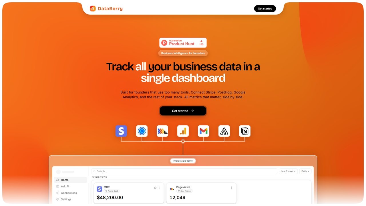
A business intelligence dashboard for founders that unifies data from tools like Stripe, PostHog, and Google Analytics. Track all key metrics like MRR, user sign-ups, and errors on a single page with no code required.
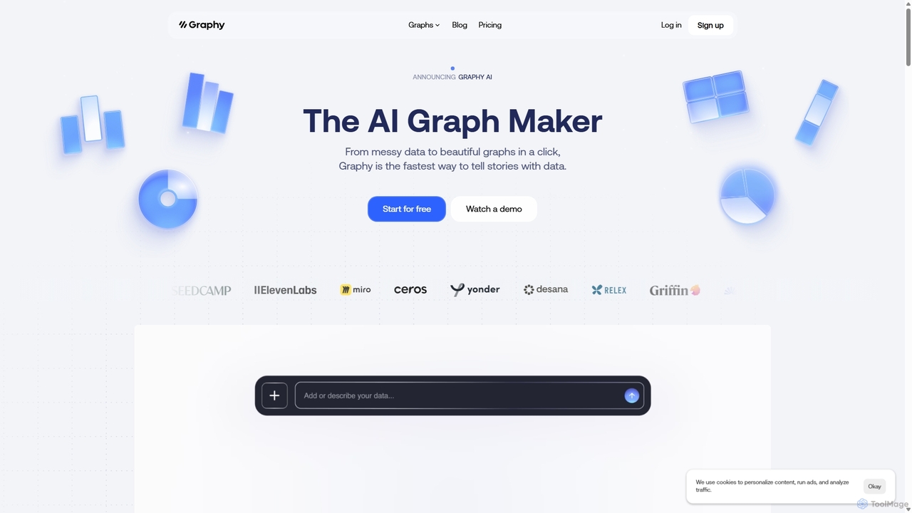
Graphy is an AI-powered data visualization tool that transforms raw data into beautiful, interactive charts and graphs in seconds. It simplifies data storytelling by automatically identifying key insights, allowing users to chat with their data, and offering extensive customization. Ideal for marketers, analysts, and teams who need to create compelling visual reports and presentations without complex software.
Product overview
Databerry Product overview
A business intelligence dashboard for founders that unifies data from tools like Stripe, PostHog, and Google Analytics. Track all key metrics like MRR, user sign-ups, and errors on a single page with no code required.
Graphy Product overview
Graphy is an AI-powered data visualization tool that transforms raw data into beautiful, interactive charts and graphs in seconds. It simplifies data storytelling by automatically identifying key insights, allowing users to chat with their data, and offering extensive customization. Ideal for marketers, analysts, and teams who need to create compelling visual reports and presentations without complex software.
Detailed feature comparison
| Feature | Databerry | Graphy |
|---|---|---|
| Primary category | 3D | 3D |
| Added | 2026-05-26 | 2025-09-21 |
| Pricing | Freemium | Freemium |
| Official website | databerry.app | graphy.app |
| Product type | Website | Website |
| Performance data | ||
| User rating | Not verified | Not verified |
| Comments | 0 | 0 |
| Monthly visits | 4.2K | 167.6K |
| Monthly growth | Not verified | -16.3% |
| Favorites | 19 | 118 |
| Details | View details | View details |
Databerry vs Graphy monthly traffic
Compare Databerry and Graphy by monthly reach, traffic trend, visit depth, top regions, and acquisition sources.
How to interpret the traffic data
In the Databerry vs Graphy monthly traffic comparison, Databerry currently shows 4.2K visits and Graphy shows 167.6K; Graphy has about 40.2 times the visible traffic of Databerry, an absolute difference of about 163.4K visits. This reflects visible reach, not feature quality or paid users.
Only Graphy has complete third-party traffic details; Databerry uses visits recorded inside ToolMage. These scopes cannot estimate market share directly, and on-site views should not be treated as the product’s total website traffic.

Databerry monthly traffic:
Latest traffic
Graphy monthly traffic:
Latest traffic
Monthly traffic trend
- 2025/9: 155.2K Monthly visits
- 2026/1: 177.6K Monthly visits
- 2026/2: 154.1K Monthly visits
- 2026/3: 164K Monthly visits
- 2026/4: 200.4K Monthly visits
- 2026/5: 167.6K Monthly visits
Top regions
Top 5 countries/regions
| Country/region | Percentage | Traffic |
|---|---|---|
| 🇮🇳India | 34.73% | 58.2K |
| 🇰🇭Cambodia | 29.22% | 49K |
| 🇺🇸United States | 20.57% | 34.5K |
| 🇷🇺Russia | 8.1% | 13.6K |
| 🇲🇾Malaysia | 7.38% | 12.4K |
Traffic sources
| Source type | Percentage | Traffic |
|---|---|---|
| Direct | 86.47% | 144.9K |
| Referral | 11.57% | 19.4K |
| 1.96% | 3.3K |
Search keywords
Usage comparison
Compare the core capabilities of Databerry and Graphy
Databerry Core features
Graphy Core features
Use cases
Databerry Use cases
Graphy Use cases
Best suited roles
Databerry Best suited roles
Graphy Best suited roles
Databerry vs Graphy:In-depth comparison and selection guidance
First decide whether the products solve the same kind of need
This in-depth Databerry vs Graphy comparison uses only the product records, taxonomy, audience, traffic, and community signals available on this page. Databerry is primarily listed under “3D”, while Graphy is primarily listed under “3D”, so the first decision is whether your actual task matches their recorded scope.
The structured fields currently show these decision-relevant differences: Monthly visits (Databerry: 4.2K; Graphy: 167.6K); Favorites (Databerry: 19; Graphy: 118); Website (Databerry: databerry.app; Graphy: graphy.app); Added (Databerry: 2026-05-26; Graphy: 2025-09-21). These facts are more useful for selection than brand visibility alone.
What market visibility and monthly traffic mean
In the Databerry vs Graphy monthly traffic comparison, Databerry currently shows 4.2K visits and Graphy shows 167.6K; Graphy has about 40.2 times the visible traffic of Databerry, an absolute difference of about 163.4K visits. This reflects visible reach, not feature quality or paid users.
Only Graphy has complete third-party traffic details; Databerry uses visits recorded inside ToolMage. These scopes cannot estimate market share directly, and on-site views should not be treated as the product’s total website traffic.

The current traffic scope is not sufficient for a reliable product ranking. Treat monthly visits as a market-interest signal, then decide using taxonomy, use cases, pricing, and a like-for-like trial rather than reading exposure as product capability.
Product positioning, use cases, and roles
Databerry and Graphy currently overlap in shared categories: 3D; shared tags: business intelligence and dashboard; shared roles: Data Analyst, Finance Manager, Founder, Marketing Manager, and Product Manager. This can place both on the same shortlist, but it does not prove equal implementation, depth, or cost.
Databerry's unique categories/tags are Marketing Analytics, Data Aggregation, data aggregation, founder tools, Google Analytics, mrr tracking, multi-project, and no-code; Graphy's are Business Intelligence, Reporting, Presentations, AI, chart maker, data analysis, Data Storytelling, and data visualization. These unique fields are the strongest differentiators: validate the product whose recorded scope matches the task instead of following traffic alone.
What ratings, comments, and favorites can tell you
Databerry has no verified rating, 0 comments, 19 favorites, and 9 likes;Graphy has no verified rating, 0 comments, 118 favorites, and 129 likes。
Neither product has enough rating or comment samples for a credible reputation ranking.
Selection guidance by actual need
When to evaluate Databerry first
Put Databerry on the priority trial list when the task aligns with “3D” and especially Marketing Analytics, Data Aggregation, data aggregation, founder tools, Google Analytics, and mrr tracking, or the users include Growth Hacker, Sales Manager, and Startup CEO. This follows recorded positioning and does not imply unlisted capabilities are absent.
Databerry also currently records: pricing is freemium, product type is website, 4.2K on-site monthly views, no verified user rating. Verify any hard requirement around price, platform, or reach before trial, and do not let sparse review data substitute for testing.
When to evaluate Graphy first
Put Graphy on the priority trial list when the task aligns with “3D” and especially Business Intelligence, Reporting, Presentations, AI, chart maker, and data analysis, or the users include Business Owner, Consultant, Content Creator, and Sales Representative. This follows recorded positioning and does not imply unlisted capabilities are absent.
Graphy also currently records: pricing is freemium, product type is website, 167.6K verified monthly visits, no verified user rating. Verify any hard requirement around price, platform, or reach before trial, and do not let sparse review data substitute for testing.
How to validate the recommendation before deciding
The available data describes positioning, public visibility, and community signals, but it cannot prove output quality, speed, integration effort, privacy, or long-term cost in your workflow. Before deciding, run the same representative tasks in Databerry and Graphy, then record completion time, accuracy, manual corrections, and the real paid threshold. A like-for-like trial turns this comparison into a defensible adoption decision.
Comparison FAQ
How should I choose between Databerry and Graphy?
Where does this comparison data come from?
What do unknown fields mean?
Related AI tools

Othor AI
Othor AI is a no-code business intelligence platform that transforms your data into actionable insights in seconds. It automatically generates narrative-driven reports, smart charts, and predictive analytics, enabling anyone in your organization to make faster, data-driven decisions without technical expertise. Connect your data sources and get instant dashboards and executive summaries.
Business Intelligence
Veltrix
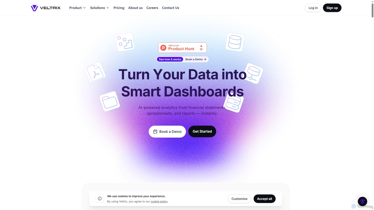
Veltrix is an AI-powered, no-code platform that transforms raw data from files and connected sources into interactive dashboards. Users can ask questions in plain language to get instant, visualized answers for business intelligence and financial analysis.
Business Intelligence
Lazy Admin
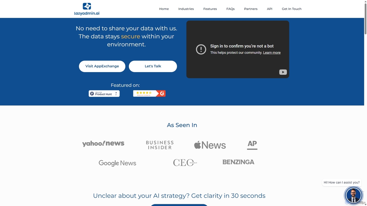
Lazy Admin is an AI-powered data analysis and reporting solution designed primarily for Salesforce. It enables users to query data, generate charts, and create dashboards using natural language. The tool emphasizes security by keeping all data within your environment and can be personalized to understand your specific business terminology, making data insights accessible to everyone on your team.
Business Intelligence
Jyek
Jyek is an AI agent platform that understands objectives, creates execution plans, uses tools, and delivers verifiable results for complex, multi-step tasks.
Automation
Flarelight
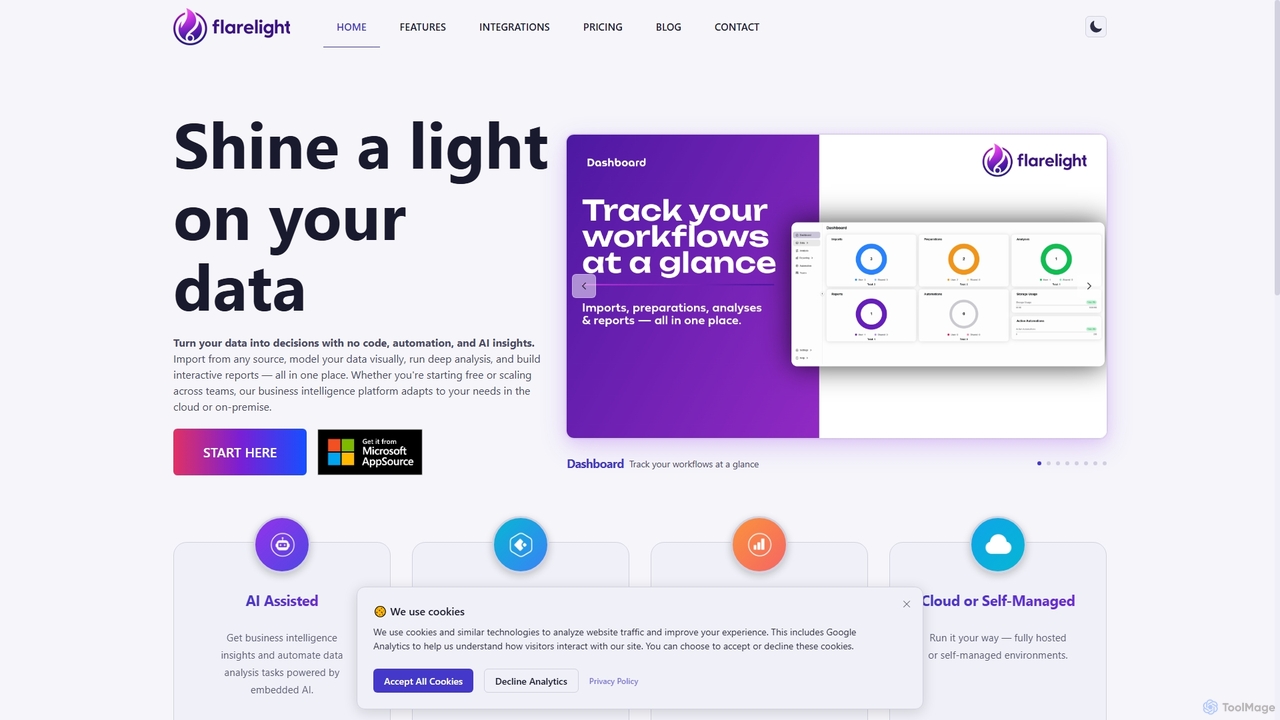
Flarelight is an AI-powered, no-code business intelligence platform for data analysis and visualization. It allows users to import data from any source, prepare it visually, perform deep analysis, and build interactive reports. The all-in-one tool supports both cloud and on-premise deployment, featuring workflow automation and natural language configuration to turn complex data into actionable decisions.
No Code
Graphitup
Graphitup is an AI-powered data visualization tool that transforms raw data from Excel or Google Sheets into stunning, on-brand charts and interactive dashboards. It offers robust theming, extensive customization, and easy publishing options, enabling businesses and creators to tell compelling data stories and build lasting digital assets.
3D
Coupler.io
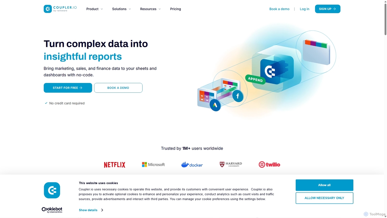
Coupler.io is a no-code data analytics and automation platform that helps businesses connect disparate data sources from marketing, sales, and finance apps to spreadsheets, data warehouses, or BI tools. It automates data collection, transforms raw data into analysis-ready formats, and provides AI-powered insights and pre-built dashboard templates for faster, smarter decision-making.
Business Intelligence
Polymer Search
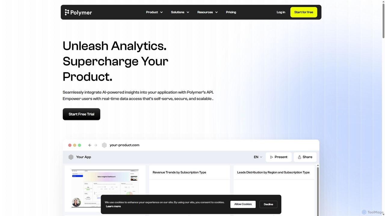
Polymer Search is an AI-driven embedded analytics platform designed to supercharge products with powerful, white-labeled data visualizations. It enables seamless integration of beautiful dashboards and reports directly into your application, empowering users with self-serve analytics and AI-generated insights, all with minimal development effort.
Business Intelligence
Conduit
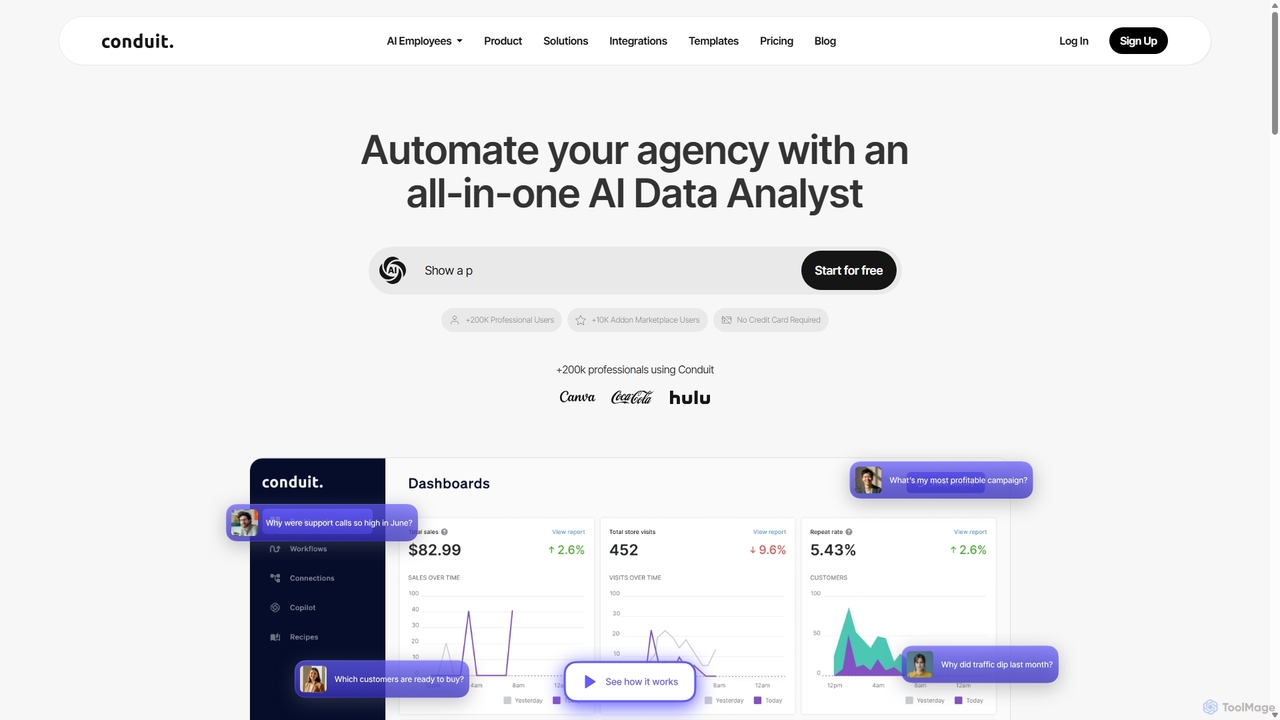
Conduit is an all-in-one AI data analyst platform designed to automate agencies and businesses. It centralizes data from hundreds of sources like CRMs, ad platforms, and databases, enabling users to build automated workflows, create interactive dashboards, and query their data using a natural language AI copilot. It's built for marketing teams, data analysts, and developers to save time, improve accuracy, and make faster, data-driven decisions.
Business Intelligence
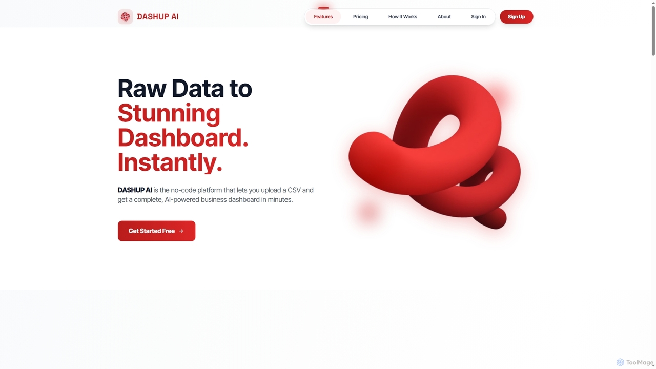
Dashup
Dashup is a no-code AI platform that instantly transforms raw CSV data into stunning, interactive business dashboards. Simply upload your file, choose a template, and let the AI suggest key metrics and visualizations. No SQL or technical skills required. Go from spreadsheet to actionable insights in minutes, making data-driven decisions faster and easier.
Business Intelligence
Morph Ai Era
Morph Ai Era is an AI-powered, interactive data analytics dashboard. It enables users to upload data, create a wide range of visualizations, and leverage AI tools for automated insights, growth forecasting, and anomaly detection. It's designed to transform raw data into actionable business intelligence.
Business Intelligence
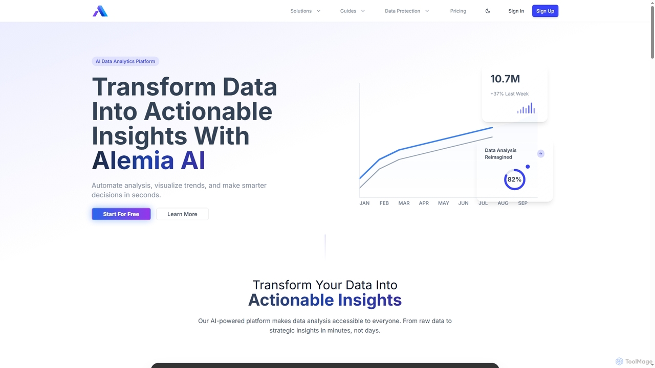
Alemia
Alemia is an AI-powered data analytics platform that transforms raw data into actionable insights, visualizations, and reports. It enables users to ask questions in plain English and receive instant, intelligent analysis, making data-driven decision-making accessible to everyone without requiring technical skills.
3D
Viewit Ai Chatbot
An AI-powered chatbot that transforms your data into insightful visualizations and summaries through simple, natural language conversations. Upload your dataset, ask questions, and instantly receive charts, graphs, and key metrics, making data analysis accessible to everyone without needing complex software or coding skills.
Business Intelligence

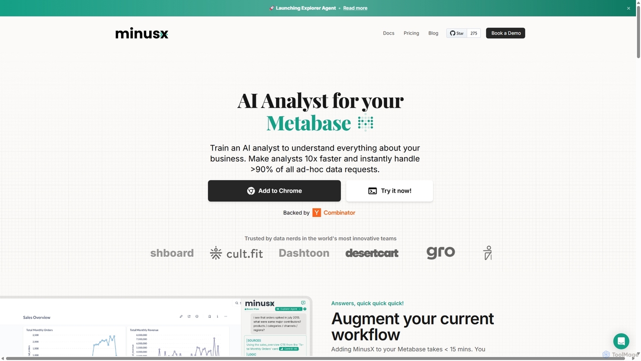
Minusx
Minusx is an AI data analyst designed to integrate seamlessly with Metabase. It empowers data analysts, business users, and executives to query data using natural language, handling over 90% of ad-hoc requests instantly. By acting as a Chrome extension within your existing workflow, Minusx enhances productivity, codifies business knowledge through 'Context Engineering', and provides quick, accurate insights directly from your dashboards and reports, all while ensuring data security.
Analytics