ToolMage
Sign in

Best 2 Charts & Graphs AI tools for Business

Popular Charts & Graphs AI tools in Business include ChartGen and Line Graph Maker, helping you work more efficiently.

ChartGen
Freemium

ChartGen

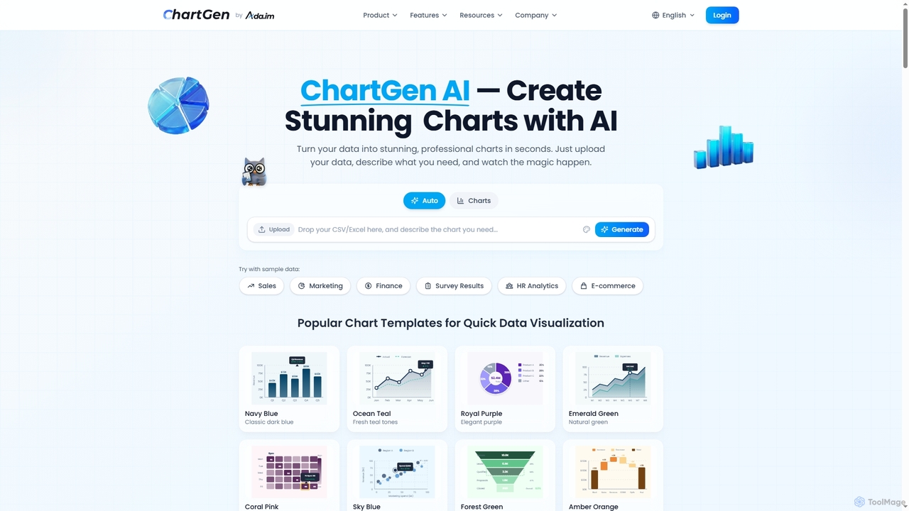
ChartGen is an AI-powered chart generator that transforms raw data into stunning, professional visualizations in seconds. Users simply upload CSV or Excel files, describe their desired chart in plain English, and the AI instantly creates various chart types like bar, line, and pie charts. It's designed for quick, effortless data visualization without requiring design or coding skills.

Charts & Graphs
Visits 153.8KFavorites 45Likes 39
Line Graph Maker
Free

Line Graph Maker

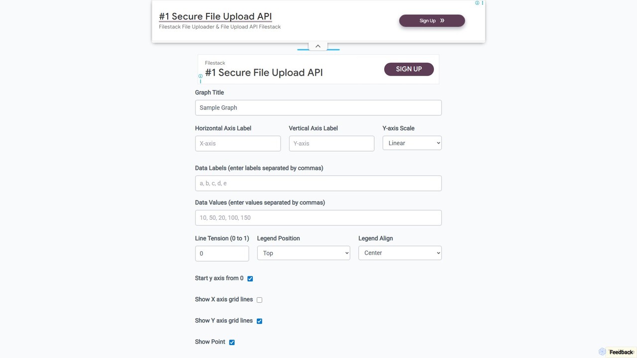
A free, web-based tool for instantly creating custom line and bar graphs. Input your data, customize labels, colors, and styles, then download your chart in PNG, JPG, or SVG format. Ideal for students, educators, and professionals for quick data visualization.

Charts & Graphs
Visits 60KFavorites 125Likes 125

About Charts & Graphs

AI Charts & Graphs tools are applications that leverage artificial intelligence to automatically transform raw data into insightful visual representations. These tools interpret data inputs, including natural language queries, to generate appropriate charts, graphs, and diagrams without manual configuration. They streamline the data visualization process, enabling users to quickly uncover trends, patterns, and correlations within their datasets. This capability is particularly valuable for business intelligence, reporting, and data-driven decision-making.

Core Features

  • Natural Language Processing (NLP): Generate charts by typing simple questions or commands, such as "Show monthly sales by product category."
  • Automated Chart Suggestion: The AI analyzes the dataset and recommends the most effective chart type (e.g., bar, line, pie) to represent the information.
  • Real-time Data Integration: Connect directly to various data sources like databases, spreadsheets, and APIs for live, up-to-date visualizations.
  • Interactive Dashboards: Create dynamic and filterable charts that allow users to explore data from different angles.
  • Customization and Styling: Easily modify colors, labels, and styles to align with brand guidelines or presentation requirements.

Use Cases

These tools are widely used by business analysts, marketing managers, financial experts, and researchers. Common applications include creating performance dashboards for sales and marketing, generating financial reports, visualizing survey results, and presenting complex scientific data in an understandable format for publications or presentations.

How to Choose

When selecting an AI Charts & Graphs tool, consider the following: the variety and quality of supported data sources, the range of available chart types, the sophistication of its natural language understanding, and its ability to integrate with your existing workflow or embed into other applications. Also, evaluate the balance between ease of use for non-technical users and advanced customization options for data analysts.

Charts & Graphs use cases

1

Generate Interactive Sales Dashboards

A sales manager needs to track team performance in real-time. Instead of manually building reports in a spreadsheet, they connect an AI chart tool to their CRM data. Using a simple prompt like "Create a dashboard showing sales pipeline stages, win rates by rep, and monthly recurring revenue growth for the last quarter," the tool instantly generates an interactive dashboard. The manager can then filter by region or salesperson to drill down into specific performance metrics, saving hours of manual report creation each week.

2

Visualize Marketing Campaign Data

A marketing analyst is tasked with presenting the results of a multi-channel campaign. They upload a CSV file containing data from social media, email, and paid ads. They ask the AI tool, "Compare the cost per acquisition and conversion rate across Facebook, Google Ads, and our email newsletter." The tool generates a grouped bar chart for easy comparison. They follow up with "Show the user engagement trend for the email campaign over 30 days," and a line chart is instantly created, ready for the presentation.

3

Simplify Financial Reporting

A financial analyst needs to prepare a summary for a quarterly board meeting. Instead of spending hours in Excel creating pivot tables and charts, they upload the financial statements. They use prompts like "Generate a waterfall chart for our cash flow changes" and "Create a pie chart showing the breakdown of operating expenses." The AI tool produces clean, professional-looking charts in minutes. This allows the analyst to focus more on interpreting the data and crafting the narrative for the meeting, rather than on the mechanics of chart creation.

4

Analyze User Survey Responses

A product manager collects feedback through a user survey with both multiple-choice and open-ended questions. They upload the survey data. For quantitative data, they ask, "Visualize the distribution of user satisfaction ratings." For qualitative data, the AI can perform sentiment analysis and they can ask, "Create a bar chart of the most common themes in positive feedback." This combination allows the product manager to quickly grasp both the 'what' and the 'why' behind user sentiment, accelerating product improvement cycles.

5

Track Project Management Metrics

A project manager oversees multiple projects and needs a consolidated view of progress. They connect the AI chart tool to their project management software (like Jira or Asana). They can then ask, "Generate a Gantt chart for Project Alpha's timeline," or "Create a burn-down chart for the current sprint." The tool visualizes complex project data, making it easy to identify bottlenecks, track resource allocation, and communicate project status to stakeholders in a clear, visual format.

6

Explore Academic Research Data

A researcher in life sciences has a large dataset from a recent experiment. Manually plotting this data in specialized software can be time-consuming. Using an AI chart tool, they can upload the data and ask, "Plot gene expression levels across different treatment groups as a heatmap" or "Show the correlation between protein concentration and cell viability in a scatter plot." The AI quickly generates publication-quality visuals, allowing the researcher to rapidly test hypotheses and identify significant findings without getting bogged down in coding or complex software interfaces.

Charts & Graphs FAQ

What are AI Charts & Graphs tools?

AI Charts & Graphs tools are software applications that use artificial intelligence, particularly natural language processing, to automatically create data visualizations. Instead of manually selecting data ranges and chart types, users can input data and make requests in plain language (e.g., "show me a bar chart of sales by country"). The AI interprets the request, analyzes the data, and generates the most appropriate visual representation, significantly speeding up the process of gaining insights from data.

How do AI chart tools differ from traditional BI software like Tableau or Power BI?

The main difference lies in the user interface and workflow. Traditional BI tools are powerful but often require users to have technical skills to manually connect data sources, model data, and use a drag-and-drop interface to build visualizations. AI chart tools simplify this process by using a conversational, natural language interface. They are designed for speed and ease of use, allowing non-technical users to generate insights quickly, whereas traditional BI tools offer deeper, more complex analytical capabilities for data professionals.

What types of data can I use with these tools?

Most AI chart generators are versatile and can handle a wide range of data formats. Common supported formats include:

  • Spreadsheet files: Such as CSV, Microsoft Excel (.xlsx), and Google Sheets.
  • Direct database connections: Connections to SQL databases like PostgreSQL, MySQL, and cloud data warehouses like BigQuery or Snowflake.
  • API integrations: Connections to business applications like Salesforce, Google Analytics, or social media platforms to pull data directly.
  • Pasted data: Simply copying and pasting data from a table directly into the tool.
The specific integrations available will vary by tool, so it's important to check if your primary data sources are supported.

How do I choose the right AI chart generator for my needs?

To choose the best tool, evaluate these factors:

  • Data Connectivity: Ensure it connects seamlessly with your primary data sources (e.g., Google Sheets, SQL database, CRM).
  • Chart Variety: Check if it supports the specific types of charts you need, from basic bar and line charts to more complex ones like heatmaps or Gantt charts.
  • Ease of Use: Consider the learning curve. Is it a simple prompt-based interface for beginners, or does it offer advanced features for data analysts?
  • Collaboration and Sharing: Look for features that allow you to share interactive charts or dashboards with your team or embed them in reports and websites.
  • Cost: Compare pricing models, from free tiers for basic use to enterprise plans for advanced features and team access.

Are AI-generated charts accurate and reliable?

Yes, the charts themselves are accurate representations of the data you provide. The AI's role is to interpret your request and visualize the data, not to alter the underlying numbers. The reliability of the insight depends on the quality and accuracy of your source data. It's always good practice to ensure your data is clean and correct before analysis. The main advantage of AI is in accurately and quickly translating your analytical questions into the correct visual format, reducing the chance of human error in chart setup.