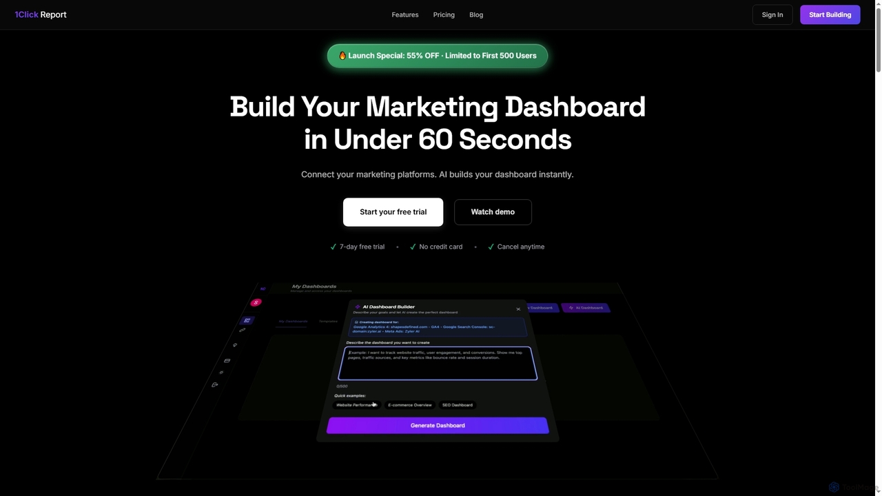
1ClickReport
1ClickReport is an AI-powered marketing analytics platform that unifies data from various marketing channels like GA4, Meta Ads, …
1ClickReport is an AI-powered marketing analytics platform that unifies data from various marketing channels like GA4, Meta Ads, and Google Ads into instant, actionable dashboards. It helps users eliminate manual reporting, gain deep insights, and optimize marketing performance with ease, offering a 7-day free trial.
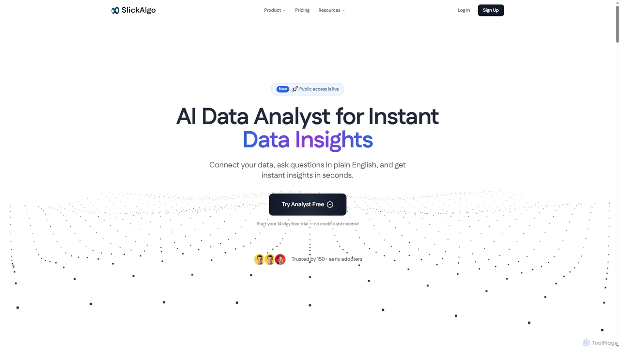
SlickAlgo
SlickAlgo is an AI data analyst platform that transforms natural language questions into instant data insights, Python code, …
SlickAlgo is an AI data analyst platform that transforms natural language questions into instant data insights, Python code, and interactive dashboards. It connects to over 50 data sources, enabling businesses to make data-driven decisions without coding.
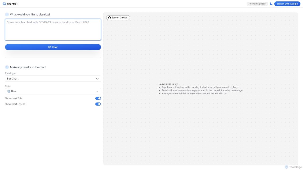
ChartGPT
ChartGPT is an AI-powered tool that transforms natural language text prompts into a wide variety of stunning charts …
ChartGPT is an AI-powered tool that transforms natural language text prompts into a wide variety of stunning charts and graphs. Simply describe the data you want to visualize, and ChartGPT instantly generates customizable charts, making data visualization accessible to everyone, regardless of technical skill.
ChartGPT
ChartGPT is an AI-powered tool that transforms natural language prompts and raw data into stunning, customizable charts and …
ChartGPT is an AI-powered tool that transforms natural language prompts and raw data into stunning, customizable charts and graphs. Effortlessly create complex visualizations like bar charts, line graphs, and pie charts without any coding, simply by describing what you want to see.
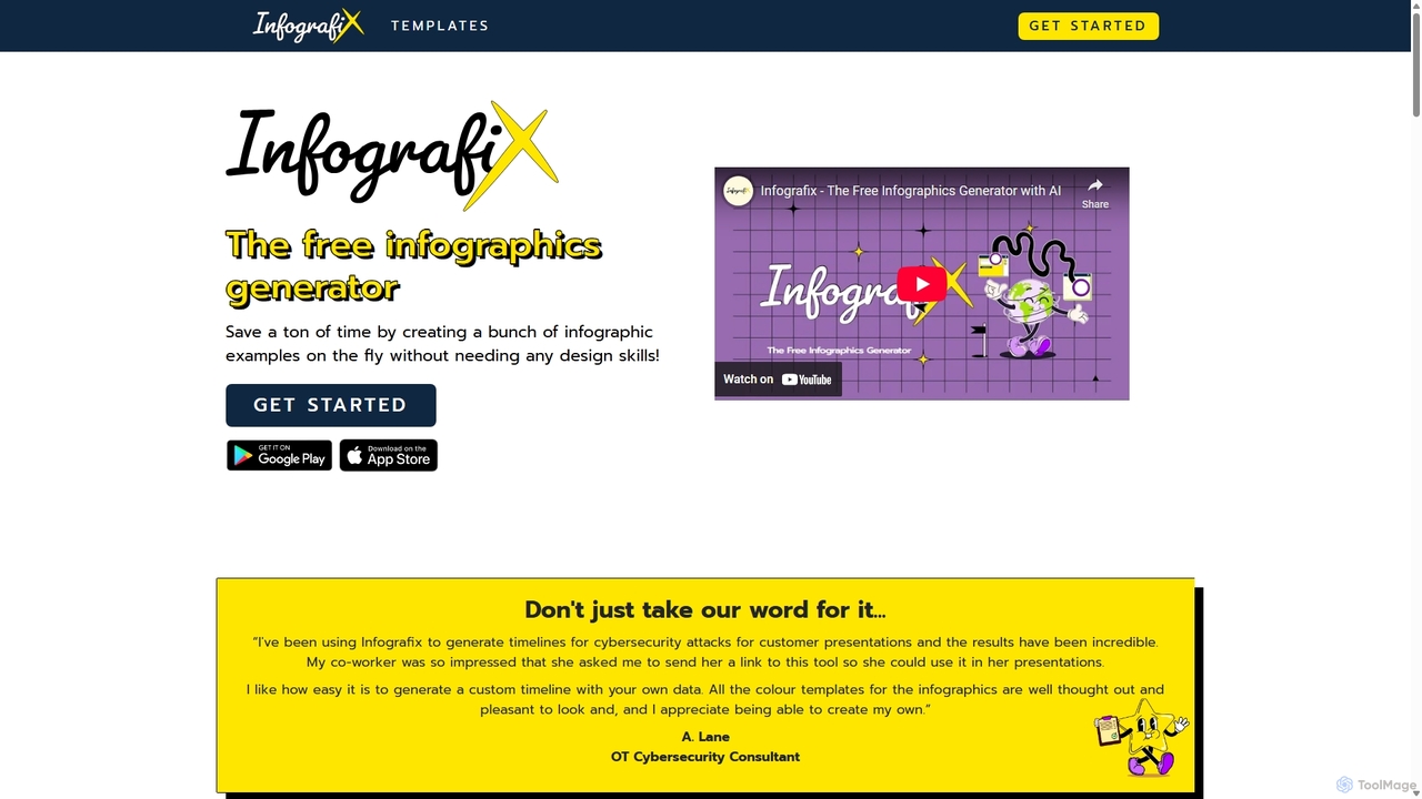
Infografix
Infografix is an AI-powered infographic generator that transforms simple text prompts into professional-quality visuals. Create stunning charts, diagrams, …
Infografix is an AI-powered infographic generator that transforms simple text prompts into professional-quality visuals. Create stunning charts, diagrams, mind maps, and timelines in seconds without any design skills. Available on web and mobile, it's perfect for marketers, students, and professionals who need to visualize data quickly and effectively.
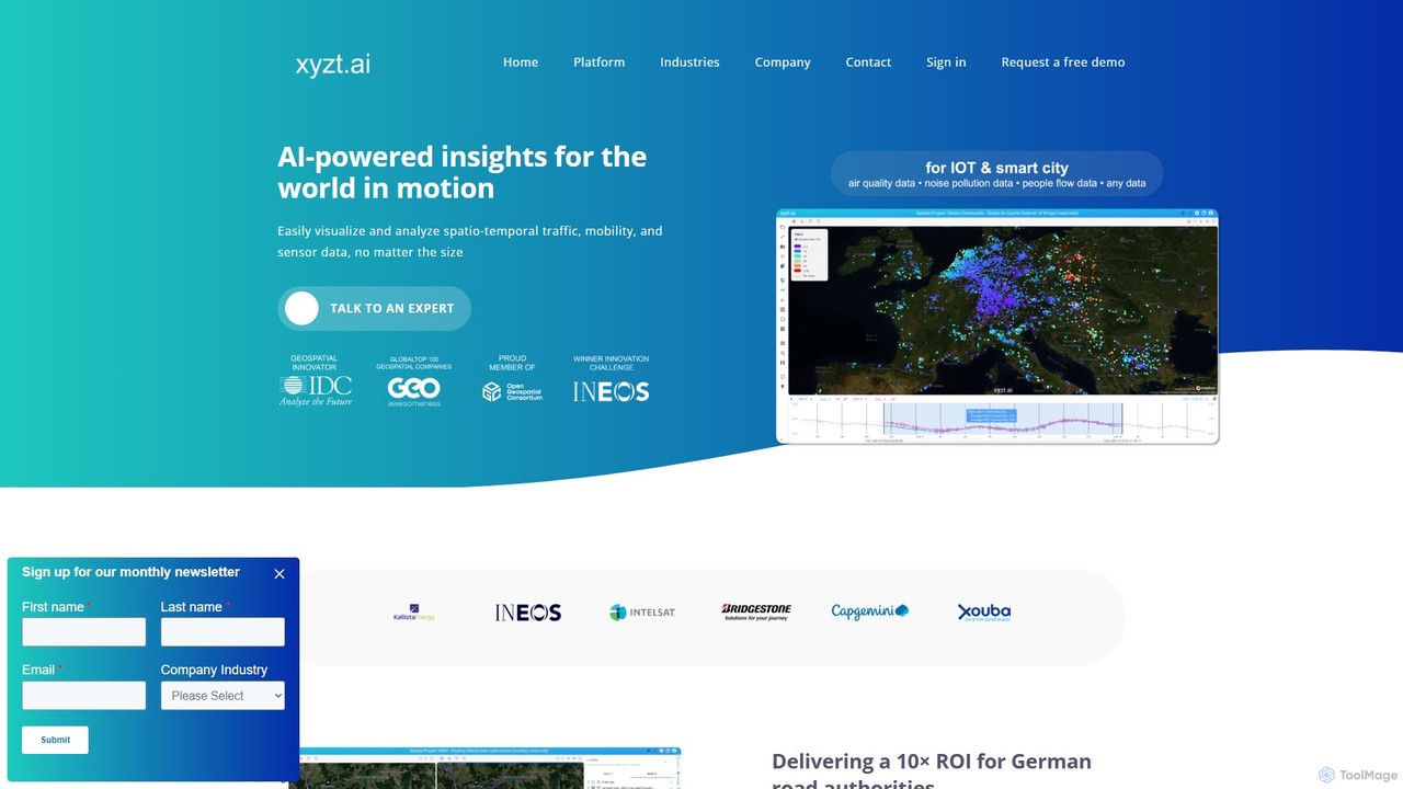
xyzt.ai
xyzt.ai is a powerful AI-driven platform for visualizing and analyzing large-scale spatio-temporal data. It specializes in mobility, traffic, …
xyzt.ai is a powerful AI-driven platform for visualizing and analyzing large-scale spatio-temporal data. It specializes in mobility, traffic, and IoT sensor data, enabling users to gain insights from complex datasets through an intuitive, self-service interface. With features like GenAI-powered natural language queries, anomaly detection, and robust dashboarding, it helps organizations in transportation, maritime, and logistics optimize operations, enhance safety, and monetize their data investments.
Line Graph Maker
A free, web-based tool for instantly creating custom line and bar graphs. Input your data, customize labels, colors, …
A free, web-based tool for instantly creating custom line and bar graphs. Input your data, customize labels, colors, and styles, then download your chart in PNG, JPG, or SVG format. Ideal for students, educators, and professionals for quick data visualization.
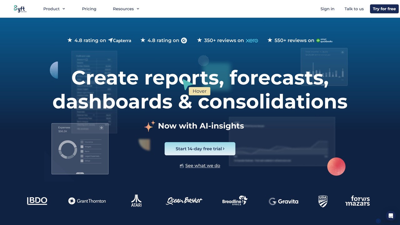
Syft Analytics
Syft Analytics is an AI-first financial reporting platform that transforms complex financial data into beautiful, insightful reports, dashboards, …
Syft Analytics is an AI-first financial reporting platform that transforms complex financial data into beautiful, insightful reports, dashboards, and forecasts. It connects with your accounting, e-commerce, and payroll software to provide a unified view of your business performance. Ideal for accountants, advisors, and businesses, Syft automates reporting, simplifies consolidations, and provides AI-driven insights to facilitate better decision-making.
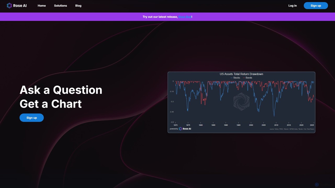
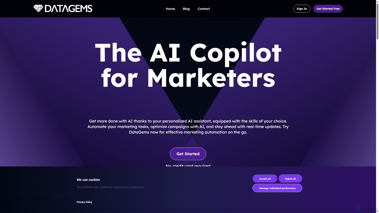
Rose
Rose is an AI-powered data platform designed for financial analysts and decision-makers. It leverages advanced language models to …
Rose is an AI-powered data platform designed for financial analysts and decision-makers. It leverages advanced language models to simplify data discovery, analysis, and visualization. Users can ask questions in natural language to instantly generate charts and insights from diverse data sources. The platform emphasizes data traceability, collaboration, and creating compelling data narratives, streamlining the entire financial research process.
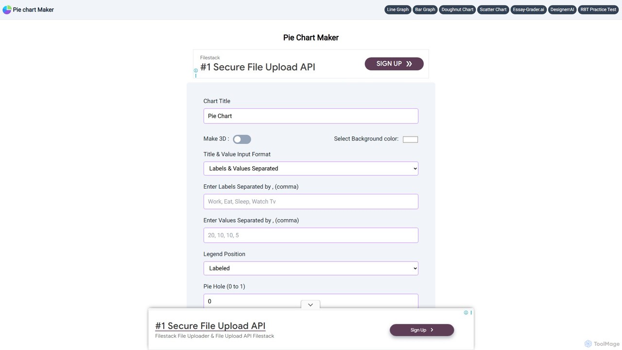
Pie Chart Maker
A free, user-friendly online tool for creating beautiful and customizable pie charts, doughnut charts, and line graphs in …
A free, user-friendly online tool for creating beautiful and customizable pie charts, doughnut charts, and line graphs in just a few clicks. Instantly visualize your data by simply entering labels and values, and download your charts in various formats like PNG, JPEG, and SVG.
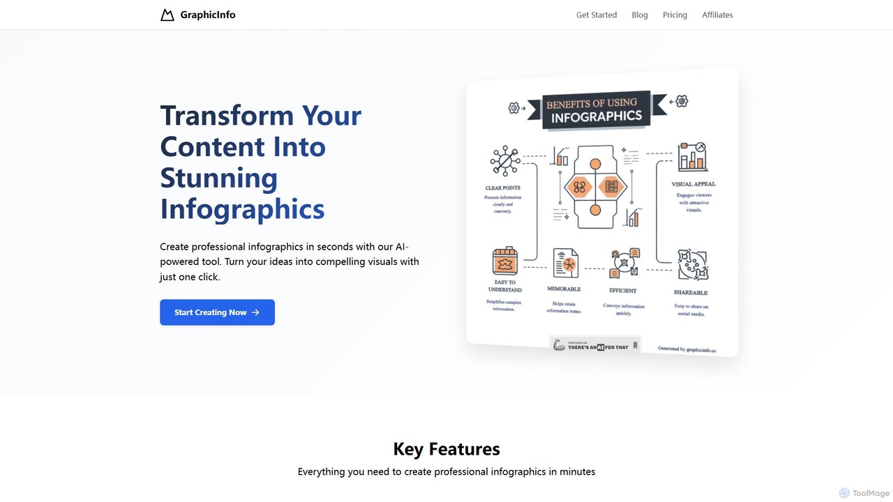
graphicinfo
graphicinfo is an AI-powered infographic generator that transforms your text and ideas into stunning, professional visuals in seconds. …
graphicinfo is an AI-powered infographic generator that transforms your text and ideas into stunning, professional visuals in seconds. With just one click, create customizable, data-rich infographics for marketing, education, and business, no design skills required.
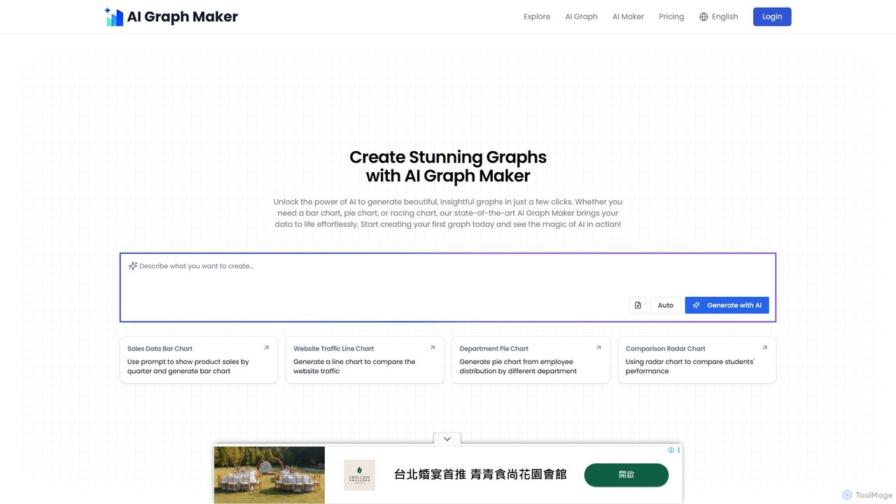
aigraphmaker
aigraphmaker is an AI-powered platform that transforms raw data and text prompts into a wide variety of professional …
aigraphmaker is an AI-powered platform that transforms raw data and text prompts into a wide variety of professional and interactive charts and diagrams. It enables users, from beginners to experts, to effortlessly create stunning visualizations like bar charts, mind maps, flowcharts, and knowledge graphs in seconds, without any coding or design skills required.
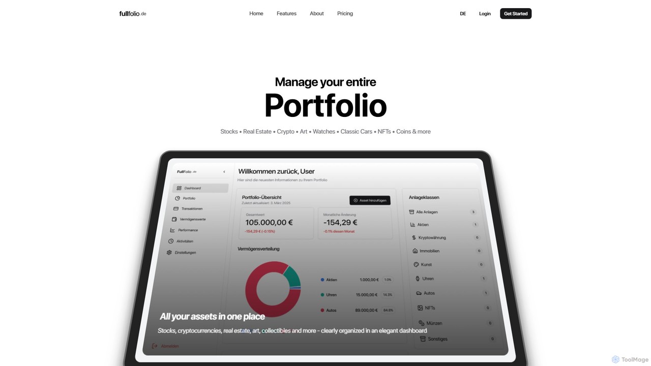
fullfolio.de
fullfolio.de is an all-in-one portfolio management platform that allows users to track a diverse range of assets in …
fullfolio.de is an all-in-one portfolio management platform that allows users to track a diverse range of assets in a single, elegant dashboard. It consolidates everything from traditional stocks, bonds, and real estate to modern investments like cryptocurrencies, NFTs, and collectibles such as art, watches, and classic cars, providing a complete financial overview.
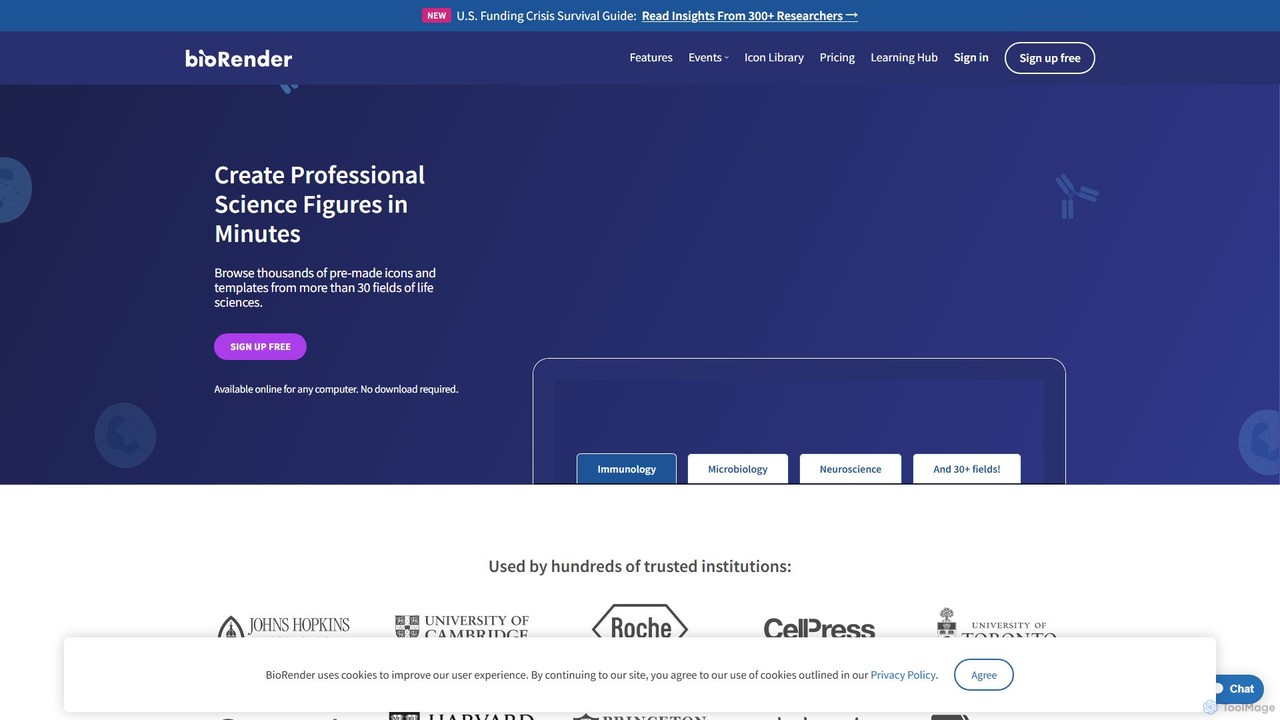
BioRender
BioRender is a web-based software that empowers scientists to create professional scientific figures, diagrams, and illustrations with ease. …
BioRender is a web-based software that empowers scientists to create professional scientific figures, diagrams, and illustrations with ease. Featuring a vast library of over 50,000 scientifically accurate icons and templates, it streamlines the process of visualizing complex biological concepts for publications, presentations, and grants. It's designed by scientists, for scientists, to replace generic tools like PowerPoint for scientific communication.
About Data Visualization
Data Visualization AI tools are a category of productivity-enhancing software that leverage artificial intelligence to transform raw data into insightful, interactive visual representations. These tools utilize machine learning algorithms to automate chart generation, identify patterns, and uncover hidden trends, making complex data accessible and understandable. They empower users to make data-driven decisions faster and more effectively, streamlining the process of data exploration and reporting.
Core Features
- Automated Chart Generation: Intelligently suggests and creates appropriate charts and graphs based on data types and user queries.
- Intelligent Insights & Anomaly Detection: AI algorithms analyze data to highlight key findings, outliers, and potential issues automatically.
- Interactive Dashboards: Allows users to explore data dynamically, filter, drill down, and customize views for deeper analysis.
- Natural Language Query (NLQ): Enables users to ask data-related questions in plain language and receive visual answers instantly.
- Predictive Visualization: Uses AI to forecast future trends and visualize potential outcomes based on historical data.
Use Cases
These tools are invaluable across various sectors, from business intelligence and marketing analytics to scientific research and financial reporting. They help analysts quickly grasp market trends, enable researchers to visualize complex experimental results, and assist executives in monitoring key performance indicators for strategic planning.
How to Choose
When selecting an AI data visualization tool, consider its compatibility with your existing data sources, the range and customizability of visualization types offered, and the sophistication of its AI-driven insights. Evaluate ease of use, collaboration features, integration capabilities with other business tools, and pricing models to ensure it aligns with your team's technical proficiency and budget.
Data VisualizationUse Cases
Automating Business Performance Dashboards
Business analysts and executives can leverage AI data visualization tools to automatically generate and update interactive dashboards from various enterprise data sources (CRM, ERP, sales data). The AI identifies key performance indicators (KPIs) and trends, presenting them in an easily digestible format. This allows for real-time monitoring of business health, quick identification of areas needing attention, and supports agile strategic decision-making, saving hours of manual report compilation.
Enhancing Marketing Campaign Analytics
Marketing managers can use these tools to visualize the performance of their campaigns across multiple channels. By feeding in data from social media, ad platforms, and website analytics, AI can highlight which campaigns are most effective, identify audience segments with high engagement, and predict future campaign success. This enables data-driven optimization of marketing spend and strategy, leading to improved ROI and more targeted outreach.
Accelerating Scientific Research Data Exploration
Researchers in fields like biology, physics, or social sciences can utilize AI data visualization to explore vast and complex datasets from experiments or surveys. The AI assists in identifying correlations, anomalies, and significant patterns that might be missed with traditional methods. This accelerates the discovery process, helps validate hypotheses, and facilitates clearer communication of findings through compelling visual evidence in publications and presentations.
Streamlining Financial Reporting and Forecasting
Finance professionals can employ AI data visualization tools to create dynamic reports on budgets, expenditures, revenue, and profit margins. The AI can automatically detect financial anomalies, forecast future financial performance based on historical data, and visualize cash flow trends. This provides stakeholders with clear, up-to-date financial insights, aiding in risk management, investment decisions, and strategic financial planning.
Creating Engaging Educational Content
Educators and content creators can use these tools to transform complex statistical or scientific information into engaging and easy-to-understand infographics, charts, and interactive presentations. AI can help in structuring the data visually to maximize comprehension and retention for students or general audiences. This makes learning more accessible and enjoyable, particularly for subjects rich in data, such as economics, history, or environmental science.
Optimizing Supply Chain and Operations Monitoring
Operations managers can visualize real-time data from their supply chain, manufacturing processes, or logistics networks. AI-powered visualization can highlight bottlenecks, predict equipment failures, optimize inventory levels, and track delivery performance. This proactive approach allows managers to identify inefficiencies, make timely adjustments, and improve overall operational productivity and resilience, reducing costs and improving service delivery.