
AI Lab
AI Lab is a no-code visual workspace for building machine learning models and data science pipelines. It enables …
AI Lab is a no-code visual workspace for building machine learning models and data science pipelines. It enables users of all technical levels to create, train, and deploy AI applications through an intuitive drag-and-drop interface, accelerating development and making AI accessible.
Streamlit
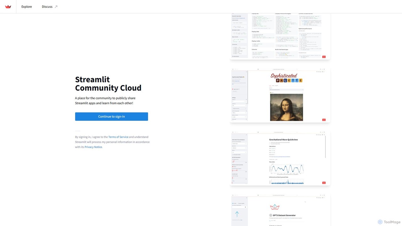
Streamlit is an open-source Python framework that enables developers and data scientists to build and share beautiful, custom …
Streamlit is an open-source Python framework that enables developers and data scientists to build and share beautiful, custom web apps for machine learning and data science in minutes. The Streamlit Community Cloud provides a free platform to deploy, manage, and share these public applications with the world, fostering a collaborative environment for innovation.
Neural4D
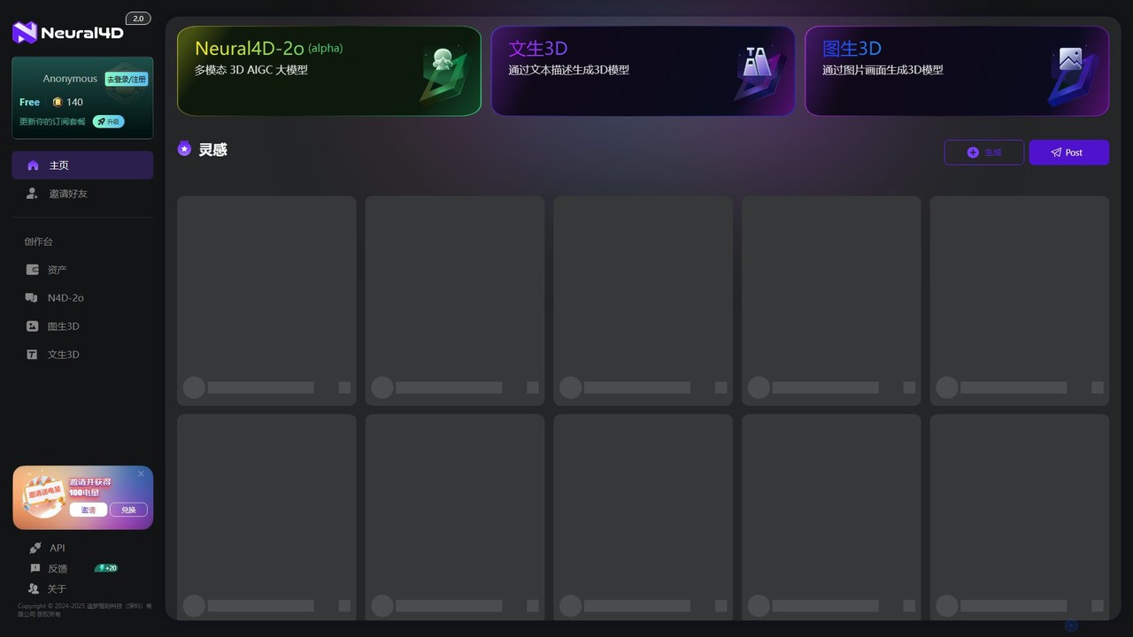
Neural4D is an advanced AI platform for 4D medical imaging analysis. It leverages deep learning to process spatio-temporal …
Neural4D is an advanced AI platform for 4D medical imaging analysis. It leverages deep learning to process spatio-temporal data from dynamic CT, MRI, and PET scans, enabling faster diagnostics, precise tumor tracking, and quantitative analysis of physiological functions for healthcare professionals and researchers.

victordibia
A comprehensive resource hub by Victor Dibia, a leading researcher in Applied ML and HCI. It features open-source …
A comprehensive resource hub by Victor Dibia, a leading researcher in Applied ML and HCI. It features open-source AI tools like AutoGen Studio and LIDA, in-depth articles, research papers, and talks on generative AI, multi-agent systems, and human-computer interaction. A valuable platform for developers, researchers, and AI enthusiasts.
marimo
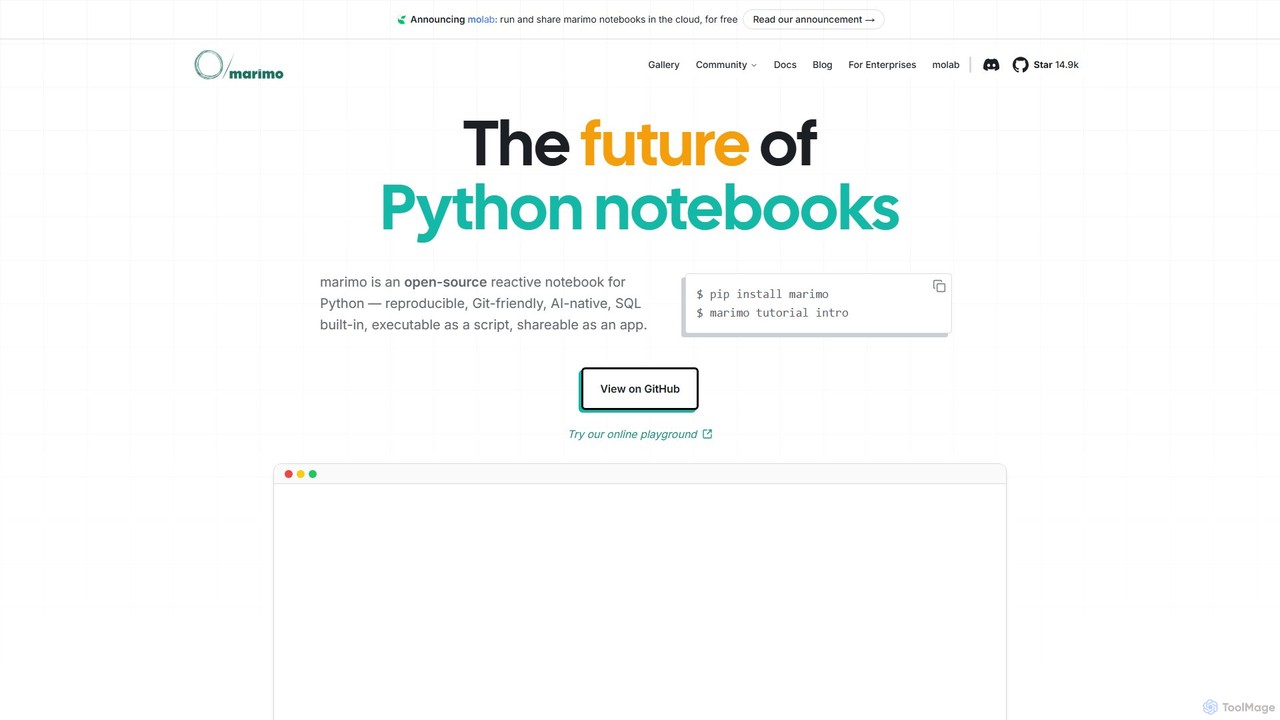
marimo is an open-source reactive Python notebook for modern data science and AI. It offers a reproducible, Git-friendly, …
marimo is an open-source reactive Python notebook for modern data science and AI. It offers a reproducible, Git-friendly, and interactive environment where notebooks are pure Python scripts. Features include built-in AI assistance, SQL cells, and the ability to share notebooks as web apps, streamlining the workflow from experiment to production.

Sonify
Sonify is an innovation studio that specializes in data sonification, using AI and emerging technologies to transform complex …
Sonify is an innovation studio that specializes in data sonification, using AI and emerging technologies to transform complex data into meaningful audio, music, and soundscapes. It focuses on making data more accessible, intuitive, and emotionally resonant for applications in research, art, and accessibility.
About Data Visualization
Data Visualization tools are a specialized class of software designed to transform raw, complex datasets into intuitive graphical representations. These tools utilize algorithms to create charts, graphs, maps, and interactive dashboards, making it easier to identify trends, patterns, and outliers. As a critical component of the data science workflow, they bridge the gap between raw data and human understanding, enabling clearer communication and data-driven decision-making. Many modern tools incorporate AI to suggest optimal visualizations or highlight key insights automatically.
Core Features
- Interactive Dashboards: Combine multiple visualizations into a single, filterable interface for comprehensive analysis.
- Diverse Chart Library: Support for a wide range of charts beyond basic types, including heatmaps, scatter plots, network graphs, and geospatial maps.
- Real-time Data Connectivity: Ability to connect directly to live databases, APIs, and streaming data sources for up-to-the-minute insights.
- AI-Powered Suggestions: Use artificial intelligence to recommend the most effective chart type for a given dataset or automatically uncover significant patterns.
- Collaboration and Sharing: Features for embedding visualizations, sharing interactive reports, and annotating charts for team collaboration.
Use Cases
Data Visualization tools are essential across various sectors. In business intelligence, managers use them to track KPIs and sales performance. Marketers analyze campaign effectiveness and customer behavior. In scientific research, they help visualize complex experimental results, while financial analysts use them to monitor market trends and portfolio performance.
How to Choose
When selecting a Data Visualization tool, consider its data source compatibility—can it connect to your databases and services? Evaluate the balance between ease of use for non-technical users and the customization power needed by data analysts. Assess the library of available chart types to ensure it meets your specific analytical needs. Finally, consider its scalability for handling large datasets and its features for collaboration and sharing insights with stakeholders.
Data VisualizationUse Cases
Create a Real-time Sales Performance Dashboard
A sales manager needs to monitor team performance across different regions and product lines. Using a data visualization tool, they connect directly to the company's CRM and sales database. They build an interactive dashboard with a map showing sales by region, a bar chart for individual representative performance, and a pie chart for product category sales. This allows the manager to drill down into specific data points during weekly meetings, identify top performers, and spot regions needing more support, all without manually compiling reports.
Analyze Marketing Campaign ROI
A digital marketer is running multiple campaigns across Google Ads, Facebook, and LinkedIn. To understand the overall return on investment (ROI), they use a data visualization tool to pull data from all three platforms into one dashboard. They create funnel charts to track conversion rates and line graphs to compare cost-per-acquisition (CPA) over time for each channel. This unified view helps them quickly identify the most profitable campaigns and reallocate their budget from underperforming channels to maximize results.
Explore Complex Scientific Datasets
A biologist is studying gene expression data from a large-scale experiment. The raw data is a massive table of numbers, making it impossible to spot patterns visually. By importing the data into a visualization tool, the researcher can generate an interactive heatmap. This immediately reveals clusters of genes that are co-regulated under certain conditions. They can then use network graphs to visualize potential interactions between these genes, leading to new hypotheses for further investigation that would have been missed by looking at spreadsheets alone.
Monitor Financial Market Trends
A financial analyst needs to track the performance of several stocks and identify potential trading opportunities. Instead of looking at raw price data, they use a visualization tool to create candlestick charts that show open, high, low, and close prices for each day. They overlay technical indicators like moving averages and Bollinger Bands. This visual representation allows them to quickly spot trends, identify support and resistance levels, and make more informed trading decisions compared to analyzing rows of numerical data.
Visualize Supply Chain Logistics
A logistics manager for a global retail company needs to optimize shipping routes and monitor delivery statuses. They use a data visualization tool with geospatial mapping capabilities. By plotting the real-time location of all shipments on an interactive map, they can instantly see delivery progress, identify bottlenecks in transit, and analyze route efficiency. Color-coding shipments by status (e.g., in transit, delayed, delivered) provides an at-a-glance overview of the entire supply chain, enabling proactive problem-solving.
Analyze Website User Behavior Funnels
An e-commerce product manager wants to understand why many users abandon their shopping carts. They use a data visualization tool to create a funnel chart that tracks the user journey from the homepage, through product search and adding to cart, to the final purchase. The visualization clearly shows the largest drop-off occurs at the shipping information step. This insight allows the team to focus their optimization efforts on simplifying that specific page, potentially by adding more payment options or clarifying shipping costs upfront.