ToolMage
Sign in

Best 1 Visualisation AI tools for Design

Popular Visualisation AI tools in Design include AnyAngle, helping you work more efficiently.

AnyAngle
Freemium

AnyAngle

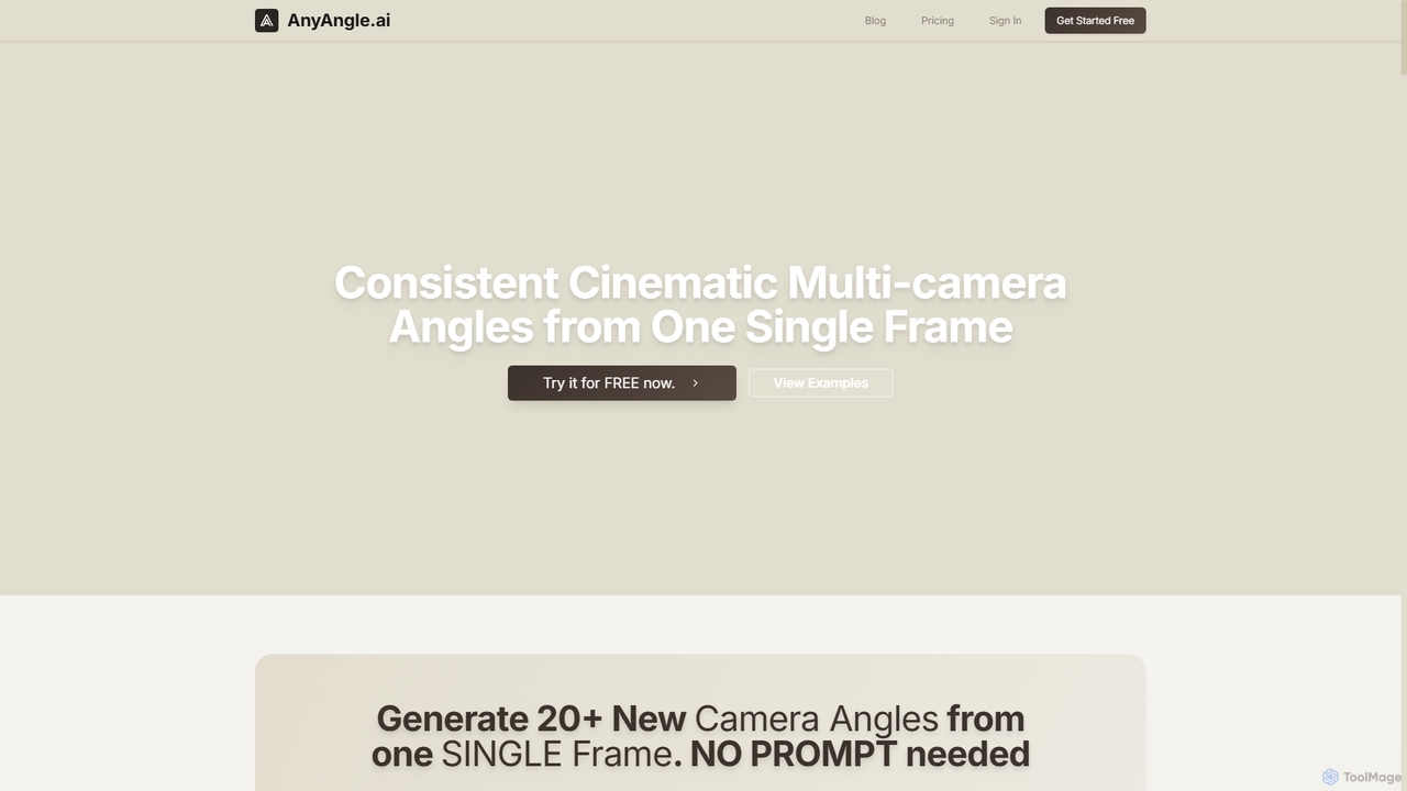
AnyAngle is an AI-powered tool that transforms a single image into over 20 consistent, cinematic camera angles without requiring prompts. It's ideal for filmmakers, advertisers, and designers to visualize sequences, create multi-angle videos, and enhance visual content with high-resolution outputs up to 16K.

Photography
Visits 13.1KFavorites 108Likes 105

About Visualisation

AI Visualisation tools are a category of software that leverage artificial intelligence to transform complex data, information, or abstract concepts into intuitive and engaging visual formats. These tools utilize advanced algorithms to automate design processes, suggest optimal graphical representations, and enhance the clarity and impact of visual communication. They empower users to create compelling charts, graphs, infographics, and interactive dashboards with unprecedented speed and precision, making data more accessible and insights more apparent.

Core Features

  • Automated Chart Generation: Automatically selects and generates appropriate chart types (bar, line, pie, scatter) based on input data characteristics.
  • Intelligent Layout & Design: Suggests optimal visual layouts, color palettes, and typography to enhance readability and aesthetic appeal.
  • Interactive Dashboard Creation: Enables the rapid assembly of dynamic, interactive dashboards for real-time data exploration and monitoring.
  • Natural Language to Visual: Converts textual descriptions or data queries into visualisations, simplifying the creation process for non-technical users.
  • Data Storytelling Assistance: Guides users in structuring visual narratives, highlighting key insights, and creating a compelling flow of information.

Use Cases

Business analysts use AI visualisation tools to quickly generate interactive reports and dashboards from large datasets, identifying trends and presenting findings to stakeholders. Marketing teams leverage them to create engaging infographics for campaigns, simplifying complex market research data for wider audiences. Researchers can visualize scientific data to uncover patterns and communicate complex theories more effectively in publications and presentations.

How to Choose

When selecting an AI visualisation tool, consider its data source compatibility (e.g., SQL, Excel, cloud databases) and the range of visualization types it supports. Evaluate the level of AI automation offered, from basic chart suggestions to advanced data storytelling. Assess its integration capabilities with existing business intelligence platforms or design software. Finally, review the user interface for ease of use and the availability of customization options to match brand guidelines.

Visualisation use cases

1

Creating Dynamic Business Dashboards

Business intelligence analysts use AI visualisation tools to rapidly build interactive dashboards that consolidate key performance indicators (KPIs) from various data sources. The AI assists in selecting the most effective chart types and layouts, allowing stakeholders to explore real-time data, identify trends, and make informed decisions quickly.

2

Generating Engaging Marketing Infographics

Marketing professionals leverage these tools to transform complex market research data, campaign results, or product features into visually appealing infographics for social media, blogs, and presentations. AI helps in designing visually consistent and impactful graphics, ensuring the message is clear and resonates with the target audience.

3

Visualizing Scientific Research Data

Researchers in fields like biology, physics, or social sciences utilize AI visualisation to interpret and present vast amounts of experimental or survey data. The tools can automatically identify correlations, outliers, and patterns, generating precise charts and graphs that are crucial for academic papers, conferences, and grant applications.

4

Simplifying Financial Report Presentations

Financial analysts employ AI visualisation to convert intricate financial statements, budget forecasts, and investment performance data into easily digestible charts and graphs. This simplifies the communication of complex financial information to non-financial executives or clients, highlighting key insights and potential risks or opportunities.

5

Designing Interactive Educational Content

Educators and content creators use AI visualisation to develop engaging and interactive learning materials. By transforming abstract concepts or historical data into dynamic visualisations, students can better grasp complex subjects, explore data independently, and retain information more effectively.

6

Automating Supply Chain Performance Monitoring

Supply chain managers deploy AI visualisation tools to monitor logistics, inventory levels, and delivery performance across global networks. The AI-driven dashboards provide real-time insights into bottlenecks, inefficiencies, and potential disruptions, enabling proactive decision-making to optimize operations and reduce costs.

Visualisation FAQ

What are AI Visualisation tools?

AI Visualisation tools are software applications that use artificial intelligence to create visual representations of data, information, or concepts. They automate the process of generating charts, graphs, infographics, and interactive dashboards, often suggesting optimal designs and layouts to enhance clarity and impact. Their core purpose is to make complex data more understandable and actionable for users across various domains.

How do AI Visualisation tools differ from traditional data visualization software?

Traditional data visualization software requires manual selection of chart types, extensive design adjustments, and often a deep understanding of data structures. AI Visualisation tools, however, leverage machine learning to automate these processes. They can suggest the best visualization types, optimize layouts, generate narratives from data, and even create visuals from natural language prompts, significantly reducing the time and expertise required.

What are the key benefits of using AI for data visualisation?

The primary benefits include increased efficiency in creating visuals, improved accuracy through AI-driven insights, and enhanced accessibility for non-technical users. AI can quickly process large datasets, identify patterns, and generate compelling visual stories that might be missed by manual analysis. This leads to faster decision-making, better communication, and a higher return on data investments.

Who can benefit most from using AI Visualisation tools?

A wide range of professionals can benefit, including business analysts, marketing specialists, data scientists, educators, and researchers. Anyone who needs to communicate complex information clearly and persuasively, or who deals with large volumes of data, will find these tools invaluable. They are particularly useful for teams looking to democratize data insights and accelerate reporting cycles.

What should I look for when choosing an AI Visualisation tool?

When choosing an AI Visualisation tool, prioritize its ability to connect with your existing data sources and its range of supported visualization types. Look for strong AI capabilities such as automated design suggestions, natural language processing for visual creation, and data storytelling features. Consider the user-friendliness of the interface, customization options, and the tool's scalability to handle growing data volumes and user needs.