Curb Appeal AI
Curb Appeal AI is an innovative AI-powered landscape design tool that allows homeowners and professionals to instantly visualize …
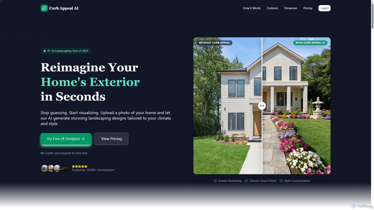
Curb Appeal AI is an innovative AI-powered landscape design tool that allows homeowners and professionals to instantly visualize exterior home transformations. By simply uploading a photo, users can generate stunning, climate-smart landscaping designs in over 20 styles, saving time and money on initial concepts.

FloorDesign
FloorDesign is a comprehensive AI-powered platform offering free tools for floor design, interior design, floor plan generation, and …
FloorDesign is a comprehensive AI-powered platform offering free tools for floor design, interior design, floor plan generation, and virtual staging. It transforms spaces instantly from text descriptions or uploaded images, providing photorealistic renders and smart recommendations for various design styles. Ideal for homeowners, designers, and real estate professionals seeking quick, professional-grade visualizations.
Edrawsoft
Edrawsoft is a comprehensive suite of AI-powered visual tools for diagramming, mind mapping, and project management. It includes …
Edrawsoft is a comprehensive suite of AI-powered visual tools for diagramming, mind mapping, and project management. It includes EdrawMax for all-in-one diagram creation, EdrawMind for brainstorming, and EdrawProj for Gantt charts. With AI assistance, users can automatically generate flowcharts, org charts, and more from text, beautify designs with a single click, and collaborate seamlessly across platforms. It's a powerful Visio alternative for individuals, teams, and enterprises.
Edraw.AI
Edraw.AI is an AI-powered visual collaboration platform that enables users to create diagrams, mind maps, flowcharts, and other …
Edraw.AI is an AI-powered visual collaboration platform that enables users to create diagrams, mind maps, flowcharts, and other visuals with ease. It combines a user-friendly interface with powerful AI tools for generation, analysis, and design. Featuring real-time collaboration, an extensive library of templates and symbols, it's designed to boost productivity for teams in project management, IT, marketing, education, and more. Get started for free and transform your ideas into professional visuals.

snapdiagram
SnapDiagram is an AI-powered tool that instantly transforms text descriptions into professional diagrams. Generate flowcharts, sequence diagrams, UML …
SnapDiagram is an AI-powered tool that instantly transforms text descriptions into professional diagrams. Generate flowcharts, sequence diagrams, UML models, mind maps, and more with simple natural language prompts. It's designed to accelerate workflows for developers, business analysts, and project managers by automating the diagramming process.
EdrawMax
EdrawMax is an all-in-one, AI-powered diagramming tool for creating over 210 types of diagrams, from flowcharts to floor …
EdrawMax is an all-in-one, AI-powered diagramming tool for creating over 210 types of diagrams, from flowcharts to floor plans. It combines intuitive drag-and-drop functionality with advanced AI features like one-click diagram generation, content analysis, and OCR. Ideal for teams and individuals, it facilitates real-time collaboration, offers extensive templates, and serves as a powerful Visio alternative for visualizing ideas and workflows.
About Visualization
AI Visualization tools are a specialized category of design software that uses machine learning to transform complex data into intuitive, interactive, and insightful visual representations. Unlike traditional chart builders, these tools can automatically analyze datasets to identify significant patterns, suggest the most effective chart types, and even generate visuals from natural language queries. Their primary value lies in accelerating data discovery and making sophisticated analytics accessible to users without deep technical expertise. This enables organizations to make faster, more informed decisions based on clear, AI-generated insights.
Core Features
- Natural Language Querying: Generate charts and reports by asking questions in plain English, such as "show me last quarter's sales by region."
- Automated Insight Discovery: The AI automatically scans data to highlight key trends, anomalies, outliers, and correlations that might be missed in manual analysis.
- Predictive Visualization: Create visual forecasts and model what-if scenarios based on historical data trends.
- Smart Chart Recommendations: The system intelligently suggests the optimal visualization format (e.g., bar chart, scatter plot, map) based on the data's structure and the user's query.
- Dynamic and Interactive Dashboards: Build self-updating dashboards that allow users to drill down into data, filter results, and explore relationships in real-time.
Use Cases
AI Visualization tools are widely used in business intelligence, market research, and scientific analysis. For example, a marketing team can use them to instantly visualize campaign performance and customer segmentation, while financial analysts can track market trends and detect anomalies in real-time. In research, scientists can map complex systems like genetic networks or climate models to uncover new discoveries.
How to Choose
When selecting an AI Visualization tool, consider the following: the variety of data sources it can connect to (e.g., databases, APIs, spreadsheets), the sophistication of its AI features (e.g., NLP quality, predictive accuracy), the level of customization available for charts and dashboards, and its ability to integrate with your existing data stack and workflows. The user interface's intuitiveness is also crucial for broad adoption within a team.
VisualizationUse Cases
Instant Business Intelligence Reporting
A business analyst needs to quickly understand sales performance for a quarterly review meeting. Instead of spending hours manually building reports in traditional BI software, they use an AI Visualization tool. They type a simple query: "Compare Q3 sales revenue vs Q2 by product category and show the top 3 performing regions." The AI instantly generates an interactive dashboard with a comparison bar chart and a color-coded map. It also adds an automated note: "Insight: Electronics category grew by 18%, driven primarily by the West region." This allows the analyst to present deep insights in minutes, not hours.
Visualizing Complex Scientific Data
A genetics researcher has a massive dataset of gene interactions. Manually plotting this as a network graph would be extremely complex and time-consuming. Using an AI Visualization tool, they upload the dataset. The AI automatically identifies the nodes (genes) and edges (interactions), applies an optimal layout algorithm to prevent clutter, and color-codes gene clusters based on function. The researcher can then interactively explore the network, zoom in on specific clusters, and filter by interaction strength, leading to the discovery of a previously unknown regulatory pathway.
Financial Market Anomaly Detection
A financial analyst is monitoring real-time stock trading data to detect unusual activities. An AI Visualization tool is connected to the live data feed. The tool displays trading volume and price movements on a dynamic chart, but its key function is the AI-powered anomaly detection. The system automatically highlights a sudden, abnormally high trading volume for a specific stock that deviates from its historical patterns, flagging it in red on the chart. This immediate visual alert allows the analyst to investigate potential market manipulation or breaking news far quicker than by watching raw numbers.
Optimizing Logistics and Supply Chains
A supply chain manager for a global company needs to visualize their entire network of suppliers, warehouses, and shipping routes. They input data from multiple systems into an AI Visualization tool. The tool generates an interactive world map showing all locations and routes. The manager can then ask, "What is the impact of a 3-day delay at the Singapore port?" The AI simulates the disruption, automatically rerouting shipments where possible and highlighting affected delivery times in red. This predictive visualization allows for proactive problem-solving and risk mitigation.
Analyzing Customer Journey and Behavior
An e-commerce manager wants to understand why many users abandon their shopping carts. They feed website analytics data into an AI Visualization tool. Instead of a simple funnel chart, the AI generates a detailed Sankey diagram that visualizes multiple user paths. It automatically identifies the top 3 drop-off points and highlights a common pattern: users who use the site's search function are 50% more likely to abandon their cart on the shipping page. This specific, visual insight helps the manager prioritize fixing potential issues with shipping cost calculation for searched items.
Urban Planning and Resource Allocation
A city planner is tasked with identifying the best locations for new public electric vehicle (EV) charging stations. They use an AI Visualization tool to overlay multiple data layers on a city map, including traffic flow, population density, existing charging station locations, and points of interest. The AI analyzes these combined datasets and generates a heatmap highlighting areas with high potential demand and low current supply. This data-driven visual evidence allows the planning department to justify their location choices and allocate resources more effectively, ensuring stations are built where they are needed most.