ToolMage
Sign in

Best 1 Visualization AI tools for Data Management

Popular Visualization AI tools in Data Management include Alemia, helping you work more efficiently.

Alemia
Freemium

Alemia

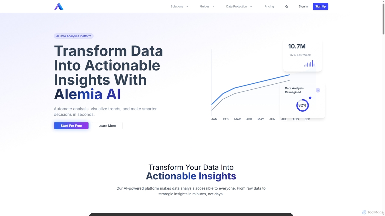
Alemia is an AI-powered data analytics platform that transforms raw data into actionable insights, visualizations, and reports. It enables users to ask questions in plain English and receive instant, intelligent analysis, making data-driven decision-making accessible to everyone without requiring technical skills.

3D
Visits 6.5KFavorites 126Likes 134

About Visualization

Visualization tools are AI-powered platforms designed to transform complex datasets into intuitive, interactive, and easily understandable visual representations. As a crucial component within the broader Data Management category, these tools leverage artificial intelligence to automate data interpretation, identify patterns, and generate dynamic charts, graphs, maps, and dashboards. Their primary value lies in enabling users to quickly grasp insights, make data-driven decisions, and communicate findings effectively without extensive technical expertise.

Core Features

  • Automated Chart Generation: Automatically suggests and creates optimal chart types based on data characteristics and user intent.
  • Interactive Dashboards: Provides customizable, real-time dashboards with drill-down capabilities for dynamic data exploration.
  • Predictive Visualization: Visualizes future trends and potential outcomes by integrating AI-driven predictive analytics models.
  • Natural Language Query (NLQ): Allows users to ask data-related questions in plain language and receive visual answers instantly.
  • Anomaly Detection Visualization: Highlights unusual patterns or outliers in data through distinct visual cues, aiding in rapid identification of issues.

Use Cases

AI visualization tools are indispensable for professionals across various sectors. Business analysts use them to create comprehensive performance reports, while marketing teams visualize campaign effectiveness and customer behavior. Financial institutions leverage these tools for risk assessment and market trend analysis, transforming raw data into actionable insights for strategic planning and operational optimization.

How to Choose

When selecting an AI visualization tool, consider its compatibility with your existing data sources (databases, cloud platforms, APIs), the range and flexibility of its visualization options, and its ease of use for non-technical users. Evaluate its AI capabilities for automated insights and natural language processing, as well as its integration potential with other business intelligence or data management systems. Scalability, security features, and pricing models are also critical factors.

Visualization use cases

1

Monitoring Real-time Business Performance

For business leaders and operations managers, AI visualization tools provide dynamic dashboards that aggregate key performance indicators (KPIs) from various departments. By connecting to live data feeds, these tools automatically update charts and graphs, allowing for immediate identification of performance bottlenecks, sales trends, or operational inefficiencies, facilitating rapid, informed decision-making.

2

Presenting Complex Research Findings Visually

Researchers and academics can utilize AI visualization to transform intricate scientific data, survey results, or statistical models into clear, compelling visual narratives. The tools help in creating interactive charts, heatmaps, and network diagrams that simplify complex relationships, making research findings more accessible and impactful for presentations, publications, and public engagement.

3

Identifying Market Trends and Customer Behavior

Marketing analysts and product managers employ AI visualization to analyze vast amounts of customer data, social media trends, and market research. These tools can visually highlight emerging patterns, segment customer demographics, and track product performance, enabling businesses to adapt strategies, personalize marketing campaigns, and develop products that resonate with target audiences.

4

Optimizing Supply Chain Logistics

Supply chain managers can visualize inventory levels, shipping routes, delivery times, and supplier performance across global networks. AI visualization tools can identify inefficiencies, predict potential disruptions, and optimize resource allocation by presenting complex logistical data in intuitive maps and flowcharts, leading to cost savings and improved operational resilience.

5

Financial Risk Assessment and Portfolio Analysis

Financial analysts and investment managers use these tools to visualize market volatility, portfolio performance, and risk exposure. By integrating with financial data feeds, AI visualization can display complex financial models, identify correlations, and highlight potential risks or opportunities, supporting strategic investment decisions and compliance reporting.

6

Enhancing Healthcare Data Interpretation

Healthcare professionals and public health researchers can visualize patient data, disease outbreaks, treatment efficacy, and resource utilization. AI visualization helps in identifying epidemiological patterns, tracking patient outcomes, and managing hospital capacities, leading to better resource planning, improved patient care, and more effective public health interventions.

Visualization FAQ

What are AI Visualization tools?

AI Visualization tools are software applications that use artificial intelligence to automatically process, analyze, and present data in graphical formats like charts, graphs, and interactive dashboards. Unlike traditional tools, they can interpret data context, suggest optimal visualizations, and even uncover hidden patterns, making complex data more accessible and actionable for users across various skill levels.

How do AI Visualization tools differ from traditional Business Intelligence (BI) tools?

While both aim to present data, AI Visualization tools go beyond traditional BI by incorporating machine learning for automated insights, predictive analytics, and natural language processing. Traditional BI often requires manual configuration and predefined queries, whereas AI tools can proactively identify trends, suggest relevant visualizations, and allow for more intuitive, conversational data exploration, reducing the need for extensive data science expertise.

Who benefits most from using AI Visualization tools?

A wide range of professionals benefit, including business analysts, marketing specialists, financial managers, researchers, and operations teams. Anyone who needs to quickly understand large datasets, identify trends, communicate insights effectively, and make data-driven decisions without deep technical knowledge in data science or programming will find these tools invaluable.

What types of data can AI Visualization tools handle?

AI Visualization tools are highly versatile and can handle diverse data types, including structured data from databases (SQL, Excel), semi-structured data (JSON, XML), and even unstructured data (text, images) when integrated with advanced NLP or computer vision capabilities. They can connect to various sources like cloud platforms, CRMs, ERPs, social media feeds, and IoT devices.

How can I choose the right AI Visualization tool for my needs?

To choose the right tool, first assess your primary data sources and ensure compatibility. Consider the level of interactivity and customization required for your dashboards. Evaluate the AI features, such as automated insights, natural language querying, and predictive capabilities. Also, factor in ease of use, integration with your existing tech stack, scalability for future data growth, security protocols, and your budget.