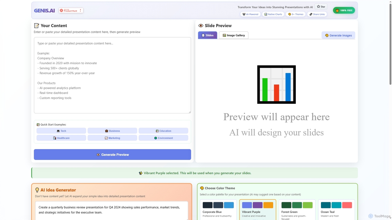
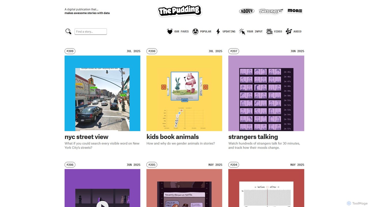
Data Visualization tools are AI-powered platforms designed to transform complex datasets into intuitive, interactive, and insightful visual representations. Leveraging advanced algorithms, these tools automate the creation of charts, graphs, and dashboards, enabling users to quickly identify patterns, trends, and anomalies. They empower businesses, researchers, and analysts to make data-driven decisions by presenting information in an easily digestible format, significantly enhancing understanding and communication.
Core Features
- Automated Chart Generation: Automatically suggests and creates optimal charts and graphs based on data characteristics and user queries.
- Natural Language Querying (NLQ): Allows users to ask questions about their data in plain language and receive visual answers instantly.
- Anomaly Detection: AI algorithms identify unusual patterns or outliers in data that might indicate critical issues or opportunities.
- Predictive Visualization: Generates visualizations that forecast future trends and outcomes based on historical data analysis.
- Interactive Dashboards: Creates dynamic and customizable dashboards that allow users to explore data from multiple perspectives.
Applicable Scenarios
AI Data Visualization tools are invaluable for business intelligence analysts seeking to uncover market trends, marketing teams tracking campaign performance, and scientific researchers needing to present complex experimental results. They are also widely used by financial institutions for risk assessment and by healthcare providers for patient data analysis.
How to Choose
When selecting an AI Data Visualization tool, consider its compatibility with your existing data sources, the variety and customizability of visualization types offered, and its ease of use for non-technical users. Evaluate its integration capabilities with other business intelligence platforms, the robustness of its AI features like NLQ and anomaly detection, and its pricing model relative to your budget and scale of data.