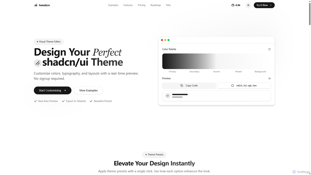
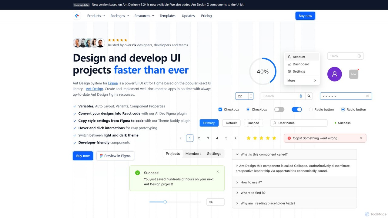
UI Kits are comprehensive collections of pre-designed user interface components that significantly streamline the design and development of digital products. These powerful toolkits typically encompass a wide array of elements such as buttons, forms, navigation menus, icons, and typography, all meticulously crafted to ensure visual consistency and accelerate the entire design workflow. By providing ready-to-use building blocks, UI Kits empower designers to construct intuitive, aesthetically pleasing, and highly functional interfaces with remarkable efficiency, serving as a foundational asset in modern UI/UX design and development pipelines.
Core Features
- Pre-built Component Library: Offers an extensive and organized library of ready-to-use UI elements, drastically reducing the time spent on creating components from scratch.
- Design System Adherence: Facilitates the implementation and maintenance of a consistent design system, ensuring brand guidelines are uniformly applied across all project touchpoints.
- Responsive and Adaptive Elements: Provides components specifically optimized to adapt seamlessly across various screen sizes, resolutions, and device types, supporting a truly responsive user experience.
- Interactive States and Variants: Includes pre-defined interactive states (e.g., hover, active, disabled) and multiple component variants, enabling designers to quickly prototype and visualize user interactions.
- Customization Capabilities: Allows for easy modification of colors, fonts, spacing, and other properties to match specific brand identities or project requirements without compromising consistency.
Applicable Scenarios
UI Kits are indispensable for design teams, individual freelancers, and product developers aiming to maintain brand consistency, accelerate their design process, and ensure a high level of user experience. They are widely utilized in the rapid prototyping of web and mobile applications, the development of new software interfaces, and the creation of consistent digital products across various platforms. From startups building their first MVP to large enterprises managing complex design systems, UI Kits provide a robust framework for efficient and scalable UI development.
How to Choose
When selecting an appropriate UI Kit, several critical factors should guide your decision. Evaluate its compatibility with your preferred design software (e.g., Figma, Sketch, Adobe XD) and the breadth and depth of its component library to ensure it meets your project's specific needs. Consider its adherence to modern design principles, ease of customization, and the quality of its documentation. Furthermore, assess whether the kit supports your target platform (web, iOS, Android) and if it offers features like dark mode compatibility or accessibility considerations. A well-chosen UI Kit can significantly enhance efficiency and design quality.