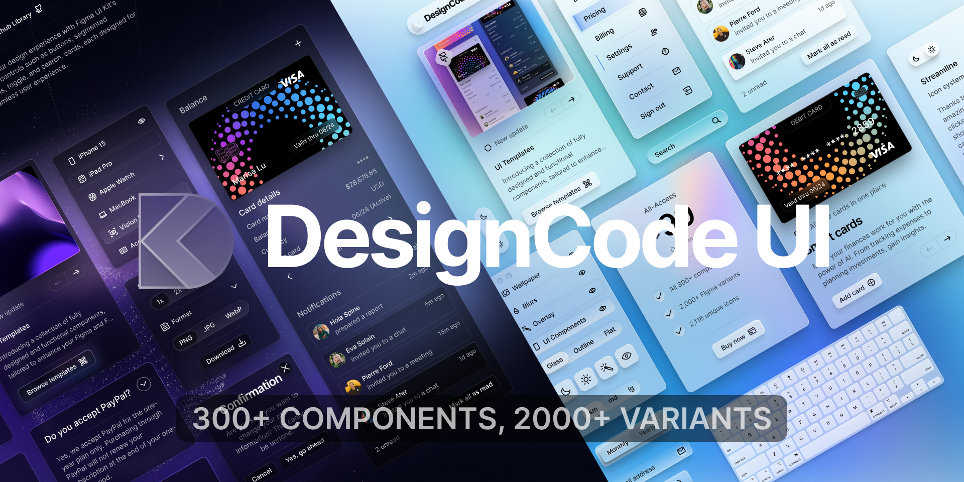
A comprehensive design system for Figma and Framer, offering over 300 components, 2,000+ variants, and unique icons. It features advanced customization with variables, adaptive layouts, and multiple styles like Glass, Outline, and Flat. Ideal for designers and developers to build beautiful, consistent, and functional websites and applications quickly.

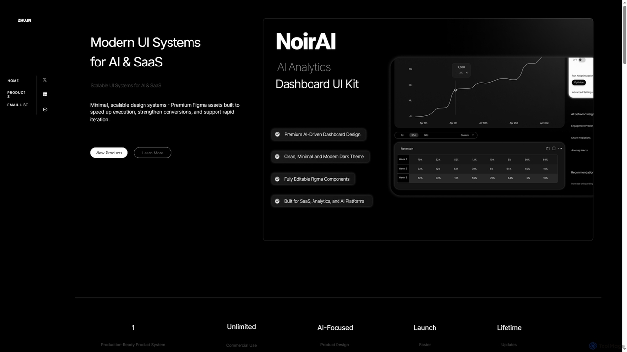
Zhujn offers premium, scalable UI systems and Figma assets specifically designed for AI and SaaS products. It helps founders, designers, and developers accelerate product launches, reduce development overhead, and create high-converting user interfaces for intelligence-powered applications.
Product overview
DesignCode UI Product overview
A comprehensive design system for Figma and Framer, offering over 300 components, 2,000+ variants, and unique icons. It features advanced customization with variables, adaptive layouts, and multiple styles like Glass, Outline, and Flat. Ideal for designers and developers to build beautiful, consistent, and functional websites and applications quickly.
Zhujn Product overview
Zhujn offers premium, scalable UI systems and Figma assets specifically designed for AI and SaaS products. It helps founders, designers, and developers accelerate product launches, reduce development overhead, and create high-converting user interfaces for intelligence-powered applications.
Detailed feature comparison
| Feature | DesignCode UI | Zhujn |
|---|---|---|
| Primary category | Ui Kits | Ui Kits |
| Added | 2025-08-14 | 2026-01-04 |
| Pricing | Freemium | Paid |
| Official website | designcodeui.com | zhujn.com |
| Product type | Website | Website |
| Performance data | ||
| User rating | Not verified | Not verified |
| Comments | 0 | 0 |
| Monthly visits | 5K | 4.3K |
| Monthly growth | 45.4% | Not verified |
| Favorites | 101 | 27 |
| Details | View details | View details |
DesignCode UI vs Zhujn monthly traffic
Compare DesignCode UI and Zhujn by monthly reach, traffic trend, visit depth, top regions, and acquisition sources.
How to interpret the traffic data
In the DesignCode UI vs Zhujn monthly traffic comparison, DesignCode UI currently shows 5K visits and Zhujn shows 4.3K; DesignCode UI has about 1.2 times the visible traffic of Zhujn, an absolute difference of about 690 visits. This reflects visible reach, not feature quality or paid users.
Only DesignCode UI has complete third-party traffic details; Zhujn uses visits recorded inside ToolMage. These scopes cannot estimate market share directly, and on-site views should not be treated as the product’s total website traffic.
DesignCode UI monthly traffic:
Latest traffic
Monthly traffic trend
- 2025/9: 6.7K Monthly visits
- 2026/1: 10.5K Monthly visits
- 2026/2: 6.8K Monthly visits
- 2026/3: 6.7K Monthly visits
- 2026/4: 3.4K Monthly visits
- 2026/5: 5K Monthly visits
Top regions
Top 5 countries/regions
| Country/region | Percentage | Traffic |
|---|---|---|
| 🇺🇸United States | 37.2% | 1.8K |
| 🇮🇳India | 34.87% | 1.7K |
| 🇧🇷Brazil | 16.42% | 816 |
| 🇬🇧United Kingdom | 7.77% | 386 |
| 🇩🇪Germany | 3.74% | 186 |
Search keywords
Zhujn monthly traffic:
Latest traffic
Usage comparison
Compare the core capabilities of DesignCode UI and Zhujn
DesignCode UI Core features
Zhujn Core features
Use cases
DesignCode UI Use cases
Zhujn Use cases
Best suited roles
DesignCode UI Best suited roles
Zhujn Best suited roles
DesignCode UI vs Zhujn:In-depth comparison and selection guidance
First decide whether the products solve the same kind of need
This in-depth DesignCode UI vs Zhujn comparison uses only the product records, taxonomy, audience, traffic, and community signals available on this page. DesignCode UI is primarily listed under “Ui Kits”, while Zhujn is primarily listed under “Ui Kits”, so the first decision is whether your actual task matches their recorded scope.
The structured fields currently show these decision-relevant differences: Pricing (DesignCode UI: Freemium; Zhujn: Paid); Monthly visits (DesignCode UI: 5K; Zhujn: 4.3K); Favorites (DesignCode UI: 101; Zhujn: 27); Website (DesignCode UI: designcodeui.com; Zhujn: zhujn.com); Added (DesignCode UI: 2025-08-14; Zhujn: 2026-01-04). These facts are more useful for selection than brand visibility alone.
What market visibility and monthly traffic mean
In the DesignCode UI vs Zhujn monthly traffic comparison, DesignCode UI currently shows 5K visits and Zhujn shows 4.3K; DesignCode UI has about 1.2 times the visible traffic of Zhujn, an absolute difference of about 690 visits. This reflects visible reach, not feature quality or paid users.
Only DesignCode UI has complete third-party traffic details; Zhujn uses visits recorded inside ToolMage. These scopes cannot estimate market share directly, and on-site views should not be treated as the product’s total website traffic.
The current traffic scope is not sufficient for a reliable product ranking. Treat monthly visits as a market-interest signal, then decide using taxonomy, use cases, pricing, and a like-for-like trial rather than reading exposure as product capability.
Product positioning, use cases, and roles
DesignCode UI and Zhujn currently overlap in shared categories: Ui Kits; shared tags: design system, figma, and ui kit. This can place both on the same shortlist, but it does not prove equal implementation, depth, or cost.
DesignCode UI's unique categories/tags are Component Libraries, Templates, app design, developer tools, framer, icons, templates, and UI components; Zhujn's are Saas Tools, Design Assets, AI product, analytics dashboard, data visualization, design assets, enterprise, and frontend development. These unique fields are the strongest differentiators: validate the product whose recorded scope matches the task instead of following traffic alone.
What ratings, comments, and favorites can tell you
DesignCode UI has no verified rating, 0 comments, 101 favorites, and 124 likes;Zhujn has no verified rating, 0 comments, 27 favorites, and 25 likes。
Neither product has enough rating or comment samples for a credible reputation ranking.
Selection guidance by actual need
When to evaluate DesignCode UI first
Put DesignCode UI on the priority trial list when the task aligns with “Ui Kits” and especially Component Libraries, Templates, app design, developer tools, framer, and icons. This follows recorded positioning and does not imply unlisted capabilities are absent.
DesignCode UI also currently records: pricing is freemium, product type is website, 5K verified monthly visits, no verified user rating. Verify any hard requirement around price, platform, or reach before trial, and do not let sparse review data substitute for testing.
When to evaluate Zhujn first
Put Zhujn on the priority trial list when the task aligns with “Ui Kits” and especially Saas Tools, Design Assets, AI product, analytics dashboard, data visualization, and design assets, or the users include Data Analyst, Design Engineer, Product Manager, and SaaS Entrepreneur. This follows recorded positioning and does not imply unlisted capabilities are absent.
Zhujn also currently records: pricing is paid, product type is website, 4.3K on-site monthly views, no verified user rating. Verify any hard requirement around price, platform, or reach before trial, and do not let sparse review data substitute for testing.
How to validate the recommendation before deciding
The available data describes positioning, public visibility, and community signals, but it cannot prove output quality, speed, integration effort, privacy, or long-term cost in your workflow. Before deciding, run the same representative tasks in DesignCode UI and Zhujn, then record completion time, accuracy, manual corrections, and the real paid threshold. A like-for-like trial turns this comparison into a defensible adoption decision.
Comparison FAQ
How should I choose between DesignCode UI and Zhujn?
Where does this comparison data come from?
What do unknown fields mean?
Related AI tools

uiants.co
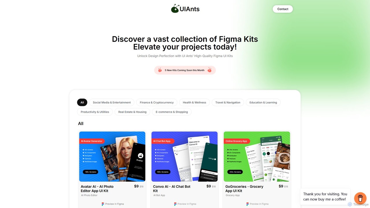
uiants.co is a marketplace offering a vast collection of high-quality, professionally designed Figma UI kits. It helps designers, developers, and startups accelerate their app development process with ready-to-use, fully customizable templates for various industries.
Ui Kits
BuninUX
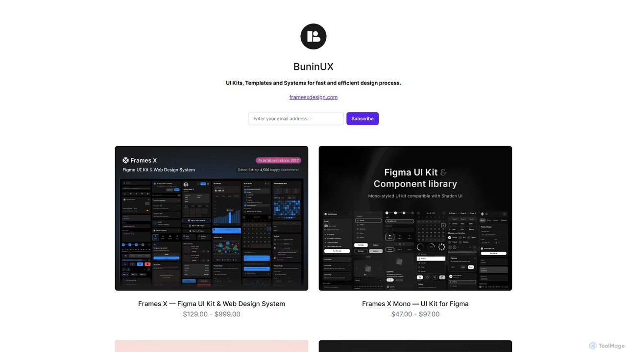
BuninUX offers a premium collection of UI kits, design systems, and templates for Figma and Framer. It's designed for UI/UX designers, developers, and teams to accelerate their design workflow, build beautiful websites and applications, and maintain design consistency with professional, ready-to-use components.
Ui Kits
Thefrontkit
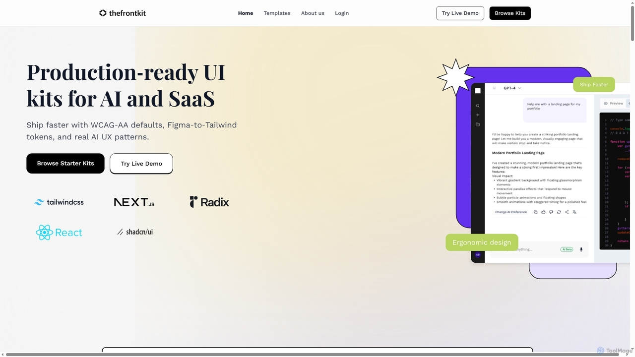
Thefrontkit provides production-ready UI kits for AI and SaaS applications, designed to accelerate development with WCAG-AA defaults, Figma-to-Tailwind token synchronization, and essential AI UX patterns. It offers structured, accessible UI components built with React and TailwindCSS, complete with Figma files and comprehensive documentation, enabling teams to ship faster and focus on product innovation.
Web Development
Vibefyre
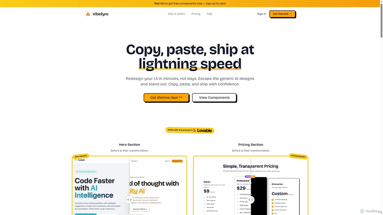
Vibefyre is an AI-powered UI kit designed to accelerate web development by providing high-quality, pre-designed components and prompts. It enables developers to quickly generate unique and consistent user interfaces using their favorite AI coding tools, significantly reducing design and development time for React/TSX applications.
Web DesignLobe Icons
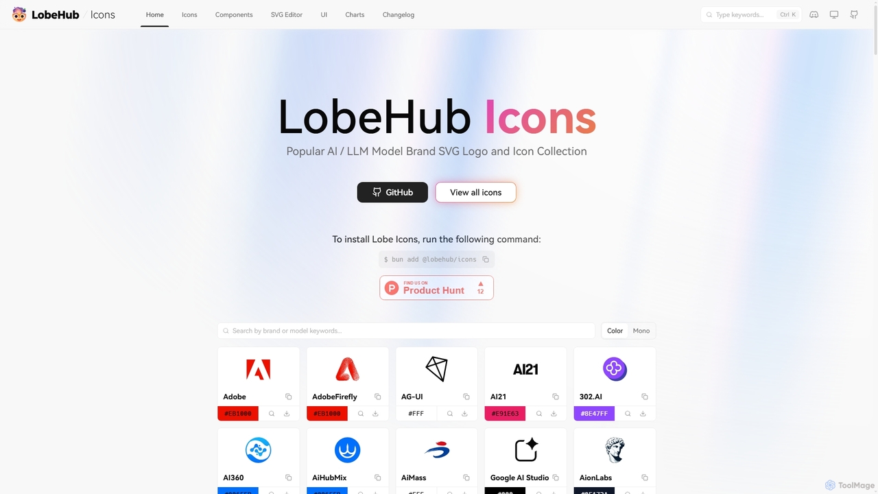
Lobe Icons is a comprehensive and optimized SVG icon collection featuring popular AI and LLM model brands. Designed for developers, it offers lightweight, scalable, and tree-shakable icons for seamless integration into web and React Native projects, ensuring consistent and high-quality branding.
Branding
HeroUI Pro
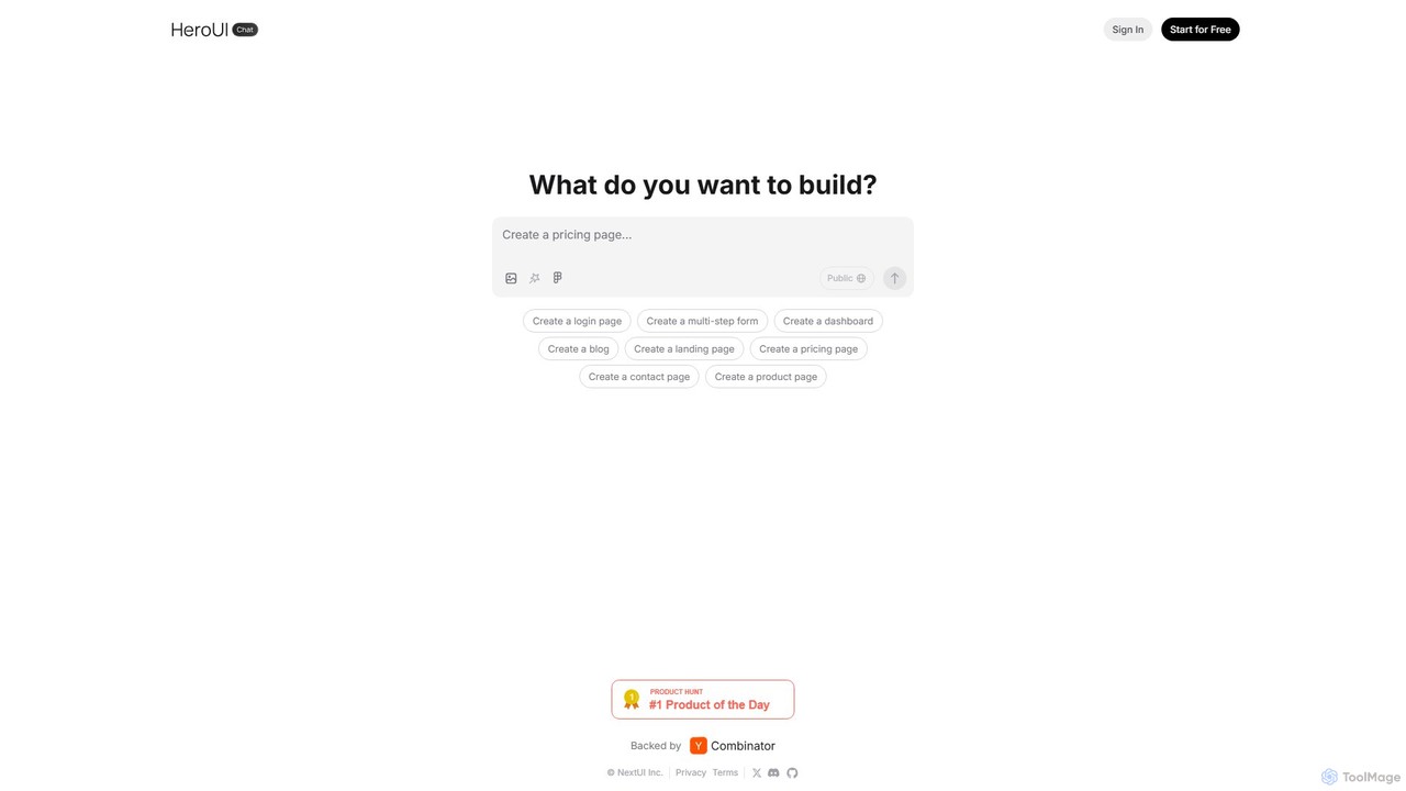
HeroUI Pro is a premium component library for React developers, offering over 220+ professionally designed, responsive, and production-ready components. It accelerates web development by providing pre-built elements for various applications, including AI dashboards, e-commerce sites, and marketing pages, all available for a one-time payment.
Components
Ant for Figma
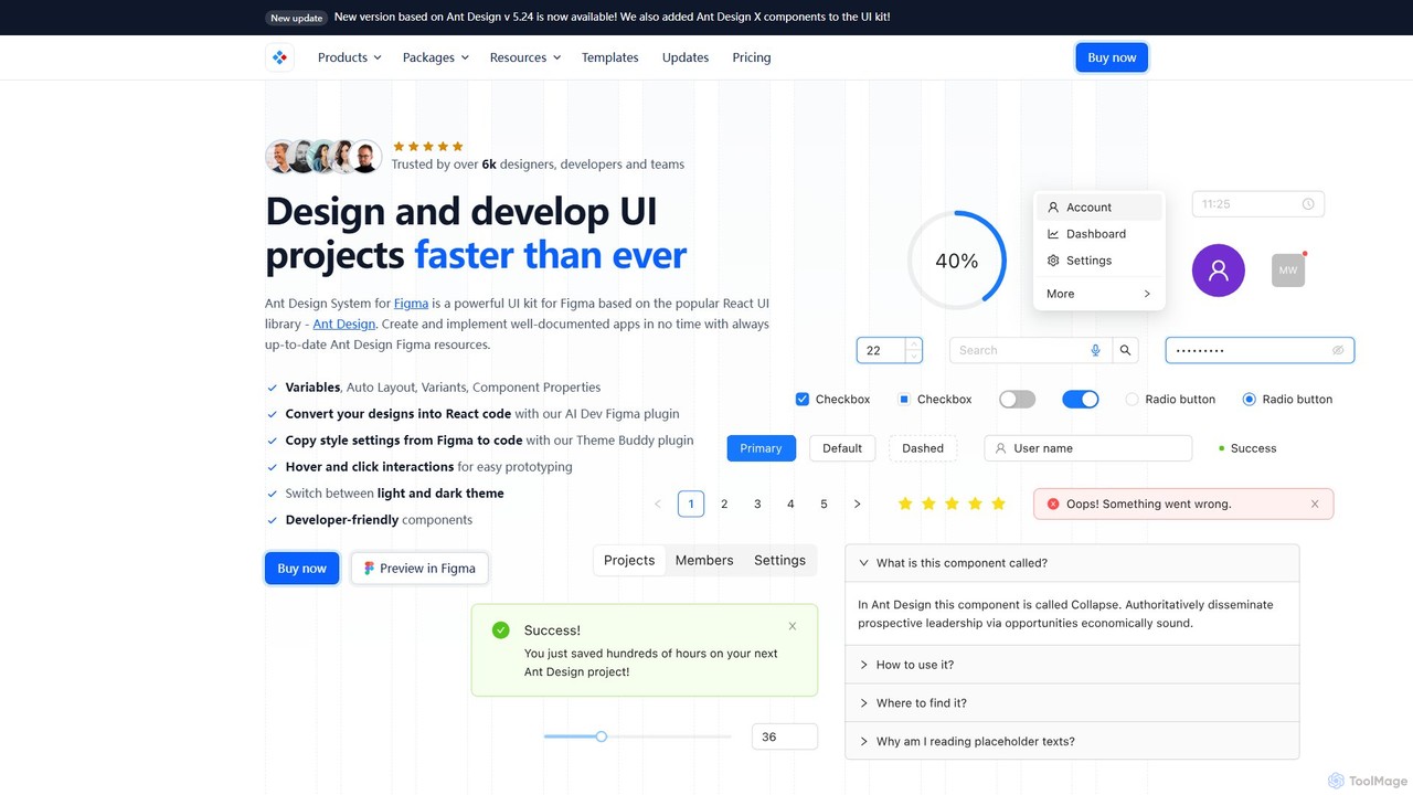
A comprehensive Ant Design system and UI kit for Figma, created to accelerate the design and development workflow. It provides a massive library of customizable components, templates, and plugins, ensuring perfect consistency between Figma designs and Ant Design React code.
Ui Kit
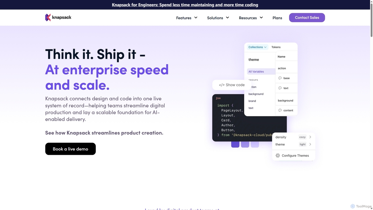
Knapsack
Knapsack is an enterprise-grade digital production platform that connects design, code, and documentation into a unified, AI-ready system of record. It streamlines workflows, accelerates product delivery, and ensures brand consistency at scale by creating a single source of truth for reusable components and design tokens.
Prototyping
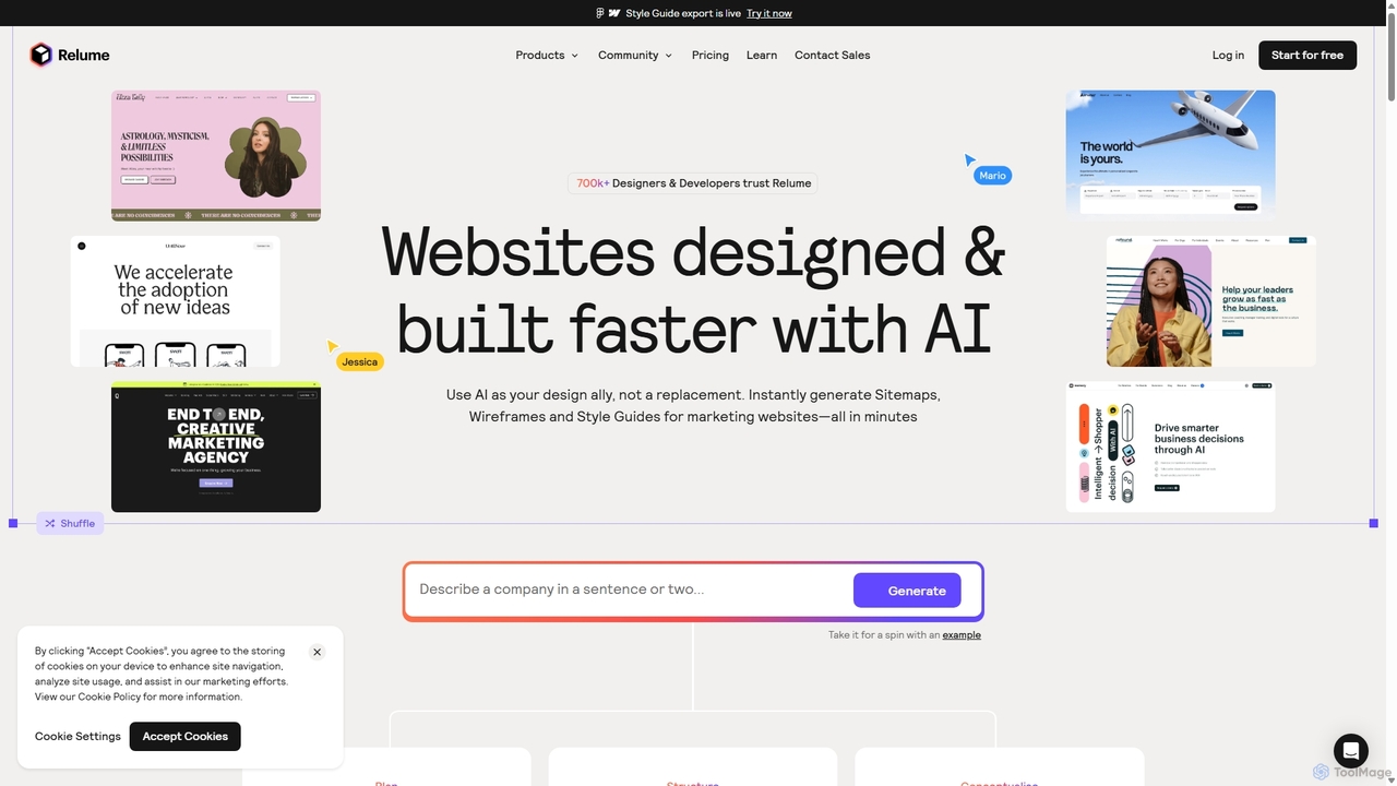
Relume
Relume is an AI-powered platform that accelerates the website design and building process. It enables users to generate sitemaps and wireframes from a simple prompt, create comprehensive style guides, and access a vast library of over 1000+ components. With seamless export to Figma, Webflow, and React, Relume streamlines the entire workflow for designers, developers, and agencies, turning ideas into high-fidelity designs in minutes.
Website Builder
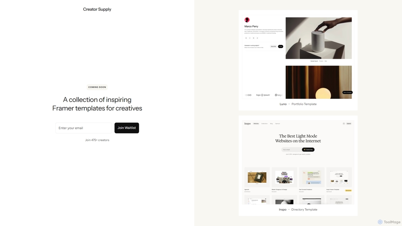
Creator Supply
Creator Supply offers a curated collection of inspiring, professionally designed Framer templates for creatives, designers, and agencies. It empowers users to build stunning, high-performance, and responsive websites with ease, significantly accelerating the design and development workflow without needing to write code.
Templates
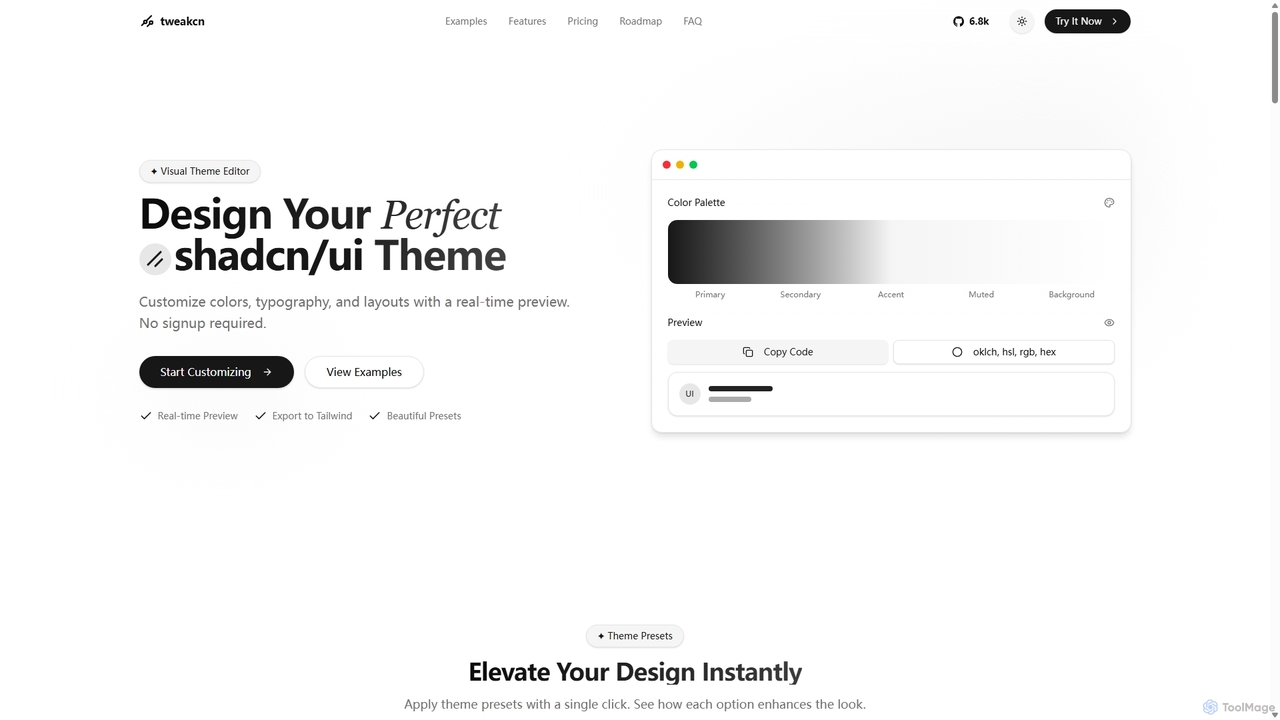
Tweakcn
Tweakcn is a visual theme editor and AI-powered generator for shadcn/ui and Tailwind CSS. It allows developers and designers to create, customize, and preview beautiful, accessible themes in real-time. Features include AI theme generation from text or images, a vast library of presets, and direct code export for seamless integration.
Ui Kit
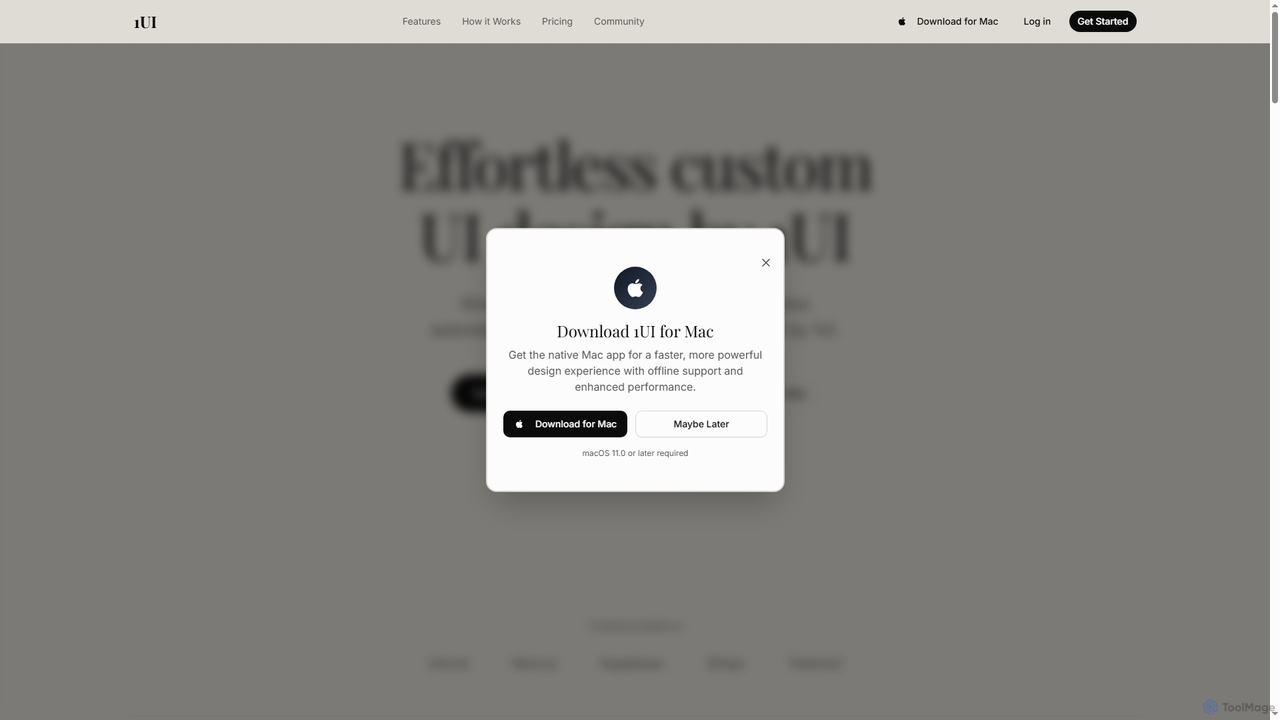
1ui
1ui is an AI-powered platform that generates pixel-perfect, production-ready UI designs from natural language prompts. It streamlines the design process by creating responsive layouts, contextual images, and clean HTML/CSS code in seconds. Features include a prompt enhancer, team collaboration, and direct export to Figma as editable layers.
Code Generation
Relume
Relume is an AI-powered website builder that accelerates the design and development process. It enables users to generate sitemaps and wireframes from simple text prompts, create comprehensive style guides, and utilize a vast library of over 1000 components for Figma, Webflow, and React. It's designed to streamline workflows for designers, developers, and agencies, turning ideas into production-ready websites in a fraction of the time.
Website Builder
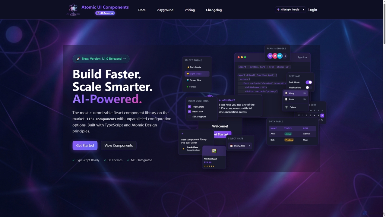
AtomicComponents
AtomicComponents is an AI-powered React component library designed for building modern, scalable, and accessible user interfaces faster. It offers over 115 highly customizable components, 30 built-in themes, and seamless integration with AI assistants like Claude and GitHub Copilot via its Model Context Protocol (MCP) server.
Design Systems
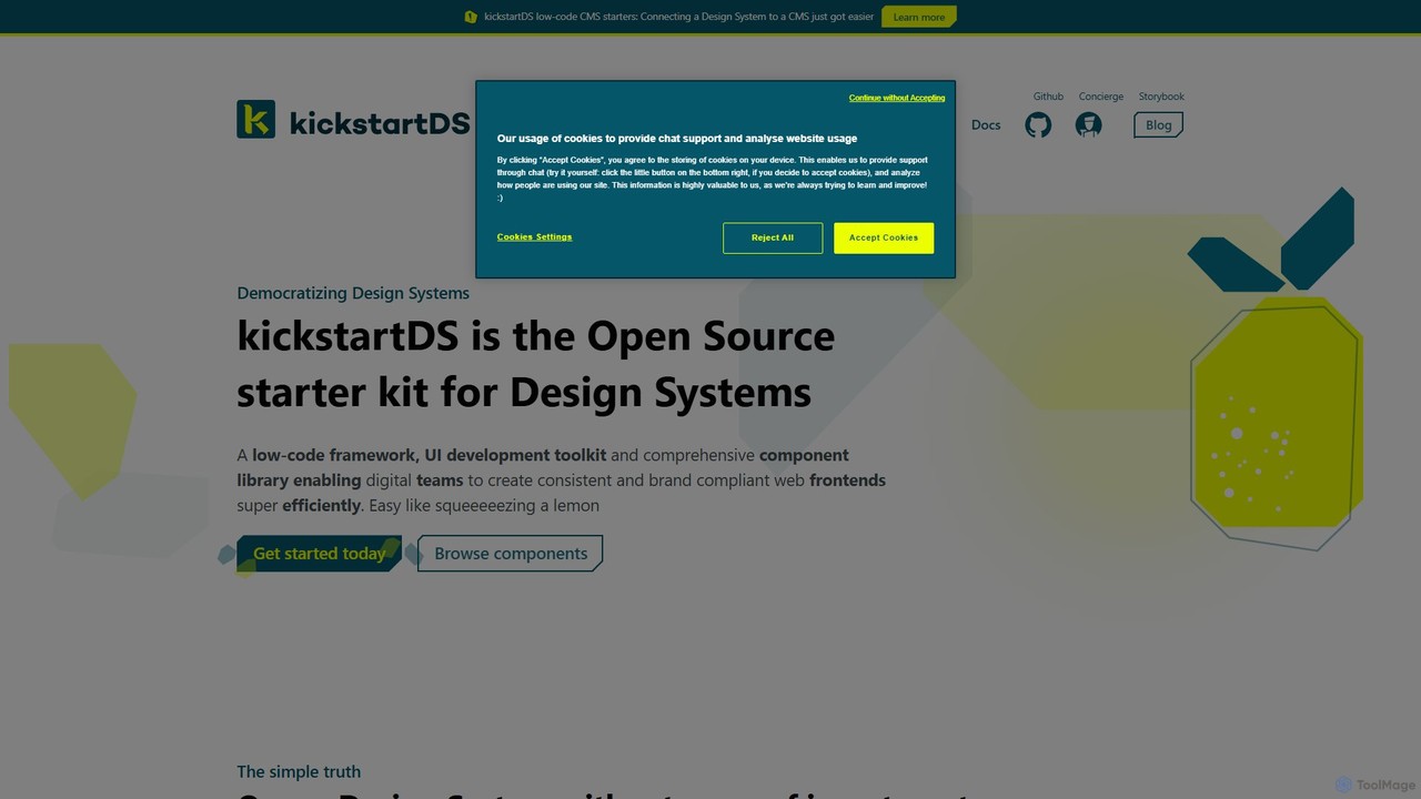
kickstartDS
kickstartDS is an open-source starter kit and next-gen UI toolkit for building and maintaining Design Systems. It offers a low-code framework, a comprehensive component library, and an AI-powered assistant to help digital teams create consistent, high-performance, and brand-compliant web frontends with maximum efficiency.
Design System