
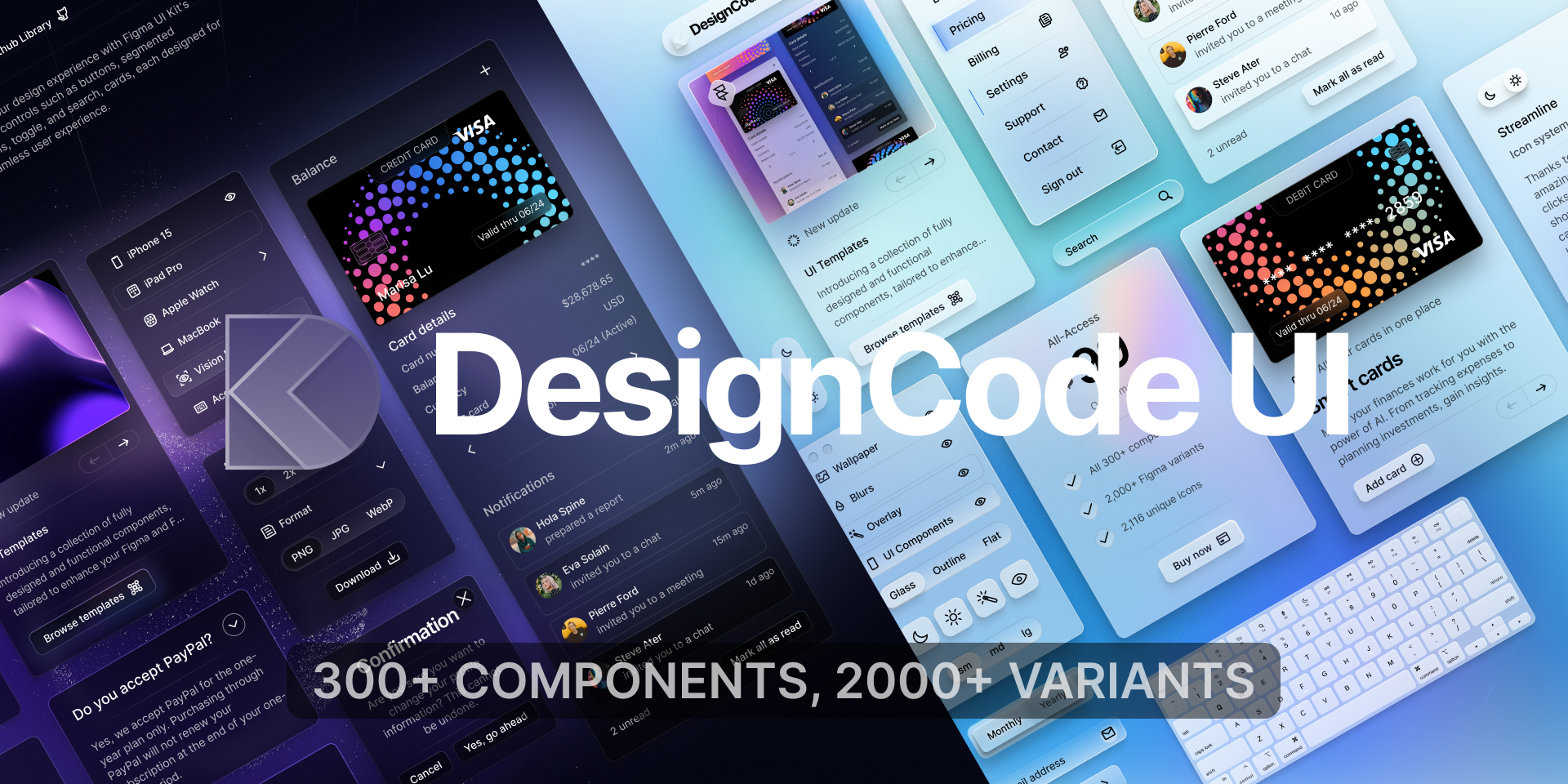

DesignCode UI Overview
DesignCode UI is an expansive and meticulously crafted design system that provides hundreds of UI components and templates for both Figma and Framer. Developed by design and code expert Meng To, this UI kit is built upon decades of UI/UX design expertise. It is designed to help designers and developers create beautiful, functional, and modern websites and applications with unparalleled speed and consistency. The system is highly flexible, leveraging the latest features of Figma and Framer, such as variables, variants, Auto Layout, and breakpoints, to offer a seamless and powerful design experience.
How to use DesignCode UI
Using DesignCode UI is straightforward, whether you are a seasoned designer or a developer. The system is designed for intuitive integration into your workflow. Start by accessing the Figma community file or purchasing a plan to get the full Figma and Framer files. Once in Figma, you can browse the extensive library of over 300 components, including buttons, menus, cards, and icons. To use a component, simply drag and drop it into your design. Customization is a core strength; you can select any component or the main frame and use the Inspector panel to switch between themes (Light/Dark), styles (Glass, Outline, Flat), and adjust properties like size, color, and spacing using predefined variables. For Framer, the components are ready for integration, allowing you to build interactive prototypes and live websites with the same design consistency.
Core Features of DesignCode UI
- Extensive Component Library: Over 300 components, 40+ full-page templates, 2,000+ Figma variants, and 2,116 unique icons.
- Figma & Framer Integration: Components are built for both Figma and Framer, ensuring a smooth transition from design to interactive prototyping and development.
- Advanced Customization: Utilizes Figma's full capabilities, including over 200 variables for colors, spacing, and styles, plus variants and Auto Layout for full control.
- Multiple Styles & Modes: Offers three distinct visual styles (Glass, Outline, Flat) and supports both Light and Dark modes for all components.
- Responsive Design: Built with breakpoints and adaptive layouts (Auto Layout Wrap, Min/Max Width) to ensure designs look perfect on desktop, tablet, and mobile devices.
- Theming System: A unique theming system allows for deep personalization. The aesthetic is defined by background moods, color-absorbing glass effects, and elevating shadows.
- Continuous Updates: The library is updated weekly with new components, features, and improvements, with lifetime updates included in paid plans.
Use Cases for DesignCode UI
DesignCode UI is versatile enough for a wide range of projects. It's an ideal choice for startups and developers who want to build a polished, professional-looking product without a dedicated design team. Product designers can use it to rapidly prototype and build complex interfaces, leveraging the vast library to maintain consistency. It's perfect for creating marketing websites, modern web applications, and even native-feel desktop apps for macOS and Windows. The system's full-page templates for app showcases, courses, and icon sets provide a solid foundation for specific projects, significantly reducing development time.
Advantages of DesignCode UI
The primary advantage of DesignCode UI is its ability to dramatically accelerate the design and development workflow while ensuring high-quality, consistent results. The system is meticulously organized and leverages the most advanced features of Figma and Framer, which sets it apart from many other UI kits. Its unique and vibrant aesthetic helps projects stand out. The inclusion of lifetime updates means the kit grows in value over time. Furthermore, it is created by a renowned designer, Meng To, and is praised by industry leaders for its quality, flexibility, and seamless integration between design and interactive states.
Pricing and Plans
DesignCode UI offers a flexible pricing structure to suit different needs:
- Basic (Free): A preview plan that includes 50 components, 200+ Figma variants, 1,000 icons, and is limited to Figma and the Glass style only. It's ideal for trying out the system.
- All-Access ($49 one-time): Provides access to all 300+ components, 2,000+ variants, 2,116 icons, all styles (Glass, Outline, Flat), and both Figma & Framer components. This plan is for a single user and includes lifetime updates.
- Team ($149 one-time): Includes all the features of the All-Access plan but provides licenses for up to 5 users, making it perfect for small teams.
Traffic
Latest traffic
Status
Monthly traffic trend
- 2025-9: 6.7K
- 2026-1: 10.5K
- 2026-2: 6.8K
- 2026-3: 6.7K
- 2026-4: 3.4K
- 2026-5: 5.0K
Geography
Top 5 countries / regions
- 🇺🇸United States37.2%
- 🇮🇳India34.9%
- 🇧🇷Brazil16.4%
- 🇬🇧United Kingdom7.8%
- 🇩🇪Germany3.7%
Top keywords
| Keyword | Cost per click |
|---|---|
| design code | $4.35 |
| graphic ui code | $0.00 |
| meng to design system | $0.00 |
| ui component guarantee | $0.00 |
| ui design code | $0.00 |
DesignCode UI Alternatives
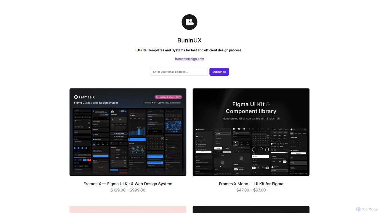
BuninUX
BuninUX offers a premium collection of UI kits, design systems, and templates for Figma and Framer. It's designed for UI/UX designers, developers, and teams to accelerate their design workflow, build beautiful websites and applications, and maintain design consistency with professional, ready-to-use components.
Ui Kits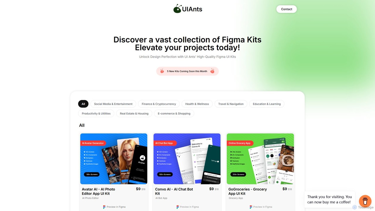
uiants.co
uiants.co is a marketplace offering a vast collection of high-quality, professionally designed Figma UI kits. It helps designers, developers, and startups accelerate their app development process with ready-to-use, fully customizable templates for various industries.
Ui Kits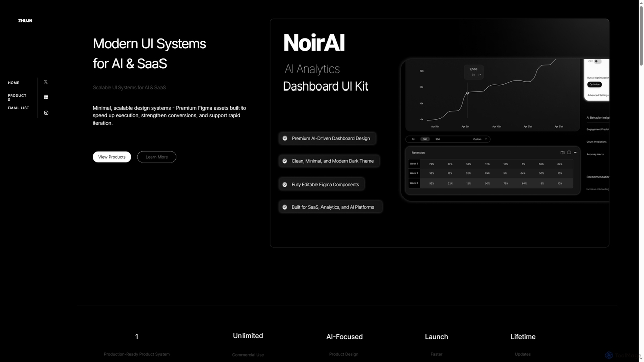
Zhujn
Zhujn offers premium, scalable UI systems and Figma assets specifically designed for AI and SaaS products. It helps founders, designers, and developers accelerate product launches, reduce development overhead, and create high-converting user interfaces for intelligence-powered applications.
Ui Kits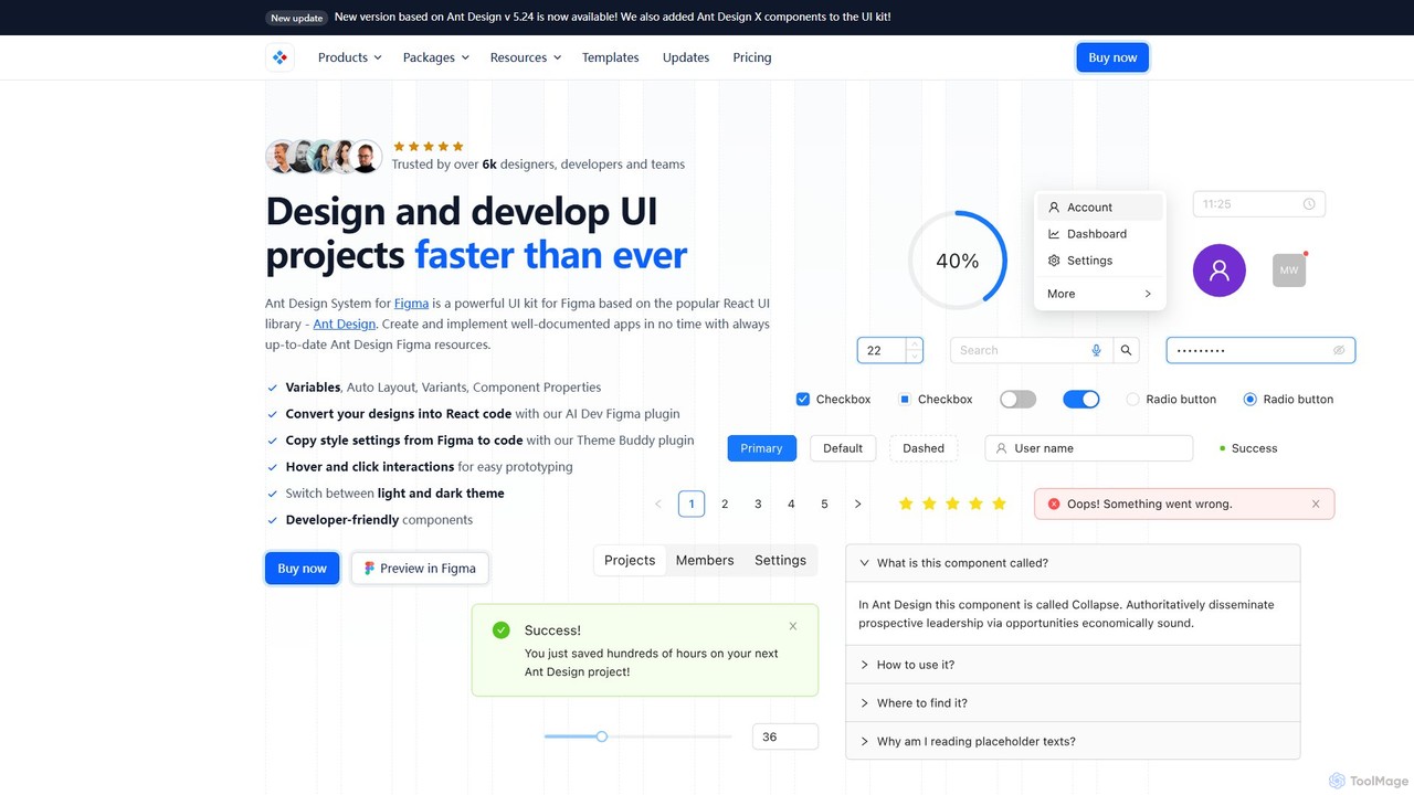
Ant for Figma
A comprehensive Ant Design system and UI kit for Figma, created to accelerate the design and development workflow. It provides a massive library of customizable components, templates, and plugins, ensuring perfect consistency between Figma designs and Ant Design React code.
Ui Kit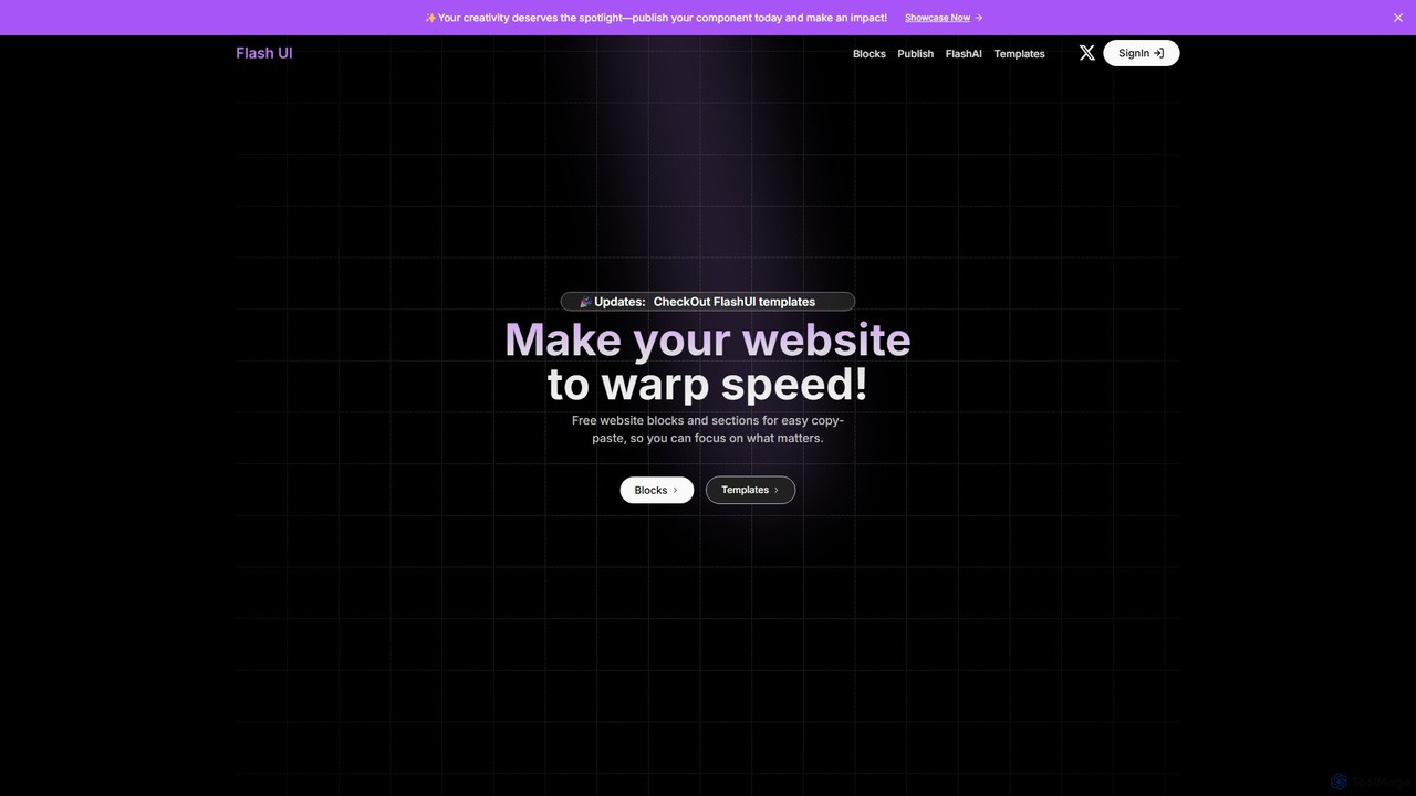
Flash UI
Flash UI is a comprehensive component library built on Tailwind CSS, designed for rapid web development. It offers a vast collection of free, responsive, and customizable UI blocks and sections. Developers can simply copy and paste components to build beautiful websites at warp speed. It also features an innovative AI component generator to turn design visions into reality with ease.
Ui KitsDesignCode UI Categories
DesignCode UI Embed Widget
Copy this embed code to place the badge on your blog, article, or product site and send readers directly to this ToolMage detail page.

Related AI tools
BuninUX
BuninUX offers a premium collection of UI kits, design systems, and templates for Figma and Framer. It's designed for UI/UX designers, developers, and teams to accelerate their design workflow, build beautiful websites and applications, and maintain design consistency with professional, ready-to-use components.
Ui Kitsuiants.co
uiants.co is a marketplace offering a vast collection of high-quality, professionally designed Figma UI kits. It helps designers, developers, and startups accelerate their app development process with ready-to-use, fully customizable templates for various industries.
Ui KitsAnt for Figma
A comprehensive Ant Design system and UI kit for Figma, created to accelerate the design and development workflow. It provides a massive library of customizable components, templates, and plugins, ensuring perfect consistency between Figma designs and Ant Design React code.
Ui Kit
HeroUI Pro
HeroUI Pro is a premium component library for React developers, offering over 220+ professionally designed, responsive, and production-ready components. It accelerates web development by providing pre-built elements for various applications, including AI dashboards, e-commerce sites, and marketing pages, all available for a one-time payment.
Components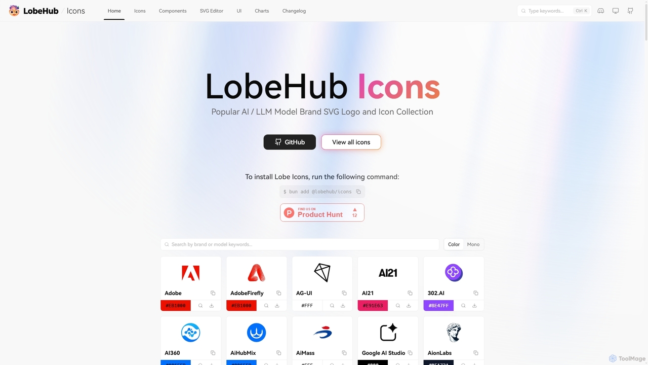
Lobe Icons
Lobe Icons is a comprehensive and optimized SVG icon collection featuring popular AI and LLM model brands. Designed for developers, it offers lightweight, scalable, and tree-shakable icons for seamless integration into web and React Native projects, ensuring consistent and high-quality branding.
Branding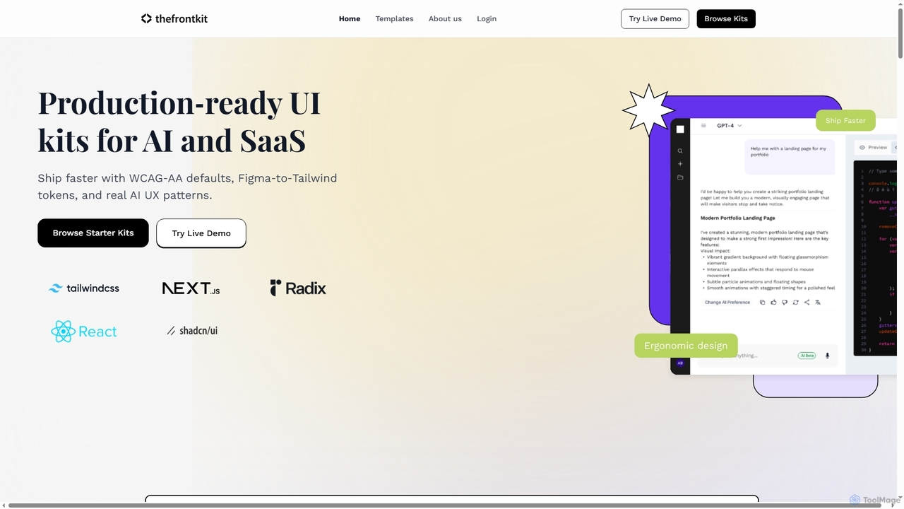
Thefrontkit
Thefrontkit provides production-ready UI kits for AI and SaaS applications, designed to accelerate development with WCAG-AA defaults, Figma-to-Tailwind token synchronization, and essential AI UX patterns. It offers structured, accessible UI components built with React and TailwindCSS, complete with Figma files and comprehensive documentation, enabling teams to ship faster and focus on product innovation.
Web Development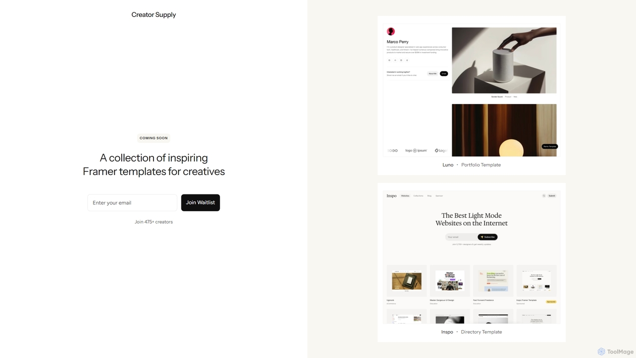
Creator Supply
Creator Supply offers a curated collection of inspiring, professionally designed Framer templates for creatives, designers, and agencies. It empowers users to build stunning, high-performance, and responsive websites with ease, significantly accelerating the design and development workflow without needing to write code.
Templates
GeniusUI
GeniusUI is an AI-powered design tool that transforms text prompts into stunning, high-fidelity UI/UX designs and components. It automates the design and front-end coding process, allowing creators to build beautiful interfaces in minutes, not days, without writing a single line of code.
Ui Ux Design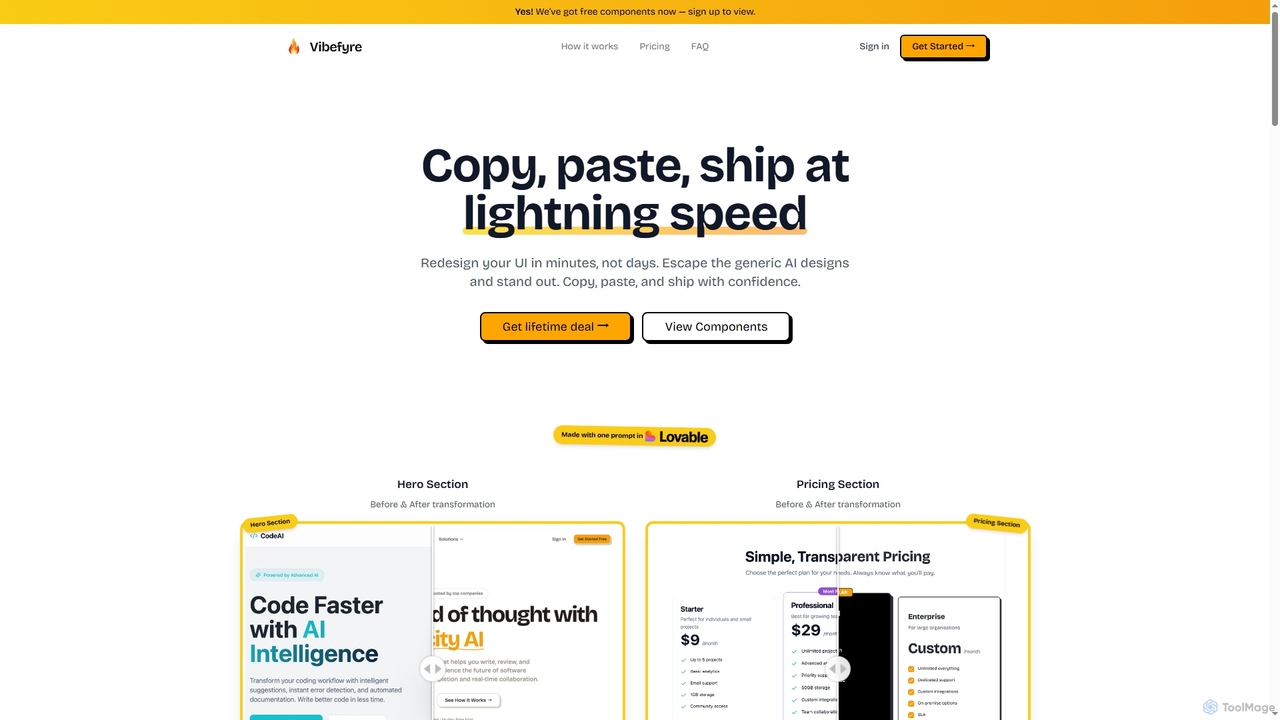
Vibefyre
Vibefyre is an AI-powered UI kit designed to accelerate web development by providing high-quality, pre-designed components and prompts. It enables developers to quickly generate unique and consistent user interfaces using their favorite AI coding tools, significantly reducing design and development time for React/TSX applications.
Web DesignZhujn
Zhujn offers premium, scalable UI systems and Figma assets specifically designed for AI and SaaS products. It helps founders, designers, and developers accelerate product launches, reduce development overhead, and create high-converting user interfaces for intelligence-powered applications.
Ui Kits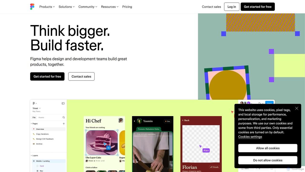
Figma
Figma is a leading collaborative interface design platform that allows teams to design, prototype, and gather feedback in one place. Powered by AI, it accelerates workflows from brainstorming in FigJam to creating high-fidelity designs and handing off to developers with Dev Mode, unifying the entire product development process.
Ui Ux Design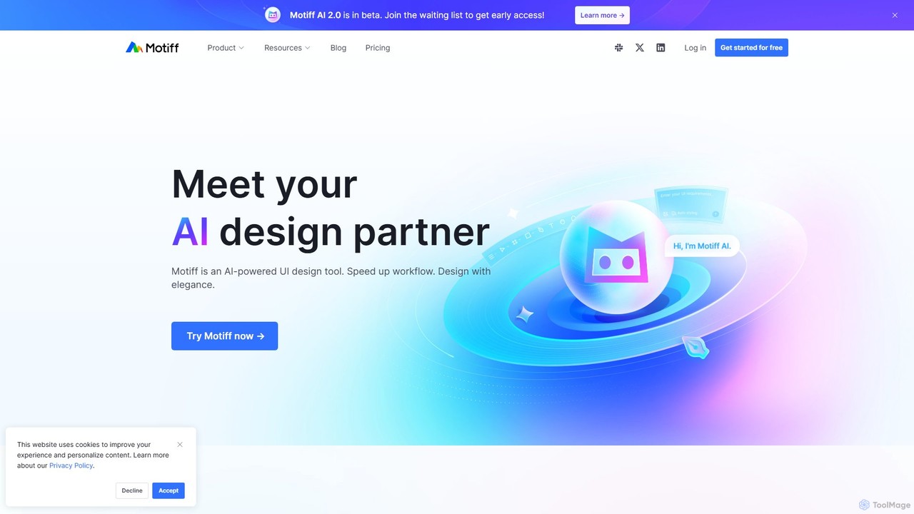
Motiff
Motiff is an AI-powered professional interface design tool that accelerates the entire workflow. It enables users to generate UIs from text and images, iterate on designs with AI assistance, and collaborate in real-time. Combining robust design tools, prototyping, and a developer-friendly handoff mode, Motiff serves as a comprehensive, high-performance platform for modern product teams.
Ui Ux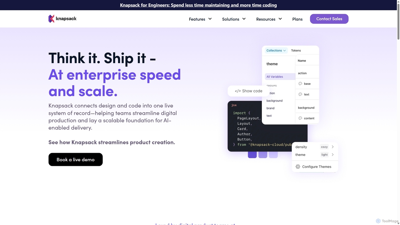
Knapsack
Knapsack is an enterprise-grade digital production platform that connects design, code, and documentation into a unified, AI-ready system of record. It streamlines workflows, accelerates product delivery, and ensures brand consistency at scale by creating a single source of truth for reusable components and design tokens.
Prototyping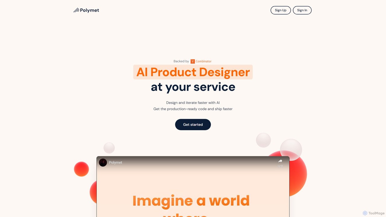
Polymet
Polymet is an AI-powered product designer that transforms ideas, text descriptions, or images into interactive prototypes with production-ready code in seconds. It streamlines the design and development workflow, integrating seamlessly with Figma and existing codebases.
Ui Ux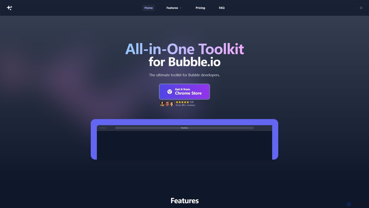
framify
Framify is an all-in-one AI-powered toolkit and component library for Bubble.io and Webflow developers. It accelerates web development with a vast library of UI components, a Figma to Bubble converter, an AI site builder, and various productivity tools. It's designed to streamline workflows, enhance design, and reduce development time significantly.
Website Builder
DesignCode UI Comments (0)
Sign in to comment.
Sign inNo comments yet.