
HeroUI Pro Overview
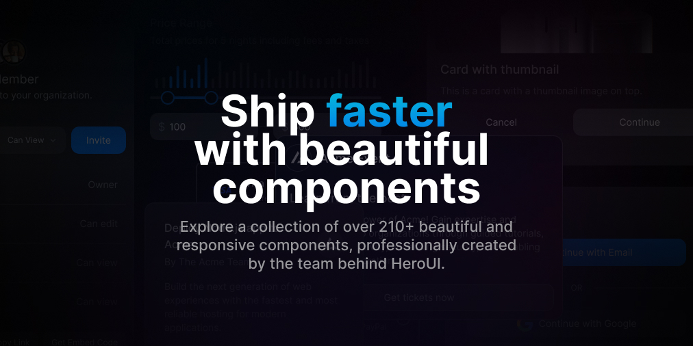
HeroUI Pro is an advanced and extensive component library designed to help React developers and teams ship products faster. Built on top of the popular free HeroUI library, HeroUI Pro provides a premium collection of over 220+ beautiful, responsive, and production-ready components. This collection is continuously growing, with a guarantee of at least 40 new components in future updates. The library is specifically tailored to accelerate the development of complex user interfaces, offering specialized components for AI applications, E-commerce platforms, and Marketing websites.
The core philosophy of HeroUI Pro is to bridge the gap between design and development, providing not just code but also the corresponding Figma files for every component. This ensures a seamless workflow for designers and developers. The components are built using modern web technologies and dependencies like Iconify for icons, `usehooks-ts` for custom React hooks, and Recharts for data visualization, making them both powerful and easy to integrate.
How to use HeroUI Pro
Integrating HeroUI Pro into your React project is a straightforward process. It assumes you have a basic understanding of React and have HeroUI version 2 or higher installed.
- Install Dependencies: Before using the components, you need to install a few necessary packages. You can do this using npm, yarn, or pnpm.
- For icons:
npm install --save-dev @iconify/react - For custom hooks used in some components:
npm install usehooks-ts - For chart components:
npm install recharts
- For icons:
- Copy & Paste Components: Once the dependencies are installed, you are ready to go. Simply browse the component library on the HeroUI Pro website, find the component you need, and copy its code.
- Integrate into Your Application: Paste the copied code directly into your React application. The components are designed to be self-contained and easy to customize, allowing for quick integration and modification to fit your project's specific needs.
Core Features of HeroUI Pro
- Extensive Component Library: Access over 220+ professionally crafted and responsive components, with 40+ more guaranteed in future updates.
- Specialized Components: Includes complex components specifically designed for AI dashboards, E-commerce storefronts, marketing pages, and more.
- Figma Files Included: Every purchase includes all corresponding Figma files, facilitating seamless collaboration between designers and developers.
- Lifetime Access & Updates: A one-time payment grants you lifetime access to all current and future components, with no recurring subscription fees.
- Production-Ready Code: Components are built to high standards, ready for deployment in commercial projects, saving you valuable development time.
- Built on Modern Tech: Leverages popular libraries like Recharts for charts and Iconify for a vast selection of icons.
Use Cases for HeroUI Pro
HeroUI Pro is versatile and can be used for a wide range of projects, including:
- Building sophisticated dashboards for SaaS and AI applications.
- Creating feature-rich e-commerce websites and online stores.
- Designing high-converting marketing websites and landing pages.
- Developing custom web applications for clients.
- Rapidly prototyping and building user interfaces for startups and personal projects.
- Standardizing the UI/UX across a large organization's web properties.
Advantages of HeroUI Pro
The primary advantage of HeroUI Pro is its ability to dramatically accelerate the development lifecycle. By providing a vast library of pre-built, high-quality components, developers can focus on core application logic instead of building UI elements from scratch. The one-time payment model offers exceptional value compared to subscription-based services. Furthermore, the inclusion of Figma files, flexible licensing for commercial use, and dedicated customer support make it a comprehensive and reliable solution for individuals and teams of all sizes.
Pricing and Plans
HeroUI Pro offers lifetime access with a single, one-time payment. There are three main plans:
- Solo Plan: $249 one-time payment. Includes a single user license, access to all components, lifetime access, unlimited projects, customer support, free updates, and all Figma files.
- Startup Plan: $399 one-time payment. Includes 5 user licenses and all features of the Solo plan, plus priority tech support.
- Organization Plan: $799 one-time payment. Includes 25 user licenses and all features of the Startup plan. Custom plans for more than 25 licenses are available upon request.
All plans come with a 7-day money-back guarantee.
Traffic
Latest traffic
Status
Monthly traffic trend
- 2025-9: 22.7K
- 2026-1: 63.5K
- 2026-2: 62.2K
- 2026-3: 67.1K
- 2026-4: 70.9K
- 2026-5: 99.7K
Geography
Top 5 countries / regions
- 🇺🇸United States53.2%
- 🇩🇪Germany15.7%
- 🇨🇦Canada11.7%
- 🇧🇷Brazil9.8%
- 🇫🇷France9.5%
Traffic sources
| Source type | Percentage |
|---|---|
Direct | 92.0% |
Referral | 7.6% |
Email | 0.3% |
Top keywords
| Keyword | Cost per click |
|---|---|
| hero ui | $3.80 |
| heroui | $3.27 |
| hero ui pro | $0.00 |
| heroui pro | $0.00 |
| heroui pro componetns | $0.00 |
HeroUI Pro Alternatives
LangUI
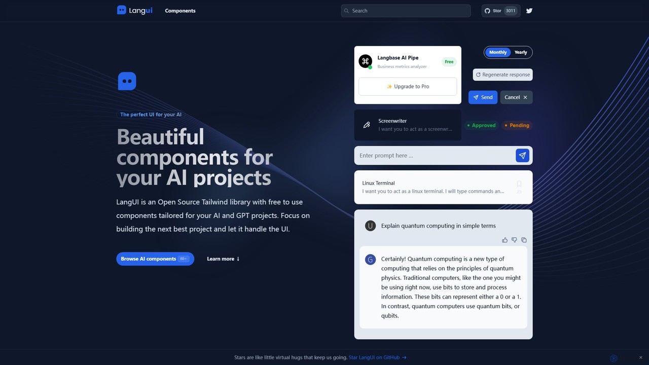
LangUI is an open-source Tailwind CSS component library offering over 60 free, ready-to-use components specifically designed for AI and GPT projects. It helps developers quickly build beautiful, responsive user interfaces for their AI applications, allowing them to focus on core functionality.
Libraries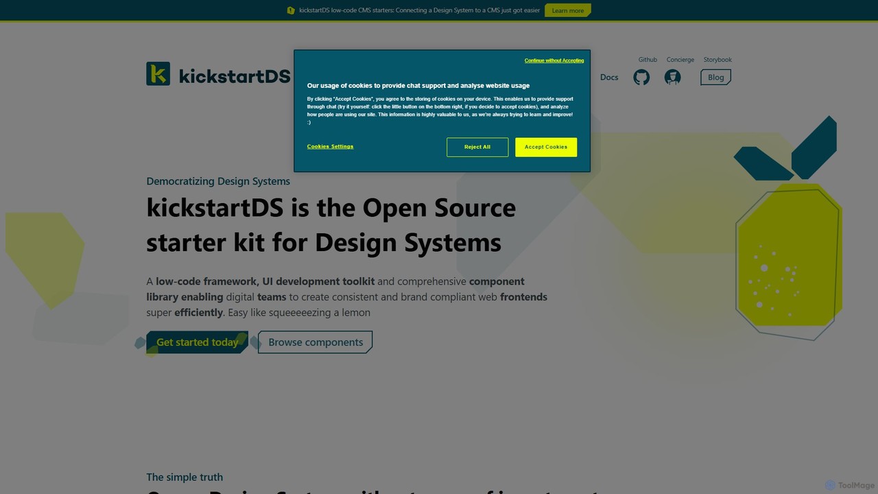
kickstartDS
kickstartDS is an open-source starter kit and next-gen UI toolkit for building and maintaining Design Systems. It offers a low-code framework, a comprehensive component library, and an AI-powered assistant to help digital teams create consistent, high-performance, and brand-compliant web frontends with maximum efficiency.
Design System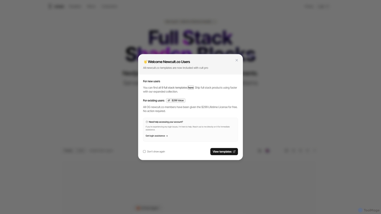
Newcult
Newcult is a developer toolkit featuring full-stack UI components, blocks, and templates for Next.js and Shadcn UI. It's designed to accelerate the development of modern, AI-powered SaaS applications by providing production-ready, customizable code for everything from marketing pages to complex AI workflows.
Templates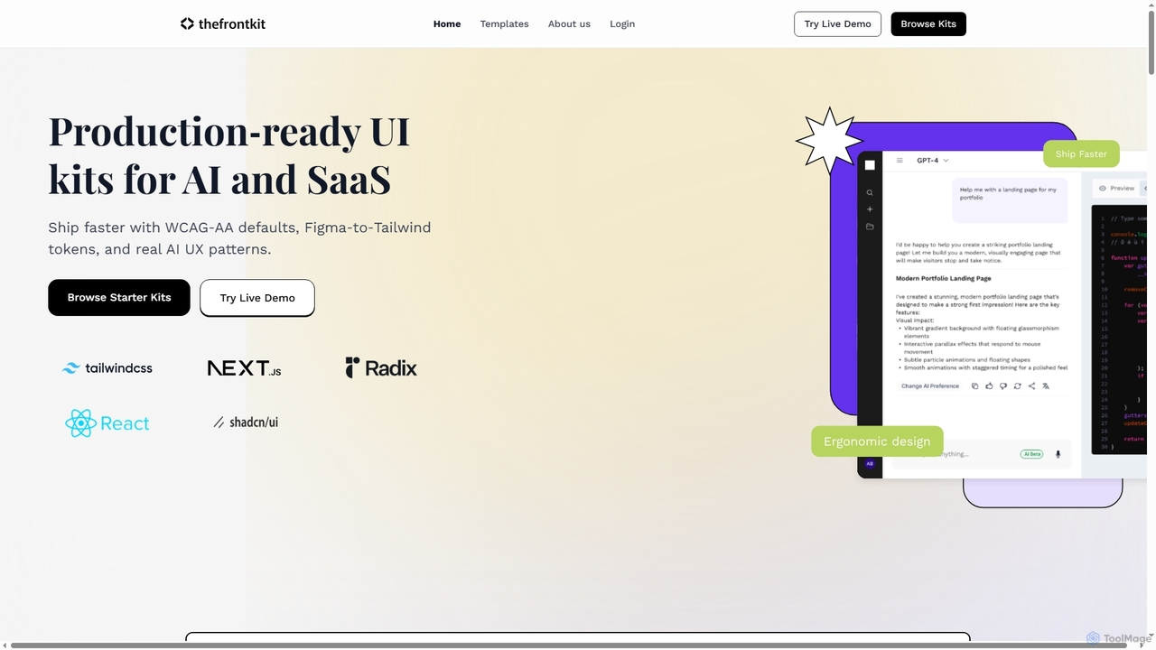
Thefrontkit
Thefrontkit provides production-ready UI kits for AI and SaaS applications, designed to accelerate development with WCAG-AA defaults, Figma-to-Tailwind token synchronization, and essential AI UX patterns. It offers structured, accessible UI components built with React and TailwindCSS, complete with Figma files and comprehensive documentation, enabling teams to ship faster and focus on product innovation.
Web Development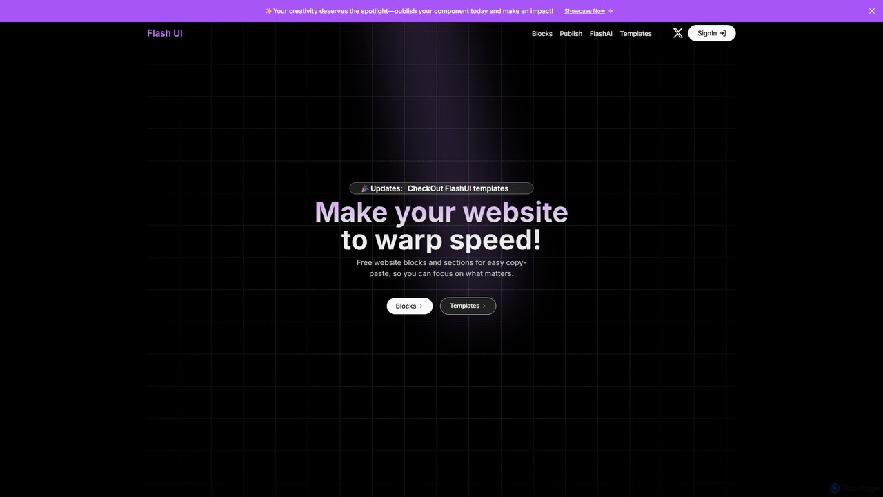
Flash UI
Flash UI is a comprehensive component library built on Tailwind CSS, designed for rapid web development. It offers a vast collection of free, responsive, and customizable UI blocks and sections. Developers can simply copy and paste components to build beautiful websites at warp speed. It also features an innovative AI component generator to turn design visions into reality with ease.
Ui KitsHeroUI Pro Categories
HeroUI Pro Embed Widget
Copy this embed code to place the badge on your blog, article, or product site and send readers directly to this ToolMage detail page.

Related AI tools
kickstartDS
kickstartDS is an open-source starter kit and next-gen UI toolkit for building and maintaining Design Systems. It offers a low-code framework, a comprehensive component library, and an AI-powered assistant to help digital teams create consistent, high-performance, and brand-compliant web frontends with maximum efficiency.
Design System
Jyek
Jyek is an AI agent platform that understands objectives, creates execution plans, uses tools, and delivers verifiable results for complex, multi-step tasks.
AutomationThefrontkit
Thefrontkit provides production-ready UI kits for AI and SaaS applications, designed to accelerate development with WCAG-AA defaults, Figma-to-Tailwind token synchronization, and essential AI UX patterns. It offers structured, accessible UI components built with React and TailwindCSS, complete with Figma files and comprehensive documentation, enabling teams to ship faster and focus on product innovation.
Web DevelopmentFlash UI
Flash UI is a comprehensive component library built on Tailwind CSS, designed for rapid web development. It offers a vast collection of free, responsive, and customizable UI blocks and sections. Developers can simply copy and paste components to build beautiful websites at warp speed. It also features an innovative AI component generator to turn design visions into reality with ease.
Ui Kits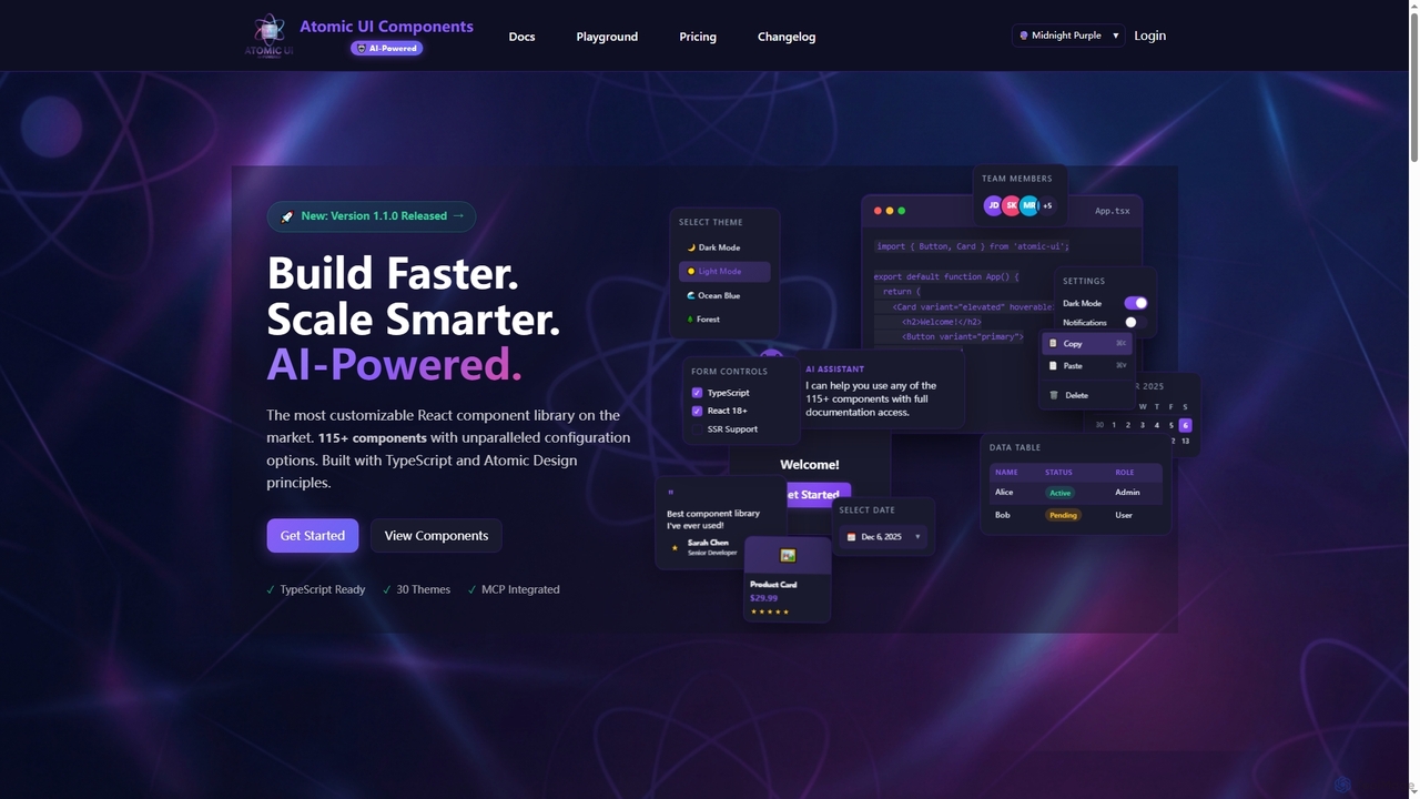
AtomicComponents
AtomicComponents is an AI-powered React component library designed for building modern, scalable, and accessible user interfaces faster. It offers over 115 highly customizable components, 30 built-in themes, and seamless integration with AI assistants like Claude and GitHub Copilot via its Model Context Protocol (MCP) server.
Design SystemsLangUI
LangUI is an open-source Tailwind CSS component library offering over 60 free, ready-to-use components specifically designed for AI and GPT projects. It helps developers quickly build beautiful, responsive user interfaces for their AI applications, allowing them to focus on core functionality.
Libraries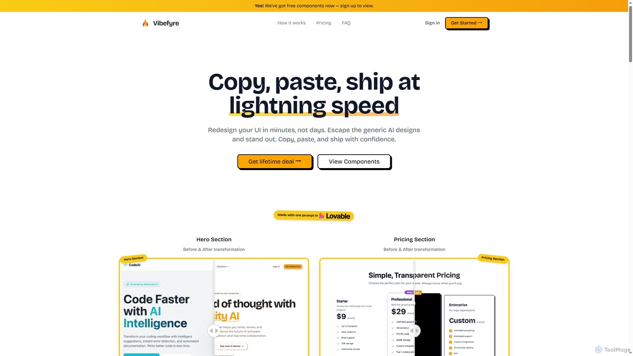
Vibefyre
Vibefyre is an AI-powered UI kit designed to accelerate web development by providing high-quality, pre-designed components and prompts. It enables developers to quickly generate unique and consistent user interfaces using their favorite AI coding tools, significantly reducing design and development time for React/TSX applications.
Web Design
Relume
Relume is an AI-powered platform that accelerates the website design and building process. It enables users to generate sitemaps and wireframes from a simple prompt, create comprehensive style guides, and access a vast library of over 1000+ components. With seamless export to Figma, Webflow, and React, Relume streamlines the entire workflow for designers, developers, and agencies, turning ideas into high-fidelity designs in minutes.
Website Builder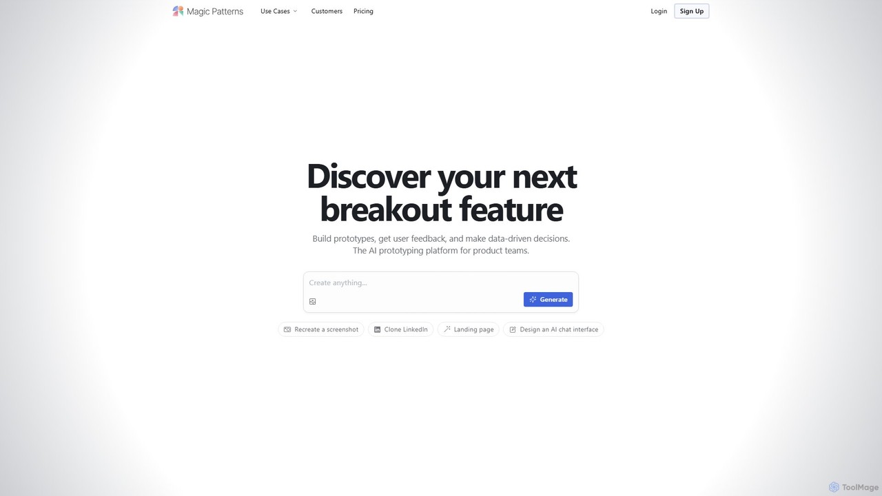
Magic Patterns
Magic Patterns is an AI-powered prototyping platform for product teams, designers, and developers. It accelerates UI creation by generating interactive prototypes and production-ready code (React, Tailwind CSS) from text prompts, screenshots, or existing websites. It helps teams iterate faster, gather user feedback, and make data-driven decisions.
Prototyping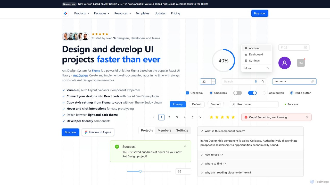
Ant for Figma
A comprehensive Ant Design system and UI kit for Figma, created to accelerate the design and development workflow. It provides a massive library of customizable components, templates, and plugins, ensuring perfect consistency between Figma designs and Ant Design React code.
Ui Kit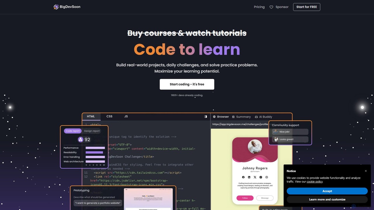
BigDevSoon
BigDevSoon is a hands-on learning platform for frontend developers. It helps users transition from tutorials to real-world applications by providing a library of projects, complete with Figma designs and structured tasks. It's designed to enhance coding skills, build a professional portfolio, and overcome the challenge of finding practical project ideas.
Frontend Development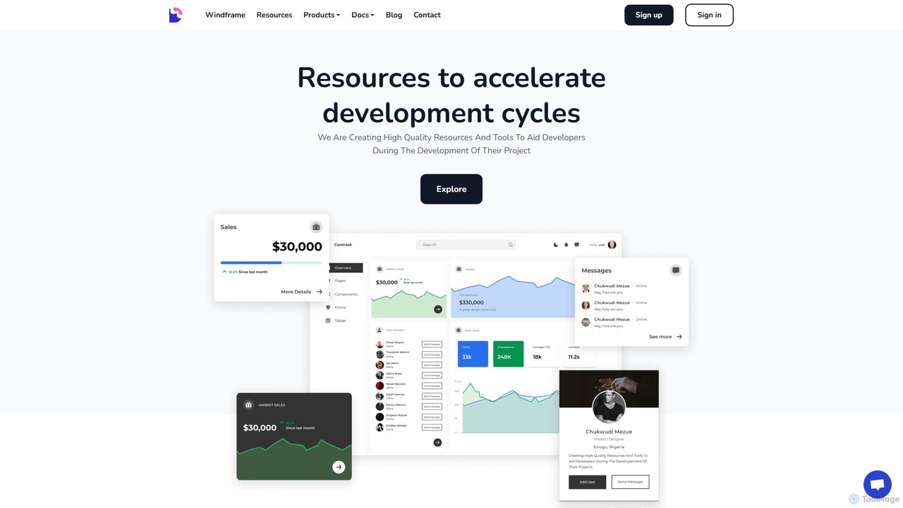
Devwares
Devwares is a comprehensive platform offering tools and resources for developers and designers. Its flagship product, Windframe, is an AI-powered visual builder for Tailwind CSS that accelerates UI and website creation by 10x. Generate designs with AI prompts, use a drag-and-drop editor, and access a vast library of templates to build and export production-ready code for React, Vue, and more.
Ui Ux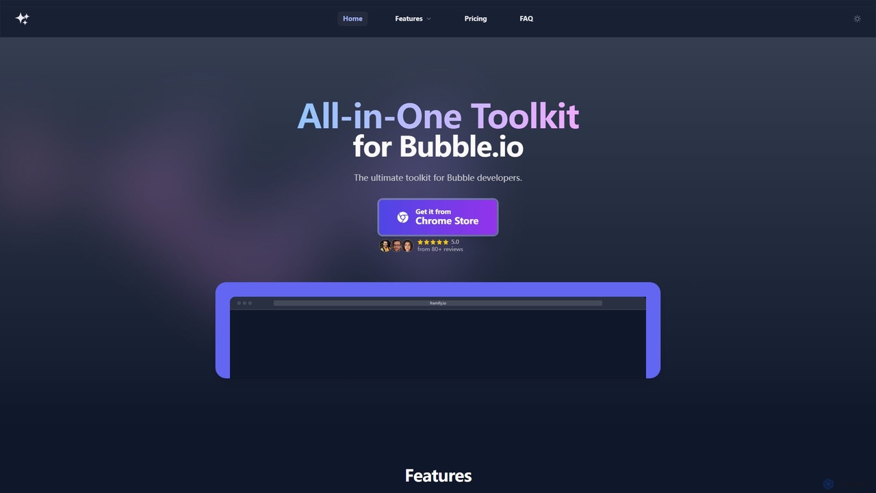
framify
Framify is an all-in-one AI-powered toolkit and component library for Bubble.io and Webflow developers. It accelerates web development with a vast library of UI components, a Figma to Bubble converter, an AI site builder, and various productivity tools. It's designed to streamline workflows, enhance design, and reduce development time significantly.
Website Builder
DesignCode UI
A comprehensive design system for Figma and Framer, offering over 300 components, 2,000+ variants, and unique icons. It features advanced customization with variables, adaptive layouts, and multiple styles like Glass, Outline, and Flat. Ideal for designers and developers to build beautiful, consistent, and functional websites and applications quickly.
Ui Kits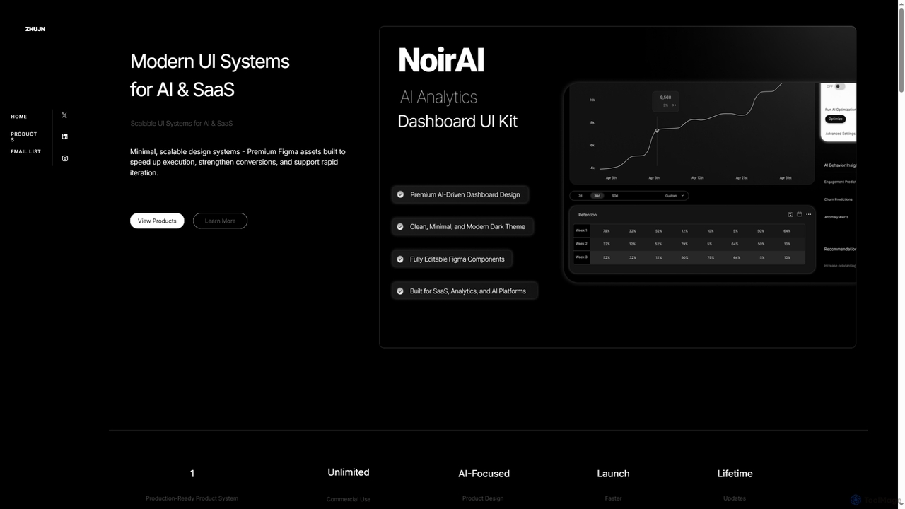
Zhujn
Zhujn offers premium, scalable UI systems and Figma assets specifically designed for AI and SaaS products. It helps founders, designers, and developers accelerate product launches, reduce development overhead, and create high-converting user interfaces for intelligence-powered applications.
Ui Kits
HeroUI Pro Comments (0)
Sign in to comment.
Sign inNo comments yet.