ToolMage
Sign in

Best 2 Data Visualization AI tools for Analytics

Popular Data Visualization AI tools in Analytics include Cambio and ecotrace, helping you work more efficiently.

Cambio
Freemium

Cambio

Cambio is an AI-powered operations platform for the commercial real estate industry. It simplifies sustainability compliance, automates data analysis, and provides data-driven retrofit recommendations to help property owners, investors, and asset managers achieve net-zero carbon goals and enhance portfolio ROI.

Data Visualization
Visits 14.6KFavorites 146Likes 139
ecotrace
Freemium

ecotrace

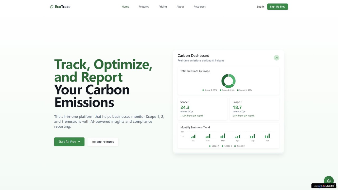
ecotrace is an all-in-one, AI-powered platform designed for businesses to track, manage, and report their Scope 1, 2, and 3 carbon emissions. It simplifies compliance with major regulatory frameworks like GHG Protocol and CSRD, provides actionable insights for reduction, and features a carbon credit marketplace for offsetting.

Data Visualization
Visits 6.6KFavorites 150Likes 137

About Data Visualization

Data Visualization tools are AI-powered solutions that transform complex datasets into intuitive, interactive visual representations. These tools leverage advanced algorithms to automatically identify patterns, trends, and outliers, enabling users to quickly grasp critical insights from their data. As a crucial component within the broader field of Analytics, AI data visualization empowers businesses and individuals to make data-driven decisions more efficiently and effectively, turning raw information into actionable intelligence.

Core Features

  • Automated Chart Generation: Intelligently suggests and creates appropriate charts (e.g., bar, line, pie, scatter) based on data types and relationships.
  • Interactive Dashboards: Allows users to explore data dynamically through filters, drill-downs, and custom views for deeper analysis.
  • Anomaly Detection: Utilizes AI to highlight unusual data points or unexpected trends that might indicate critical issues or opportunities.
  • Predictive Visuals: Generates visualizations that forecast future trends or outcomes based on historical data patterns.
  • Natural Language Query (NLQ): Enables users to ask questions about their data in plain English and receive visual answers instantly.

Applicable Scenarios

Data Visualization is essential for anyone needing to understand and communicate data effectively. Business analysts use it to monitor KPIs and identify performance gaps, marketing teams visualize campaign effectiveness, and researchers present complex findings clearly. It's also vital for executive reporting, allowing leaders to quickly grasp business health and strategic opportunities.

How to Choose

When selecting an AI data visualization tool, consider its integration capabilities with existing data sources (e.g., databases, cloud platforms), the range of interactive features and chart types offered, and the ease of use for non-technical users. Evaluate its scalability for handling large datasets, the accuracy of its AI-driven insights, and the level of customization available for dashboards and reports.


Data Visualization use cases

1

Creating Interactive Business Performance Dashboards

Business analysts and managers can utilize AI data visualization tools to build dynamic dashboards that track key performance indicators (KPIs) across sales, marketing, and operations. By connecting to various data sources, these tools automatically update visuals, allowing real-time monitoring of business health. Users can filter by region, product, or time period to identify trends, pinpoint areas for improvement, and present actionable insights to stakeholders, significantly reducing manual reporting time.

2

Identifying Customer Behavior Patterns

Marketing and product teams employ data visualization to understand how customers interact with products or services. By visualizing website traffic, purchase history, and user engagement data, they can uncover patterns in customer journeys, identify popular features, and detect churn risks. This visual analysis helps in segmenting customers, personalizing marketing campaigns, and optimizing product design to enhance user experience and drive retention.

3

Visualizing Financial Trends and Forecasts

Financial analysts and investors leverage AI data visualization to interpret complex financial data, including stock prices, market trends, and company performance metrics. These tools can generate interactive charts that highlight historical patterns, predict future market movements, and assess investment risks. The ability to visualize financial health and forecasts in an accessible format aids in strategic financial planning and making informed investment decisions.

4

Monitoring Supply Chain Efficiency

Operations managers and logistics professionals use data visualization to track and optimize supply chain performance. By visualizing data on inventory levels, shipping times, supplier reliability, and production bottlenecks, they can identify inefficiencies and potential disruptions. Interactive maps and flow diagrams help in understanding the global supply chain, enabling proactive decision-making to reduce costs, improve delivery times, and enhance overall operational resilience.

5

Presenting Research Findings Clearly

Researchers and academics utilize data visualization to communicate complex scientific or social data findings to a broader audience. Instead of dense tables, interactive graphs, heatmaps, and network diagrams can illustrate correlations, distributions, and experimental results more effectively. This enhances the clarity and impact of presentations, publications, and reports, making intricate data accessible and understandable for both experts and non-experts.

6

Analyzing Healthcare Patient Data

Healthcare professionals and public health researchers apply data visualization to analyze patient demographics, disease prevalence, treatment outcomes, and epidemiological trends. Visualizing this data can reveal patterns in disease spread, identify risk factors, and evaluate the effectiveness of public health interventions. Interactive dashboards support clinical decision-making, resource allocation, and policy formulation, ultimately improving patient care and public health strategies.

Data Visualization FAQ

What are AI Data Visualization tools?

AI Data Visualization tools are software applications that use artificial intelligence to automatically process, analyze, and present data in visual formats like charts, graphs, and dashboards. They go beyond traditional visualization by offering features such as automated insight generation, anomaly detection, and natural language querying, making complex data more accessible and actionable for users without extensive technical skills.

How do AI Data Visualization tools differ from traditional BI tools?

While both aim to present data, AI Data Visualization tools integrate advanced machine learning to automate insight discovery, suggest optimal visualizations, and even predict trends, reducing manual effort. Traditional Business Intelligence (BI) tools primarily focus on reporting and dashboard creation based on predefined queries and user configurations, requiring more human input for analysis. AI tools offer a more proactive and intelligent approach to data exploration.

What are the key benefits of using AI for data visualization?

The key benefits include faster insight generation by automating pattern recognition, improved decision-making through clearer and more accurate visual representations, and enhanced accessibility for non-technical users via natural language interfaces. AI also helps in identifying hidden correlations, detecting anomalies more efficiently, and providing predictive analytics, transforming raw data into strategic advantages.

What should I look for when choosing an AI Data Visualization platform?

When choosing, prioritize platforms with strong data integration capabilities for your specific sources, a wide array of interactive visualization options, and robust AI features like automated insights and natural language processing. Consider the platform's scalability, security features, user-friendliness, and the availability of customization options for dashboards and reports to align with your organizational needs.

Can AI Data Visualization tools handle large datasets?

Yes, modern AI Data Visualization tools are specifically designed to handle and process large, complex datasets efficiently. They often leverage cloud-based architectures and optimized algorithms to manage big data, ensuring smooth performance and rapid rendering of visualizations even with massive volumes of information. This capability is crucial for enterprises dealing with extensive data streams from various sources.