Incremental
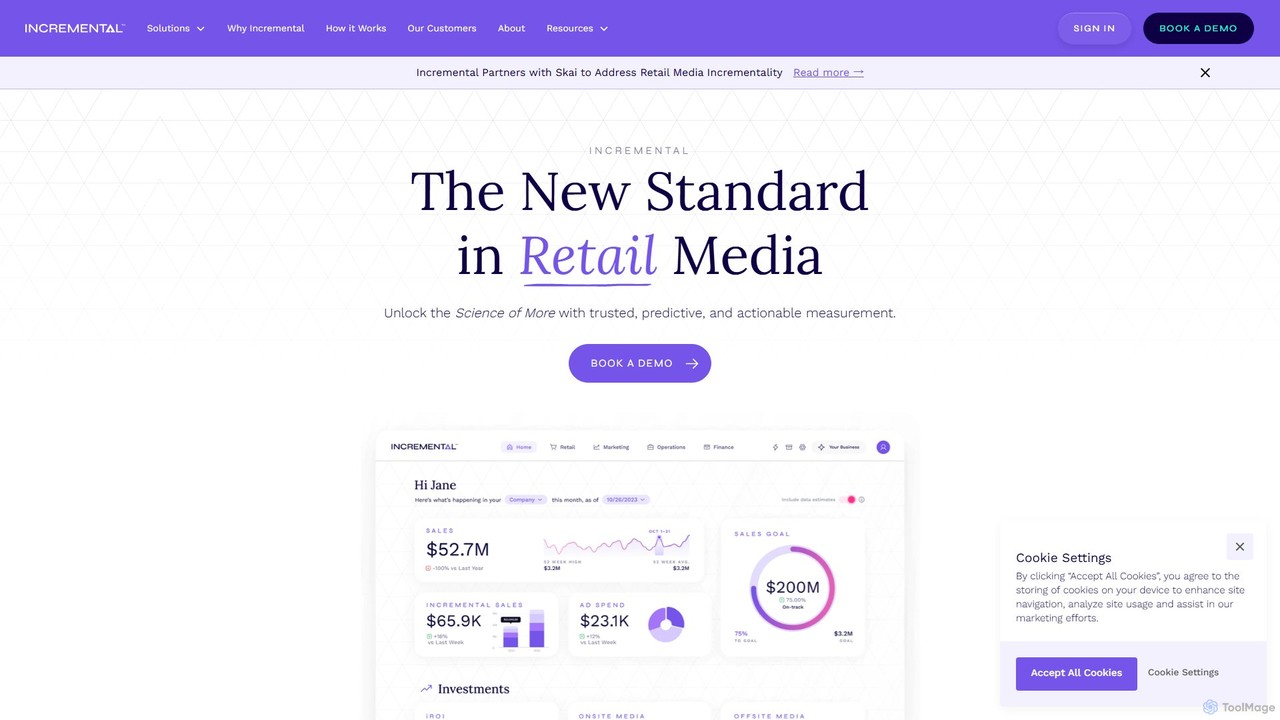
Incremental is a specialized measurement and optimization platform designed for retail media. It moves beyond traditional ROAS by …
Incremental is a specialized measurement and optimization platform designed for retail media. It moves beyond traditional ROAS by providing neutral, third-party analysis to identify the true incremental sales driven by advertising. The platform offers standardized reporting across all retail networks, scenario planning, and actionable insights to help brands and advertisers maximize profitable growth in a complex commerce environment.
Datayaki
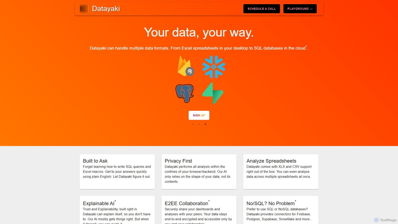
Datayaki is an AI-powered data analyst that lets you find insights from your data by asking questions in …
Datayaki is an AI-powered data analyst that lets you find insights from your data by asking questions in plain English. It supports formats like Excel and CSV, eliminating the need for SQL or complex formulas. With a strong focus on privacy, all analysis is performed locally in your browser, ensuring your data remains secure and confidential. It's designed for professionals and teams who need fast, accessible, and secure data analysis.
thebricks
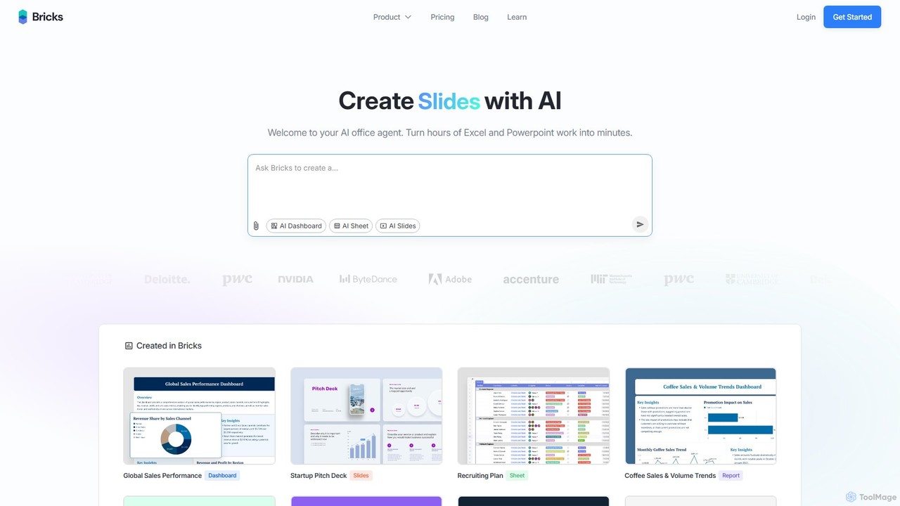
thebricks is an AI-powered workspace that transforms data analysis and reporting. It allows users to create interactive dashboards, …
thebricks is an AI-powered workspace that transforms data analysis and reporting. It allows users to create interactive dashboards, dynamic spreadsheets, and professional slides using simple natural language prompts. Turn hours of manual work in Excel and PowerPoint into minutes, streamlining your workflow and boosting productivity.
Formula Bot
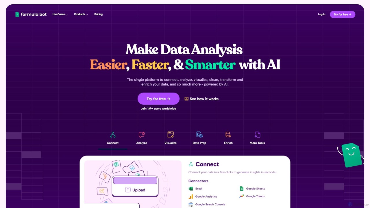
Formula Bot is an AI-powered data analysis platform that simplifies working with spreadsheets and data. It allows users …
Formula Bot is an AI-powered data analysis platform that simplifies working with spreadsheets and data. It allows users to generate Excel formulas, SQL queries, and VBA code from simple text instructions, analyze data through a conversational chat interface, and automate tasks like data cleaning and enrichment.
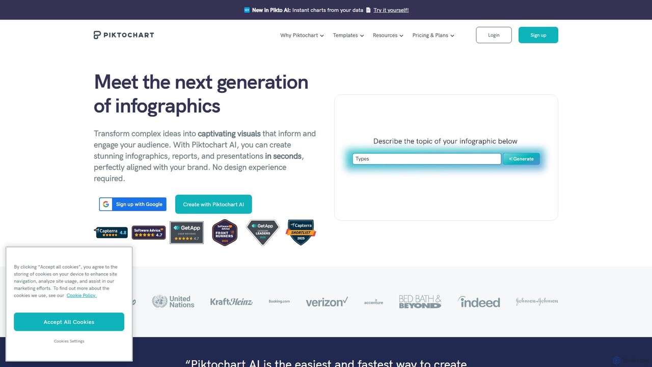
Piktochart
Piktochart is an all-in-one visual communication tool, now enhanced with AI, for creating professional infographics, presentations, reports, and …
Piktochart is an all-in-one visual communication tool, now enhanced with AI, for creating professional infographics, presentations, reports, and social media graphics. It simplifies data visualization and design, enabling users to transform text and data into compelling visuals effortlessly, with features for brand consistency and team collaboration.
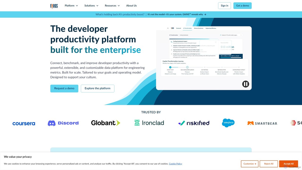
Faros AI
Faros AI is an engineering intelligence platform that connects data across the entire Software Development Life Cycle (SDLC). …
Faros AI is an engineering intelligence platform that connects data across the entire Software Development Life Cycle (SDLC). It provides engineering leaders with AI-powered metrics and insights to measure and improve productivity, streamline operations, and make data-driven decisions. By integrating with tools like GitHub, Jira, and CI/CD pipelines, Faros AI offers a unified view of engineering performance.
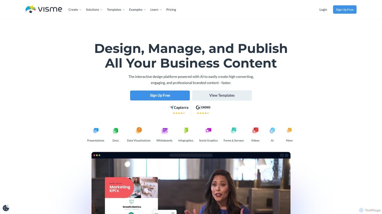
Visme
Visme is an all-in-one, AI-powered visual communication platform that enables users to create professional presentations, infographics, data visualizations, …
Visme is an all-in-one, AI-powered visual communication platform that enables users to create professional presentations, infographics, data visualizations, and other branded content. Designed for non-designers and experts alike, it combines a user-friendly drag-and-drop interface with powerful features like a brand kit, team collaboration, and a vast library of templates and assets to streamline the content creation process.
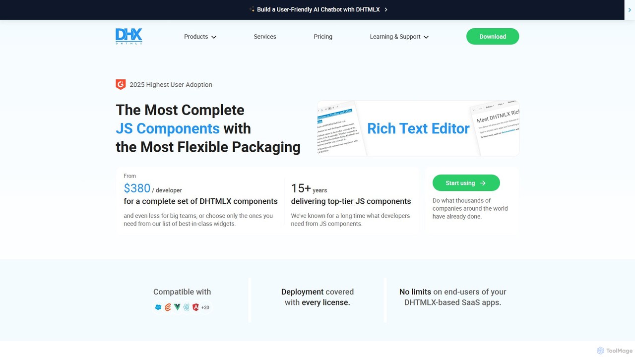
DHTMLX
DHTMLX is a comprehensive JavaScript UI library for building feature-rich, high-performance web applications. It offers a wide range …
DHTMLX is a comprehensive JavaScript UI library for building feature-rich, high-performance web applications. It offers a wide range of customizable components, including Gantt charts, schedulers, grids, diagrams, and a new AI chatbot widget, compatible with any LLM.
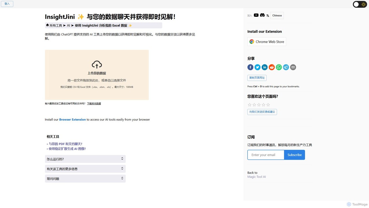
InsightJini
InsightJini is a ChatGPT-powered AI tool that transforms data analysis. Simply upload your Excel or CSV files and …
InsightJini is a ChatGPT-powered AI tool that transforms data analysis. Simply upload your Excel or CSV files and start a conversation to uncover instant insights, generate visualizations, and explore your data without writing a single line of code. It's the fastest, most intuitive way to understand your data.
About Data Visualization
AI Data Visualization tools are a class of software that uses machine learning to automatically transform complex datasets into intuitive charts, graphs, and interactive dashboards. These tools analyze the structure and context of your data to suggest the most effective visual representations, moving beyond manual chart building. Their primary value lies in accelerating the discovery of trends, patterns, and outliers, making sophisticated data analysis accessible to users without deep technical expertise. By leveraging AI, they enable faster, more accurate data-driven decision-making within business environments.
Core Features
- Automated Chart Suggestion: The AI analyzes your data and recommends the most suitable chart type (e.g., bar, line, pie) to convey insights clearly.
- Natural Language Querying (NLQ): Ask questions about your data in plain English, and the tool generates the corresponding visualization instantly.
- Insight Discovery: Algorithms automatically scan data to identify and highlight significant trends, correlations, or anomalies that might be missed.
- Interactive Dashboards: Build dynamic and filterable dashboards that allow users to explore data from multiple angles in real-time.
- Data Storytelling: Automatically generate narrative summaries and annotations that explain the key takeaways from the visualizations.
Use Cases
These tools are widely used by business analysts, marketing managers, sales teams, and executives. They are ideal for tracking key performance indicators (KPIs), analyzing marketing campaign results, monitoring sales pipelines, and presenting financial reports. Any role that requires understanding and communicating data-driven insights can benefit, particularly in fast-paced environments where quick analysis is crucial.
How to Choose
When selecting an AI Data Visualization tool, first consider its data connectivity options to ensure it integrates with your existing databases, spreadsheets, or cloud services. Evaluate the sophistication of its AI features, particularly the accuracy of its Natural Language Querying and automated insights. Also, assess the variety of available visualization types and the ease of use for non-technical team members. Finally, check its collaboration and sharing capabilities to ensure insights can be easily distributed across your organization.
Data VisualizationUse Cases
Analyze Marketing Campaign Performance
A marketing manager needs to quickly understand the ROI of a recent digital campaign. Instead of manually exporting data from Google Analytics and social media platforms into a spreadsheet, they connect their accounts to an AI data visualization tool. They simply type the query, 'Compare conversion rates and cost per acquisition for the Q2 campaign across Facebook and Google Ads.' The tool instantly generates a side-by-side bar chart and a summary, highlighting that Google Ads had a 15% higher conversion rate but Facebook had a lower CPA. This allows for immediate budget reallocation for future campaigns.
Create Executive Business Dashboards
A CEO requires a high-level overview of the company's health across sales, finance, and operations. An analyst uses an AI visualization tool to create a central dashboard that pulls real-time data from Salesforce, QuickBooks, and an internal database. The AI's insight discovery feature automatically flags a critical issue: a 20% drop in customer retention in the EMEA region over the last month. This alert, displayed prominently on the dashboard, allows the executive team to address the problem proactively before it impacts quarterly earnings.
Identify Sales Trends and Forecasts
A sales director wants to understand regional performance and predict next quarter's sales. They upload historical sales data into an AI visualization tool. The tool automatically generates a map visualization showing sales hotspots and an interactive line chart displaying growth trends over time. Furthermore, the AI applies a forecasting model to the data, projecting a 10% growth in the APAC region but a potential 5% decline in North America. This allows the director to allocate more resources to APAC and develop a mitigation strategy for the North American market.
Detect Financial Anomalies
A financial controller is tasked with monitoring company expenses for irregularities. They connect their expense management software to an AI visualization tool. Instead of manually reviewing thousands of transactions, they ask the tool to 'show all expense claims over $500 in the last 30 days, grouped by department.' The tool creates a bubble chart where the size of the bubble represents the expense amount. The AI's anomaly detection feature automatically highlights one department with an unusually high number of large claims, flagging it for a detailed audit. This process reduces manual review time by over 90%.
Analyze E-commerce Customer Behavior
An e-commerce manager wants to optimize the checkout funnel. They use an AI visualization tool to analyze user session data from their website. The tool automatically generates a funnel visualization that shows the user journey from the product page to the final purchase confirmation. It clearly identifies the biggest drop-off point: the shipping information page, where 45% of users abandon their carts. The AI also suggests a correlation: users from mobile devices have a significantly higher drop-off rate on this page. This insight leads the team to redesign the mobile shipping form, resulting in a 10% increase in completed checkouts.
Monitor Supply Chain Operations
A logistics coordinator needs to track hundreds of shipments in real-time. They integrate data from GPS trackers, weather services, and inventory systems into an AI visualization platform. The platform displays all shipments on an interactive map, color-coded by status (on-time, delayed, at-risk). The AI continuously analyzes the data and sends an alert: 'Shipment 789 is at high risk of delay due to unexpected port congestion in Singapore.' This early warning allows the coordinator to proactively reroute the shipment or inform the client, preventing costly disruptions and improving customer satisfaction.