ToolMage
Sign in

Best 1 Data Visualization AI tools for Data Analysis

Popular Data Visualization AI tools in Data Analysis include Zeit AI, helping you work more efficiently.

Zeit AI
Paid

Zeit AI

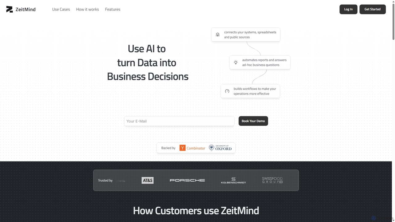
Zeit AI is an advanced business intelligence platform that uses AI to transform your company's data into actionable decisions. Connect various data sources, ask questions in natural language, and receive automated, explainable reports and insights to optimize operations and drive strategic growth.

Business Intelligence
Visits 8.4KFavorites 133Likes 131

About Data Visualization

Data Visualization tools are AI-powered solutions that transform complex datasets into intuitive, interactive visual representations. These tools leverage advanced algorithms to identify patterns, trends, and outliers, making data insights accessible and actionable. They play a crucial role within the broader field of Data Analysis by enabling users to quickly grasp information, communicate findings effectively, and support data-driven decision-making. Their unique advantage lies in automating the creation of sophisticated charts, graphs, and dashboards from raw data.

Core Features

  • Automated Chart Generation: Automatically suggests and creates appropriate charts (e.g., bar, line, pie, scatter) based on data type and user intent.
  • Interactive Dashboards: Builds dynamic dashboards allowing users to filter, drill down, and explore data in real-time.
  • Natural Language Query (NLQ): Enables users to ask questions in plain English and receive visual answers or insights.
  • Anomaly Detection: Highlights unusual data points or shifts that might indicate critical issues or opportunities.
  • Predictive Visualization: Visualizes future trends and forecasts based on historical data analysis.

Applicable Scenarios

Data Visualization tools are indispensable across various sectors. Business analysts use them to monitor key performance indicators (KPIs) and identify areas for improvement. Marketing teams visualize campaign performance to optimize strategies and allocate budgets effectively. Researchers and scientists leverage these tools to present complex findings in an understandable format, facilitating peer review and public communication.

How to Choose

When selecting a Data Visualization tool, consider its data source compatibility (e.g., databases, spreadsheets, cloud platforms), the range and customization options for charts and dashboards, and its ease of use for non-technical users. Evaluate the AI capabilities, such as natural language processing for queries and automated insight generation, as well as integration with existing business intelligence (BI) ecosystems.

Featured tool rankings

Data Visualization use cases

1

Visualizing Sales Performance Trends

Sales managers utilize AI data visualization tools to track monthly, quarterly, and annual sales figures across different regions and product lines. By generating interactive dashboards, they can quickly identify top-performing products, underperforming territories, and emerging market trends, enabling proactive adjustments to sales strategies and resource allocation. This helps in understanding the impact of various factors on revenue.

2

Monitoring Website User Engagement

Digital marketing specialists employ these tools to visualize website traffic, user behavior, and conversion funnels. They can create heatmaps, flow diagrams, and funnel charts to understand how users navigate the site, where they drop off, and which content resonates most. This data-driven approach informs website design improvements and content strategy, leading to higher engagement and conversion rates.

3

Presenting Financial Reports to Stakeholders

Financial analysts transform raw financial data, such as revenue, expenses, and profit margins, into clear, concise visual reports for executives and investors. AI visualization can automatically highlight key financial health indicators, growth projections, and risk factors, making complex financial information digestible and supporting informed strategic decisions during board meetings.

4

Analyzing Healthcare Patient Data for Insights

Healthcare professionals and researchers use data visualization to explore patient demographics, treatment outcomes, and disease prevalence. By visualizing large datasets, they can identify correlations between different health factors, track the effectiveness of new therapies, and pinpoint areas requiring public health intervention, ultimately improving patient care and medical research.

5

Optimizing Supply Chain Logistics

Logistics managers leverage AI visualization to monitor inventory levels, shipping routes, delivery times, and supplier performance. Interactive maps and dashboards reveal bottlenecks, inefficient routes, and potential delays in real-time. This allows for rapid adjustments, optimizing resource allocation, reducing operational costs, and ensuring timely delivery of goods.

6

Exploring Environmental Data for Climate Research

Environmental scientists use these tools to visualize complex climate data, including temperature changes, pollution levels, and biodiversity shifts over time and across geographical areas. By creating dynamic maps and time-series charts, they can identify long-term trends, model future scenarios, and communicate the urgency and impact of environmental issues to policymakers and the public.

Data Visualization FAQ

What are AI Data Visualization tools?

AI Data Visualization tools are software applications that use artificial intelligence to automatically process raw data and generate various visual representations like charts, graphs, and dashboards. They go beyond traditional visualization by offering features such as natural language querying, automated insight generation, and predictive analytics, making complex data more accessible and actionable for users.

How do AI Data Visualization tools differ from traditional BI tools?

While both aim to present data visually, AI Data Visualization tools leverage machine learning to automate much of the process, suggest optimal chart types, and even generate insights from data without explicit user prompts. Traditional BI tools often require more manual configuration, deeper technical knowledge for setup, and rely on predefined queries, whereas AI tools focus on intelligent automation and user-friendly interaction, often through natural language.

What are the key benefits of using AI for data visualization?

The primary benefits include increased efficiency in creating visualizations, improved accuracy through AI-driven insights, and enhanced accessibility for non-technical users. AI can quickly identify hidden patterns, anomalies, and correlations that might be missed manually, leading to faster, more informed decision-making. It also allows for more dynamic and interactive exploration of data.

What should I consider when choosing an AI Data Visualization tool?

When selecting a tool, evaluate its compatibility with your existing data sources, the breadth and depth of its visualization options, and its ease of use for your team. Key AI features like natural language processing, automated insight generation, and predictive capabilities are important. Also, consider integration with other business intelligence platforms, scalability, security features, and pricing models.

Who typically uses AI Data Visualization tools?

A wide range of professionals benefits from these tools. This includes business analysts, marketing specialists, financial professionals, data scientists, researchers, and executives who need to understand complex data quickly. Anyone involved in data-driven decision-making, reporting, or communicating insights to stakeholders can leverage these tools to enhance clarity and impact.