ToolMage
Sign in

Best 2 Infographics AI tools for Design & Art

Popular Infographics AI tools in Design & Art include ChartGPT and SmartVisuals, helping you work more efficiently.

ChartGPT
Freemium

ChartGPT

ChartGPT is an AI-powered tool that transforms natural language prompts and raw data into stunning, customizable charts and graphs. Effortlessly create complex visualizations like bar charts, line graphs, and pie charts without any coding, simply by describing what you want to see.

Infographics
Visits 5.9KFavorites 147Likes 156
SmartVisuals
Freemium

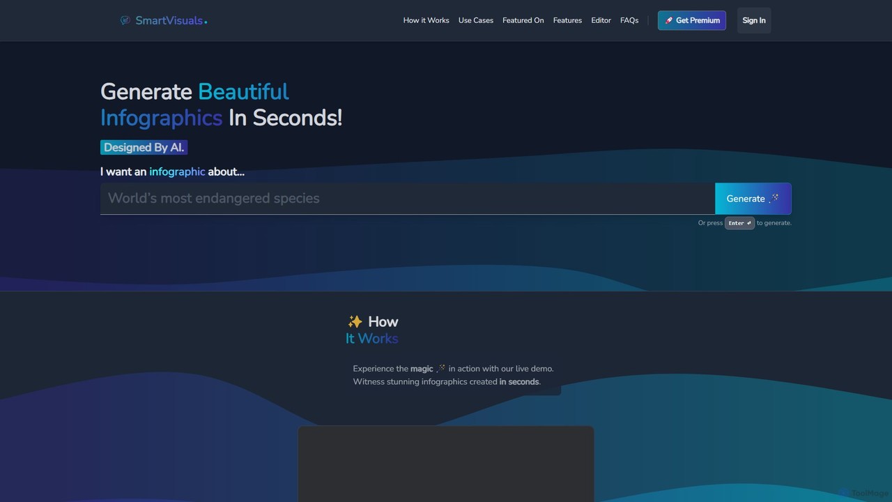
SmartVisuals

SmartVisuals is an AI-powered infographic generator that transforms text prompts into visually compelling and structured infographics. Simply describe your topic, and the AI will automatically design and populate a professional-looking visual, making complex information easy to understand and share. It's ideal for marketers, educators, students, and professionals who need to create high-quality visuals quickly without any design skills.

Infographics
Visits 5.8KFavorites 141Likes 147

About Infographics

AI Infographic tools are specialized applications that use artificial intelligence to automatically transform complex data and text into visually engaging information graphics. They leverage natural language processing and design algorithms to analyze content, select appropriate layouts, icons, and charts. This enables users to quickly create professional, easy-to-understand visuals for reports, marketing, and education without extensive design skills. Their key advantage within the Design & Art category lies in automating the entire information design process, from content structuring to visual styling.

Core Features

  • Data-to-Visual Transformation: Automatically converts raw text, statistics, or spreadsheet data into charts, graphs, and timelines.
  • AI-Powered Layout Generation: Suggests optimal layouts and design templates based on the input content's structure and purpose.
  • Contextual Asset Suggestion: Scans text to recommend relevant icons, illustrations, and stock images from a vast library.
  • Automated Brand Alignment: Instantly applies predefined brand colors, fonts, and logos for consistent visual identity.
  • Content Summarization: Utilizes NLP to condense long articles or reports into concise key points suitable for an infographic format.

Use Cases

These tools are widely used by marketers, educators, researchers, and business analysts. For example, a marketing team can convert a detailed blog post into a shareable social media infographic in minutes. A researcher can visualize complex survey results for a presentation, making findings more accessible and impactful for the audience.

How to Choose

When selecting a tool, consider the range of data inputs it accepts (e.g., plain text, CSV, API). Evaluate the level of design customization available after the initial AI generation. Also, assess the quality and size of its asset library (icons, images) and its export options (e.g., PNG, PDF, interactive HTML).

Infographics use cases

1

Repurpose Blog Posts into Social Media Graphics

A content marketer needs to increase the reach of a comprehensive research article. Instead of manually designing visuals, they input the article's URL or key text into an AI Infographic tool. The AI summarizes the core findings, extracts key statistics, and suggests a vertical layout suitable for platforms like Pinterest or Instagram Stories. It automatically populates the template with charts for data points and relevant icons for topics, generating a shareable infographic in under five minutes, significantly boosting engagement and traffic back to the original article.

2

Visualize Business Report Data

A business analyst is preparing a quarterly performance review for stakeholders. They have a spreadsheet with sales figures, customer acquisition costs, and market trends. By uploading the CSV file to an AI Infographic tool, the system automatically identifies key metrics and generates a series of charts and graphs. The analyst can then add AI-generated text summaries for each section and apply the company's branding. This transforms a dense spreadsheet into a clear, visually compelling report that makes complex data easy for executives to understand at a glance.

3

Create Educational Timelines and Process Maps

An educator wants to create a visual aid for a history lesson on the major events of World War II. They input a list of dates and key events into an AI Infographic tool. The AI recognizes the chronological data and suggests a timeline layout. It automatically arranges the events in order, suggests relevant icons (like flags or symbols of conflict), and creates a clean, easy-to-follow visual. This process saves hours of manual design work and results in a more engaging and memorable learning resource for students compared to plain text.

4

Summarize Market Research Findings

A market research firm has just completed a large-scale consumer survey with hundreds of data points. To present the findings to a client, a researcher pastes the executive summary and key data tables into an AI infographic generator. The tool identifies demographic data, percentages, and key trends, then visualizes them using a mix of pie charts, bar graphs, and highlighted statistics. The result is a one-page visual summary that communicates the most critical insights of the research quickly, making the full report less intimidating and more accessible for busy stakeholders.

5

Generate How-To Guides and Instructions

A customer support manager wants to reduce support tickets by creating clear, visual instructions for a common software setup process. They provide a step-by-step text guide to an AI infographic creator. The AI interprets the numbered steps and generates a process-flow infographic, assigning a unique icon to each step and laying them out sequentially. The manager can then quickly brand it and embed it in their knowledge base. This visual guide is easier for users to follow than a long text article, leading to a decrease in setup-related support queries.

6

Create Comparative Product or Service Overviews

A product marketer is creating a webpage to compare their product against three competitors. They input a list of features for each product into an AI infographic tool. The tool suggests a comparison table or a side-by-side feature list layout. It automatically aligns the features, uses checkmarks or crosses to indicate presence, and suggests icons to represent each feature category (e.g., security, pricing, support). This automates the tedious task of formatting a comparison chart, ensuring a professional and easy-to-read visual that helps potential customers make an informed decision quickly.

Infographics FAQ

What are AI Infographic tools?

AI Infographic tools are software applications that use artificial intelligence to automatically convert text, data, and complex information into structured, visually appealing graphics. Unlike manual design tools, they analyze your content to suggest layouts, charts, icons, and color schemes. Their primary purpose is to simplify the creation of data-driven visuals, enabling users without design expertise to produce professional-quality infographics for communication, marketing, or educational purposes quickly and efficiently.

How do AI Infographic tools differ from general design tools like Canva or Photoshop?

The key difference lies in their core approach. General design tools like Canva or Photoshop provide a blank canvas and a set of manual tools, requiring the user to make all design decisions. AI Infographic tools are content-first; they take your raw data or text as input and automatically generate a structured design based on it. They excel at information design and data visualization, whereas general design tools are for freeform graphic creation. Essentially, AI tools automate the layout and structure, while general tools provide full manual control.

How should I choose the right AI Infographic tool?

Choosing the right tool depends on your specific needs. Consider the following factors:

  • Input Types: Does the tool accept the data format you use, such as plain text, URLs, or CSV files?
  • Customization Level: How much control do you have over the design after the AI generates the initial draft? Can you easily change colors, fonts, and layouts?
  • Asset Library: Check the quality and variety of available icons, images, and templates.
  • Output Formats: Ensure the tool can export in the formats you need, like high-resolution PNG, PDF, or even interactive web formats.
  • Collaboration: If you work in a team, look for features that allow for sharing and collaborative editing.
What kind of data can I use with these tools?

AI Infographic tools are versatile and can typically handle a wide range of inputs. Common formats include:

  • Plain Text: Pasting paragraphs, bullet points, or step-by-step instructions.
  • Statistical Data: Inputting numbers, percentages, and figures, which the AI can turn into charts.
  • Spreadsheet Files: Uploading CSV or Excel files for the tool to visualize tables and datasets.
  • Website URLs: Some advanced tools can scrape a webpage or blog post to summarize its content into an infographic.

The core strength of these tools is their ability to find structure in unstructured or semi-structured information and present it visually.

Who benefits most from using AI Infographic tools?

While anyone can use them, certain roles benefit significantly. Marketers can quickly repurpose content for social media and campaigns. Educators and trainers can create engaging learning materials to simplify complex topics. Business analysts and consultants can transform dense data into clear, digestible reports for stakeholders. Essentially, anyone who needs to communicate information visually but lacks the time or advanced skills of a professional graphic designer will find these tools extremely valuable for improving clarity and efficiency.