ToolMage
Sign in
Piktochart
Data Visualization · 919.7K monthly visits

Piktochart is an all-in-one visual communication tool, now enhanced with AI, for creating professional infographics, presentations, reports, and social media graphics. It simplifies data visualization and design, enabling users to transform text and data into compelling visuals effortlessly, with features for brand consistency and team collaboration.

VS
thebricks
Business Intelligence · 251.6K monthly visits

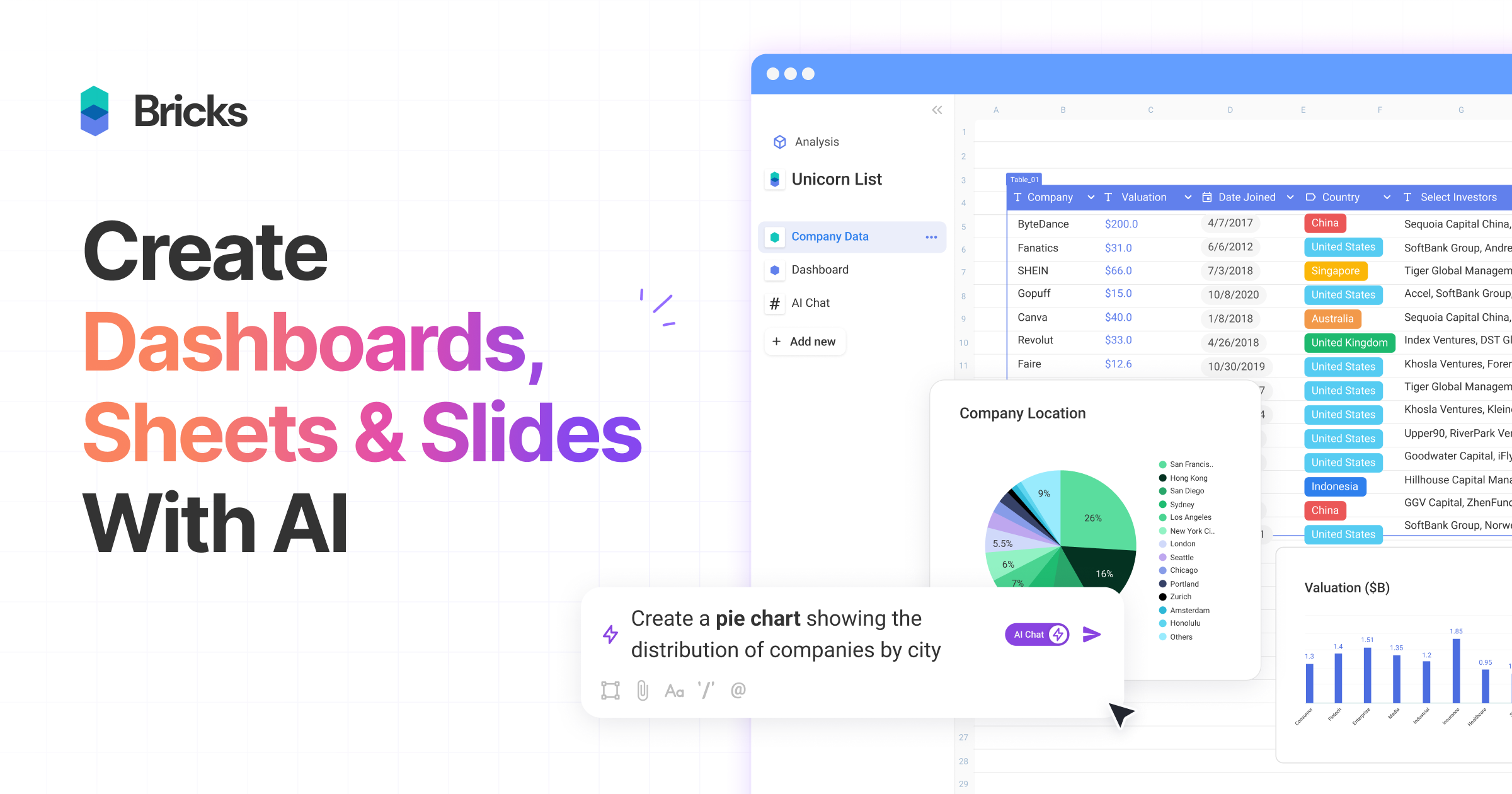
thebricks is an AI-powered workspace that transforms data analysis and reporting. It allows users to create interactive dashboards, dynamic spreadsheets, and professional slides using simple natural language prompts. Turn hours of manual work in Excel and PowerPoint into minutes, streamlining your workflow and boosting productivity.

Piktochart vs thebricks: pricing, features, traffic, and use cases

Compare Piktochart and thebricks across positioning, pricing, traffic, and user feedback using structured factual data.

Updated Aug 19, 2026

Product overview

Piktochart Product overview

Piktochart is an all-in-one visual communication tool, now enhanced with AI, for creating professional infographics, presentations, reports, and social media graphics. It simplifies data visualization and design, enabling users to transform text and data into compelling visuals effortlessly, with features for brand consistency and team collaboration.
Preview

thebricks Product overview

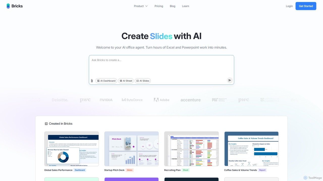
thebricks is an AI-powered workspace that transforms data analysis and reporting. It allows users to create interactive dashboards, dynamic spreadsheets, and professional slides using simple natural language prompts. Turn hours of manual work in Excel and PowerPoint into minutes, streamlining your workflow and boosting productivity.

Preview

Detailed feature comparison

FeaturePiktochartthebricks
Primary categoryData VisualizationBusiness Intelligence
Added2025-08-092025-08-11
PricingFreemiumFreemium
Official websitepiktochart.comwww.thebricks.com
Product typeWebsiteWebsite
Performance data
User ratingNot verifiedNot verified
Comments00
Monthly visits919.7K251.6K
Monthly growth4.7%-23.6%
Favorites167119
DetailsView detailsView details

Piktochart vs thebricks monthly traffic

Compare Piktochart and thebricks by monthly reach, traffic trend, visit depth, top regions, and acquisition sources.

How to interpret the traffic data

In the Piktochart vs thebricks monthly traffic comparison, Piktochart currently shows 919.7K visits and thebricks shows 251.6K; Piktochart has about 3.7 times the visible traffic of thebricks, an absolute difference of about 668.1K visits. This reflects visible reach, not feature quality or paid users.

Both tools provide verified traffic details, so monthly trends, visit depth, regions, and acquisition sources can be compared on the same basis.

Piktochart monthly traffic:

Latest traffic

Monthly visits
919.7K
Avg. visit duration
2:13
Pages per visit
4.48
Bounce rate
39.2%
Data updated 2026-06-15

Monthly traffic trend

  • 2025/9: 1.6M Monthly visits
  • 2026/1: 1.1M Monthly visits
  • 2026/2: 831.4K Monthly visits
  • 2026/3: 924.2K Monthly visits
  • 2026/4: 878.4K Monthly visits
  • 2026/5: 919.7K Monthly visits

Top regions

Top 5 countries/regions
Country/regionPercentageTraffic
🇺🇸United States36.2%332.9K
🇮🇳India19.05%175.2K
🇲🇽Mexico17.13%157.5K
🇨🇴Colombia15.31%140.8K
🇧🇷Brazil12.31%113.2K

Traffic sources

Source typePercentageTraffic
Direct84.6%778.1K
Referral12.61%116K
Email2.79%25.7K

Search keywords

ia pour synthese de document avec shemasias para hacer infografiaspictochartpiktochartpiktochart ai

thebricks monthly traffic:

Latest traffic

Monthly visits
251.6K
Avg. visit duration
3:30
Pages per visit
3.1
Bounce rate
48.17%
Data updated 2026-06-15

Monthly traffic trend

  • 2025/9: 706.4K Monthly visits
  • 2026/1: 493.4K Monthly visits
  • 2026/2: 382K Monthly visits
  • 2026/3: 414.7K Monthly visits
  • 2026/4: 329.3K Monthly visits
  • 2026/5: 251.6K Monthly visits

Top regions

Top 5 countries/regions
Country/regionPercentageTraffic
🇺🇸United States51.54%129.7K
🇨🇦Canada19.43%48.9K
🇮🇳India11.5%28.9K
🇬🇧United Kingdom10.12%25.5K
🇻🇳Vietnam7.41%18.6K

Traffic sources

Source typePercentageTraffic
Direct78.94%198.6K
Referral16.45%41.4K
Email4.61%11.6K

Search keywords

bricksbricks aiportrait spreadsheetremove extra enters in cell excelthebricks
Traffic-based selection guidance: If public market visibility is an important first-pass criterion, investigate Piktochart first. The final choice should still follow taxonomy, use case, and a real trial because higher traffic does not prove broader capabilities or better workflow fit.

Usage comparison

Compare the core capabilities of Piktochart and thebricks

Piktochart Core features

Data Visualization
Presentations
Graphics
Social Media

thebricks Core features

Data Visualization
Presentations
Business Intelligence
Spreadsheets

Use cases

Piktochart Use cases

data visualization
presentation
ai design
brand kit
chart maker
flowchart
infographic maker
report generator
social media graphics
visual communication

thebricks Use cases

data visualization
presentation
AI assistant
business intelligence
dashboard
data analysis
no-code
productivity
reporting
spreadsheet

Piktochart vs thebricks:In-depth comparison and selection guidance

First decide whether the products solve the same kind of need

This in-depth Piktochart vs thebricks comparison uses only the product records, taxonomy, audience, traffic, and community signals available on this page. Piktochart is primarily listed under “Data Visualization”, while thebricks is primarily listed under “Business Intelligence”, so the first decision is whether your actual task matches their recorded scope.

The structured fields currently show these decision-relevant differences: Primary category (Piktochart: Data Visualization; thebricks: Business Intelligence); Monthly visits (Piktochart: 919.7K; thebricks: 251.6K); Monthly growth (Piktochart: 4.7%; thebricks: -23.6%); Favorites (Piktochart: 167; thebricks: 119); Website (Piktochart: piktochart.com; thebricks: www.thebricks.com). These facts are more useful for selection than brand visibility alone.

What market visibility and monthly traffic mean

In the Piktochart vs thebricks monthly traffic comparison, Piktochart currently shows 919.7K visits and thebricks shows 251.6K; Piktochart has about 3.7 times the visible traffic of thebricks, an absolute difference of about 668.1K visits. This reflects visible reach, not feature quality or paid users.

Both tools provide verified traffic details, so monthly trends, visit depth, regions, and acquisition sources can be compared on the same basis.

If public market visibility is an important first-pass criterion, investigate Piktochart first. The final choice should still follow taxonomy, use case, and a real trial because higher traffic does not prove broader capabilities or better workflow fit.

Product positioning, use cases, and roles

Piktochart and thebricks currently overlap in shared categories: Data Visualization and Presentations; shared tags: data visualization and presentation. This can place both on the same shortlist, but it does not prove equal implementation, depth, or cost.

Piktochart's unique categories/tags are Graphics, Social Media, ai design, brand kit, chart maker, flowchart, infographic maker, and report generator; thebricks's are Business Intelligence, Spreadsheets, AI assistant, business intelligence, dashboard, data analysis, no-code, and productivity. These unique fields are the strongest differentiators: validate the product whose recorded scope matches the task instead of following traffic alone.

What ratings, comments, and favorites can tell you

Piktochart has no verified rating, 0 comments, 167 favorites, and 157 likes;thebricks has no verified rating, 0 comments, 119 favorites, and 137 likes。

Neither product has enough rating or comment samples for a credible reputation ranking.

Selection guidance by actual need

When to evaluate Piktochart first

Put Piktochart on the priority trial list when the task aligns with “Data Visualization” and especially Graphics, Social Media, ai design, brand kit, chart maker, and flowchart. This follows recorded positioning and does not imply unlisted capabilities are absent.

Piktochart also currently records: pricing is freemium, product type is website, 919.7K verified monthly visits, no verified user rating. Verify any hard requirement around price, platform, or reach before trial, and do not let sparse review data substitute for testing.

When to evaluate thebricks first

Put thebricks on the priority trial list when the task aligns with “Business Intelligence” and especially Business Intelligence, Spreadsheets, AI assistant, business intelligence, dashboard, and data analysis. This follows recorded positioning and does not imply unlisted capabilities are absent.

thebricks also currently records: pricing is freemium, product type is website, 251.6K verified monthly visits, no verified user rating. Verify any hard requirement around price, platform, or reach before trial, and do not let sparse review data substitute for testing.

How to validate the recommendation before deciding

The available data describes positioning, public visibility, and community signals, but it cannot prove output quality, speed, integration effort, privacy, or long-term cost in your workflow. Before deciding, run the same representative tasks in Piktochart and thebricks, then record completion time, accuracy, manual corrections, and the real paid threshold. A like-for-like trial turns this comparison into a defensible adoption decision.

Comparison FAQ

How should I choose between Piktochart and thebricks?
Compare positioning, pricing, taxonomy, and traffic maturity, then verify the latest details on each official website.
Where does this comparison data come from?
The factual baseline is derived from product, taxonomy, traffic, and community data. Reviewed editorial conclusions show their source and verification date.
What do unknown fields mean?
Unknown means there is not enough reliable evidence; the page does not fill gaps with assumptions.

Related AI tools

ChatExcel
Freemium

ChatExcel

ChatExcel is an AI-powered data analysis tool that allows users to process spreadsheets and analyze data through a simple chat interface. It automates tasks like data cleaning, merging, and analysis, and generates over 100 types of charts and visualizations from natural language commands. No coding or complex formulas required, boosting productivity by up to 90%.

Business Intelligence
Visits 321.5KFavorites 104Likes 115
Ajelix
Freemium

Ajelix

Ajelix is an AI-powered suite of tools designed to enhance productivity for Excel and Google Sheets users. It acts as an AI data analyst, automating tasks, generating formulas and VBA scripts, creating insightful reports, and providing advanced data analysis through a simple chat interface.

Business Intelligence
Visits 104.5KFavorites 103Likes 102
excelmatic
Freemium

excelmatic

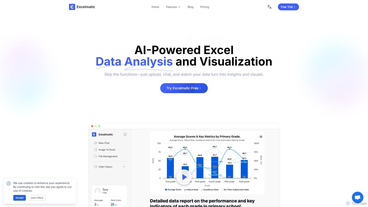
Excelmatic is an AI-powered assistant that transforms your Excel and spreadsheet tasks. Simply upload your data, ask questions in plain English, and instantly get data analysis, visualizations, and generated formulas. It's a no-code solution designed to automate data cleaning, chart creation, and insight discovery, making data accessible to everyone.

Business Intelligence
Visits 67.1KFavorites 126Likes 113
GRID
Freemium

GRID

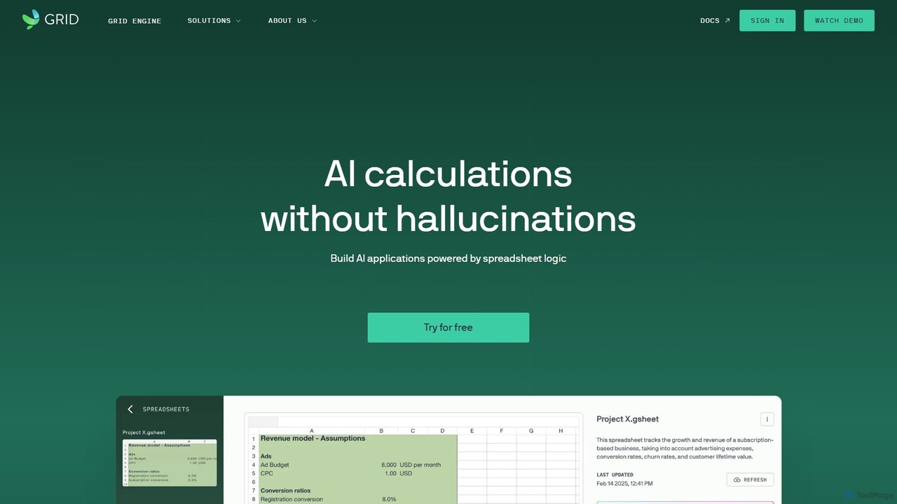
GRID is an AI-first platform that transforms your existing spreadsheets into powerful, interactive web applications and AI-driven tools. It leverages the logic and data within your Excel and Google Sheets files to build reliable calculators, dashboards, and models that can be queried using natural language, eliminating AI hallucinations.

Business Intelligence
Visits 32.5KFavorites 130Likes 117
Graphy
Freemium

Graphy

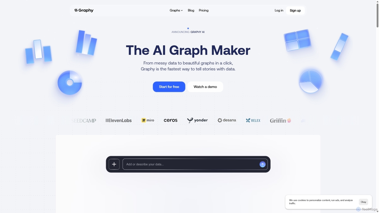
Graphy is an AI-powered data visualization tool that transforms raw data into beautiful, interactive charts and graphs in seconds. It simplifies data storytelling by automatically identifying key insights, allowing users to chat with their data, and offering extensive customization. Ideal for marketers, analysts, and teams who need to create compelling visual reports and presentations without complex software.

3D
Visits 171.9KFavorites 119Likes 130
Datayaki
Freemium

Datayaki

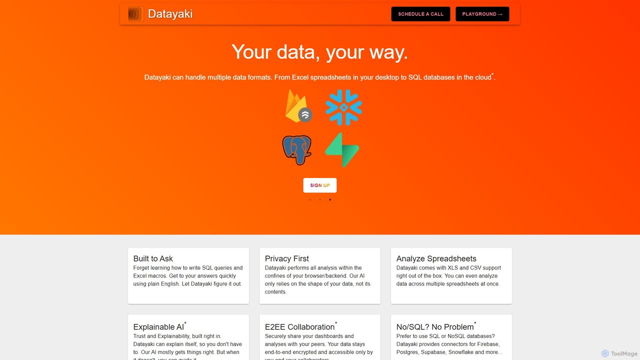
Datayaki is an AI-powered data analyst that lets you find insights from your data by asking questions in plain English. It supports formats like Excel and CSV, eliminating the need for SQL or complex formulas. With a strong focus on privacy, all analysis is performed locally in your browser, ensuring your data remains secure and confidential. It's designed for professionals and teams who need fast, accessible, and secure data analysis.

Data Visualization
Visits 4.4KFavorites 134Likes 140
airwiz
Freemium

airwiz

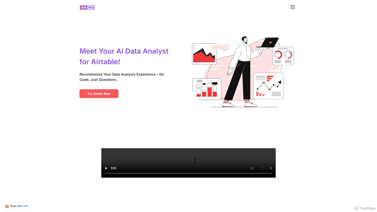
Airwiz is an AI-powered data analyst designed specifically for Airtable. It allows users to ask complex questions about their data in plain English and receive instant, actionable insights. With seamless integration and no coding required, Airwiz democratizes data analysis, enabling teams in product, finance, and operations to make faster, data-driven decisions directly from their Airtable bases.

No Code
Visits 4.1KFavorites 96Likes 99
AskExcel
Freemium

AskExcel

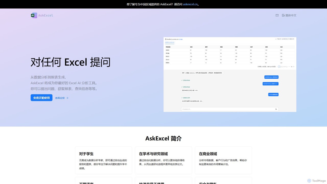
AskExcel is an AI-powered data analysis tool that transforms your Excel spreadsheets into interactive conversations. Simply upload your file, ask questions in natural language, and instantly receive data analysis, reports, and visualizations without writing any formulas or code.

Business Intelligence
Visits 4.2KFavorites 103Likes 104
Querio
Freemium

Querio

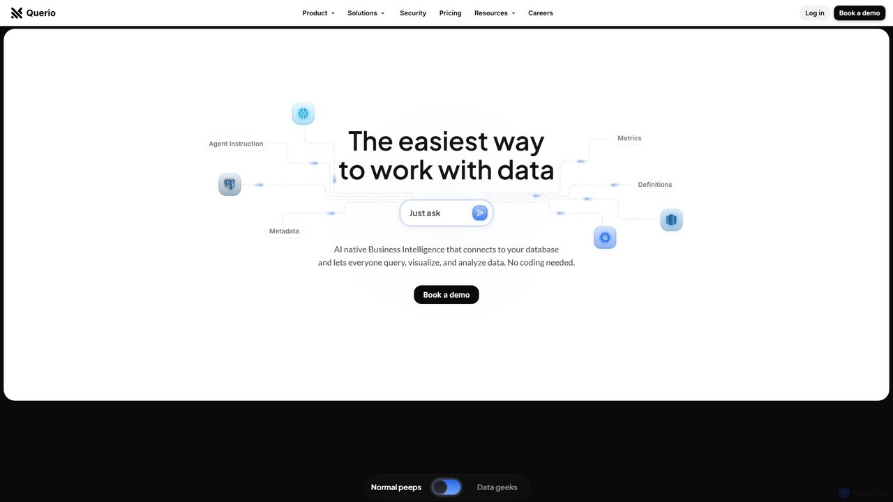
Querio is an AI-native Business Intelligence (BI) platform that allows teams to analyze their data using natural language. Connect directly to your database and ask questions to generate queries, visualizations, and reports without writing any code. It's designed for both technical and non-technical users to make data-driven decisions quickly.

Business Intelligence
Visits 53.1KFavorites 128Likes 124
Basedash
Freemium

Basedash

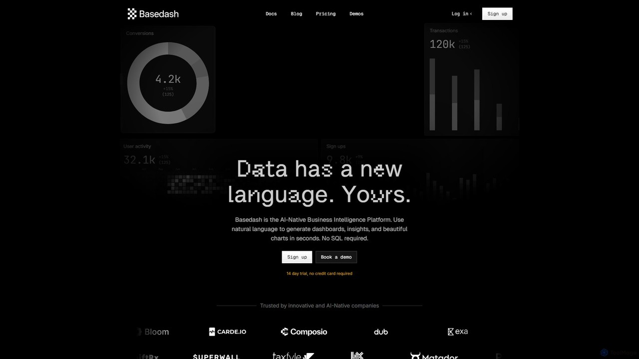
Basedash is an AI-native business intelligence platform that allows teams to interact with their data using natural language. Generate beautiful dashboards, charts, and insights in seconds without writing any SQL code. Connect your data sources and simply ask questions to get answers.

Business Intelligence
Visits 51.4KFavorites 109Likes 103
Sourcetable
Freemium

Sourcetable

Sourcetable is an AI-powered spreadsheet that combines the functionality of traditional spreadsheets with an AI data analyst. It allows users to connect to live data sources, ask questions in plain English, generate formulas, create charts, and automate reports. By integrating AI, Python, and SQL capabilities directly into the spreadsheet interface, Sourcetable empowers users of all skill levels to perform complex data analysis, cleaning, and visualization tasks effortlessly, turning raw data into actionable insights in seconds.

No Code
Visits 47.2KFavorites 123Likes 145
Supaboard
Freemium

Supaboard

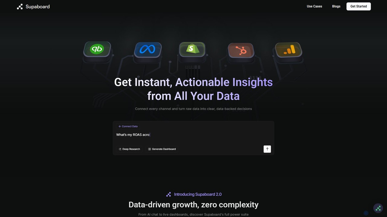
Supaboard is an AI-powered business intelligence platform that connects all your data sources into a unified hub. It transforms raw data into actionable insights and live dashboards, allowing teams to make data-backed decisions quickly without needing to write code or wrangle spreadsheets.

Business Intelligence
Visits 35.1KFavorites 135Likes 129
table.studio
Freemium

table.studio

table.studio is an AI-powered data workspace that combines the simplicity of a spreadsheet with the power of a database and AI. Use natural language to query, analyze, and visualize your data, automating tedious tasks and uncovering insights instantly. It's designed for teams to collaborate on data projects in real-time.

Database Management
Visits 22.4KFavorites 123Likes 136
Fabi.ai
Freemium

Fabi.ai

Fabi.ai is an AI-powered business intelligence and data analysis platform designed for lean teams. It integrates SQL, Python, and AI to help users build dashboards, automate workflows, and explore data 10x faster. The platform offers an all-in-one collaborative environment, reducing context switching and enabling both technical and non-technical users to derive insights from their data sources like data warehouses, Google Sheets, and more.

Business Intelligence
Visits 21.9KFavorites 96Likes 126
Definite
Freemium

Definite

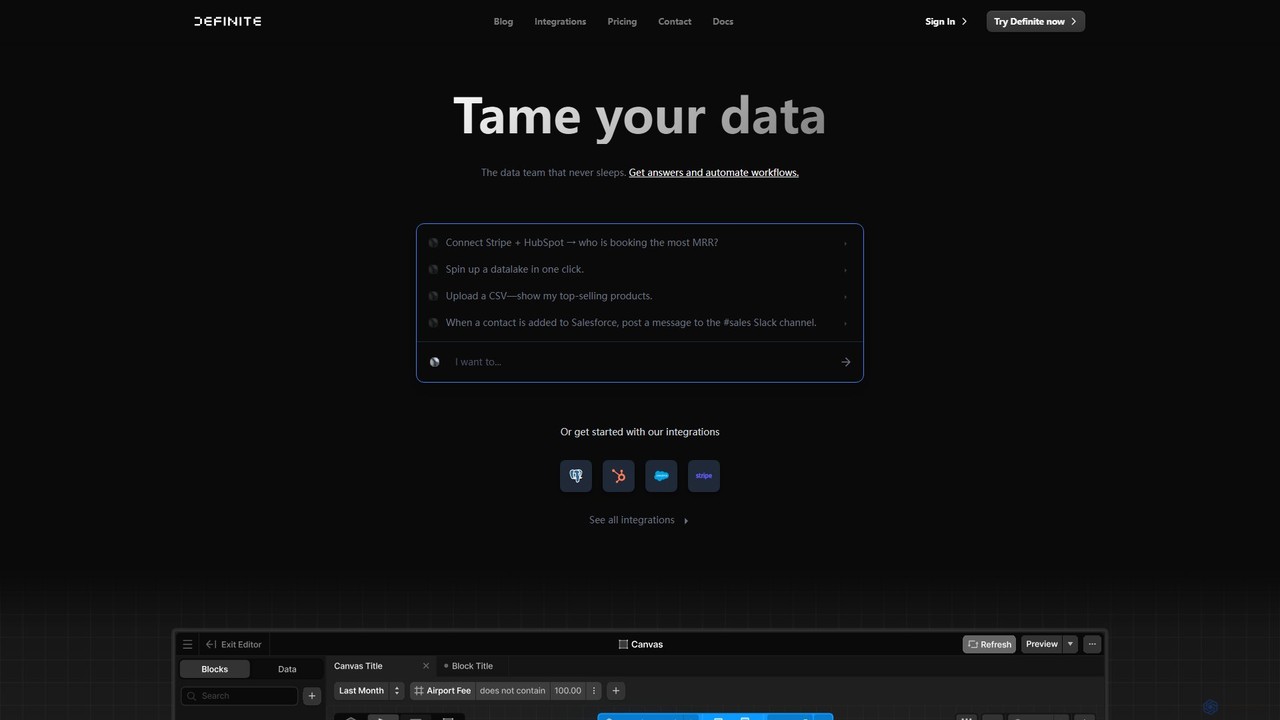
Definite is an AI-powered, all-in-one data analytics platform that combines data integration, warehousing, and business intelligence. It enables teams to connect hundreds of data sources, ask questions in plain English, and build dashboards without engineering support, turning scattered data into actionable insights in minutes.

Business Intelligence
Visits 19.5KFavorites 122Likes 111