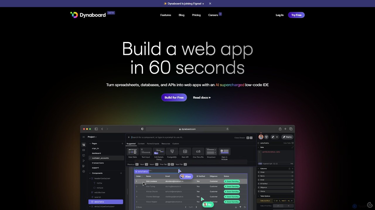
Dynaboard
Dynaboard is an AI-supercharged, collaborative low-code IDE for developers. It enables the rapid creation of web applications by …
Dynaboard is an AI-supercharged, collaborative low-code IDE for developers. It enables the rapid creation of web applications by connecting to databases, APIs, and spreadsheets. It combines a drag-and-drop interface with the power of TypeScript and React, facilitating real-time team collaboration and instant deployment.
About Dashboard Builder
Dashboard Builders are specialized tools designed to create interactive and visual data dashboards without requiring extensive coding knowledge. They connect to various data sources, providing a drag-and-drop interface to build charts, graphs, maps, and tables for data visualization. These tools are essential for monitoring key performance indicators (KPIs), tracking business metrics in real-time, and sharing actionable insights across an organization. AI-powered versions can even suggest optimal visualizations, identify significant trends, and generate narrative summaries from the data.
Core Features
- Data Connectivity: Seamlessly connect to databases, APIs, spreadsheets, and cloud services.
- Drag-and-Drop Interface: Build complex visualizations intuitively without writing code.
- Real-time Data Updates: Ensure dashboards always display the most current information automatically.
- Interactive Elements: Allow users to filter, drill down, and explore data directly within the dashboard.
- AI-Powered Insights: Automatically detect anomalies, forecast trends, and generate natural language summaries.
Use Cases
Dashboard Builders are widely used by business intelligence teams, marketing analysts, sales managers, and operations leads. They are ideal for creating sales performance trackers, marketing campaign ROI dashboards, operational monitoring systems for e-commerce, and executive-level financial summaries. Any role that relies on data for decision-making can benefit from a centralized, visual reporting hub.
How to Choose
When selecting a Dashboard Builder, consider its data source compatibility; it must connect to your existing systems. Evaluate the ease of use and the learning curve for your team. Assess the range of visualization options and customization capabilities. Finally, review the collaboration features for sharing dashboards and the pricing model to ensure it aligns with your budget and usage scale.
Dashboard BuilderUse Cases
Real-Time Sales Performance Tracking
A sales manager needs to monitor daily team performance, individual contributions, and progress toward quarterly goals. By connecting a Dashboard Builder to Salesforce and internal databases, they can create a centralized dashboard. This dashboard visualizes key metrics like deals closed, revenue generated, and sales funnel velocity with leaderboards and regional maps. The result is a live, transparent view of performance that fosters healthy competition and allows for immediate strategic adjustments based on real-time data.
Marketing Campaign ROI Analysis
A digital marketing analyst manages campaigns across multiple platforms like Google Ads, Facebook, and email. To measure overall ROI, they use a Dashboard Builder to consolidate data from these disparate sources. They create visualizations that track cost-per-acquisition (CPA), conversion rates, and customer lifetime value (CLV) by channel. This unified view allows the marketing team to identify the most effective channels, optimize ad spend in real-time, and make data-driven decisions to improve future campaign strategies.
Monitoring E-commerce Operations
An e-commerce operations manager needs to track key metrics like inventory levels, order fulfillment times, and shipping costs. They use a Dashboard Builder to connect to their Shopify store, warehouse management system, and shipping carriers. The resulting dashboard provides a real-time overview of the entire supply chain, visualizing stock levels to prevent stockouts, monitoring order processing times to identify bottlenecks, and analyzing shipping data to optimize logistics. This helps improve operational efficiency and enhance customer satisfaction.
Customer Support Performance Dashboard
A head of customer support aims to improve team efficiency and customer satisfaction. They connect a Dashboard Builder to a helpdesk system like Zendesk. This allows them to create a dashboard tracking metrics such as first response time, ticket resolution time, and customer satisfaction (CSAT) scores. By visualizing these KPIs, managers can identify trends in support requests, manage agent workload effectively, and proactively address issues affecting service quality, ultimately leading to a better customer experience.
SaaS Product Usage Analytics
A product manager wants to understand how users interact with their software to inform feature development. They integrate product analytics data from a tool like Mixpanel into a Dashboard Builder. They then build dashboards to visualize user engagement, feature adoption rates, and user retention cohorts. These visual insights help the product team gain a deep understanding of user behavior, validate product hypotheses with data, and prioritize the development roadmap based on which features provide the most value to users.
Executive Financial KPI Reporting
A financial analyst is tasked with preparing monthly reports for the executive team. Instead of static spreadsheets, they use a Dashboard Builder to connect to accounting software and ERP systems. They create a high-level executive dashboard showing key financial KPIs like revenue, profit margins, cash flow, and burn rate. This automates the reporting process, reduces manual errors, and provides executives with an interactive, up-to-date overview of the company's financial health, allowing them to drill down into specific areas for more detail.