ToolMage
Sign in

Best 23 Data Visualization AI tools for Data

Popular Data Visualization AI tools in Data include Microsoft Power BI, Gradio, Algo, Polymer Search, Taipy, Upsolve AI, DataSquirrel.ai, Sumifai, Zing Data, and Synnax, helping you work more efficiently.

Freemium

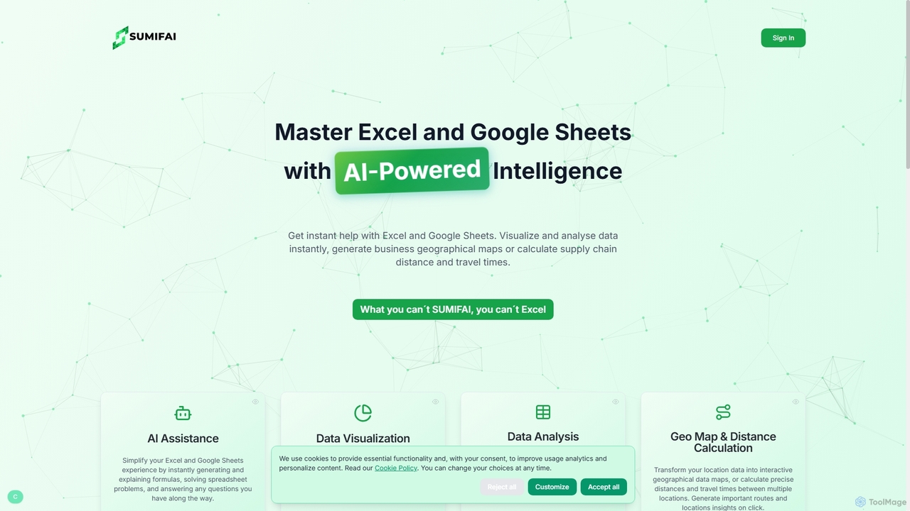
Sumifai

Sumifai is an AI-powered assistant for Excel and Google Sheets that simplifies spreadsheet tasks. It instantly generates and explains formulas, analyzes data, creates visualizations, and even builds interactive geographical maps from location data. Designed for all skill levels, it helps users uncover insights and streamline workflows without requiring technical expertise.

Business Intelligence
Visits 4.9KFavorites 87Likes 85
Freemium

AnimStats

AnimStats is an AI-powered platform that transforms statistics and data into stunning animated GIFs and videos to boost engagement. It also features an AI shorts generator for creating viral, faceless content for TikTok, YouTube, and Instagram, complete with scripts, voiceovers, and captions.

Data Visualization
Visits 4.6KFavorites 81Likes 66
Freemium

Tako

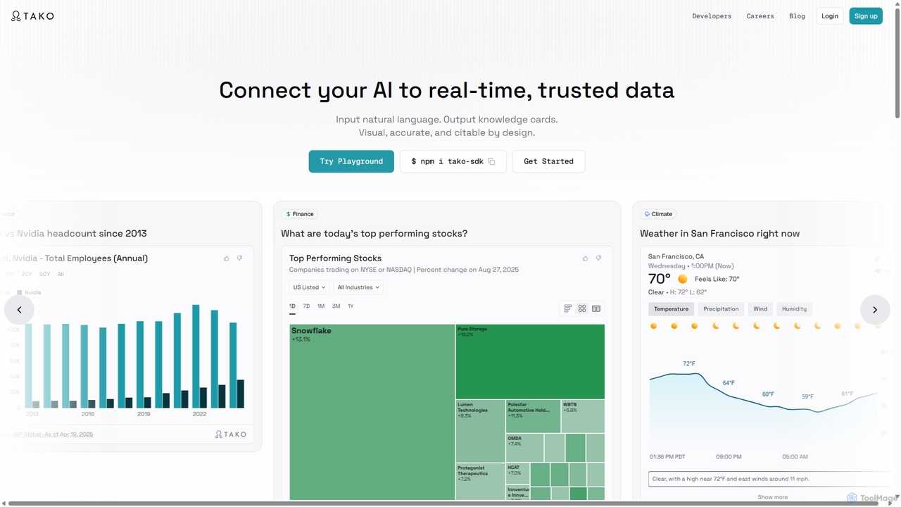
Tako is an AI knowledge engine that connects applications and agents to real-time, trusted data. It transforms natural language queries into interactive, visual "knowledge cards" that are accurate and citable. Designed for developers, Tako provides a powerful API and an easy-to-integrate plugin to enrich AI chatbots, search engines, and content creation platforms with dynamic, data-driven insights from authoritative sources.

Enrichment
Visits 3.5KFavorites 123Likes 123
Paid

Upsolve AI

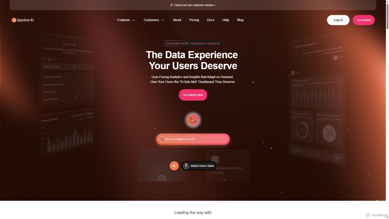
Upsolve AI is an embedded Generative Business Intelligence (GenBI) platform that enables SaaS companies to integrate AI-powered, hyper-personalized analytics dashboards directly into their products. It allows end-users to interact with data using natural language, providing actionable insights and a seamless, self-service data experience without requiring extensive development resources.

Business Intelligence
Visits 12.1KFavorites 97Likes 93
Freemium

Polymer Search

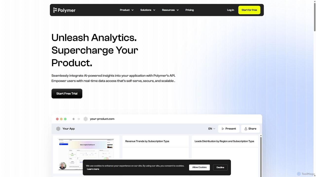
Polymer Search is an AI-driven embedded analytics platform designed to supercharge products with powerful, white-labeled data visualizations. It enables seamless integration of beautiful dashboards and reports directly into your application, empowering users with self-serve analytics and AI-generated insights, all with minimal development effort.

Business Intelligence
Visits 23.2KFavorites 110Likes 117
Paid

Algo

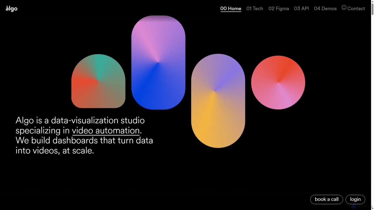
Algo is a data-visualization studio specializing in video automation. It builds custom dashboards, Figma plugins, and APIs that empower teams to turn data into high-quality, personalized videos at scale, leveraging AI for enhanced creativity and efficiency.

Data Visualization
Visits 35.5KFavorites 113Likes 129
Free

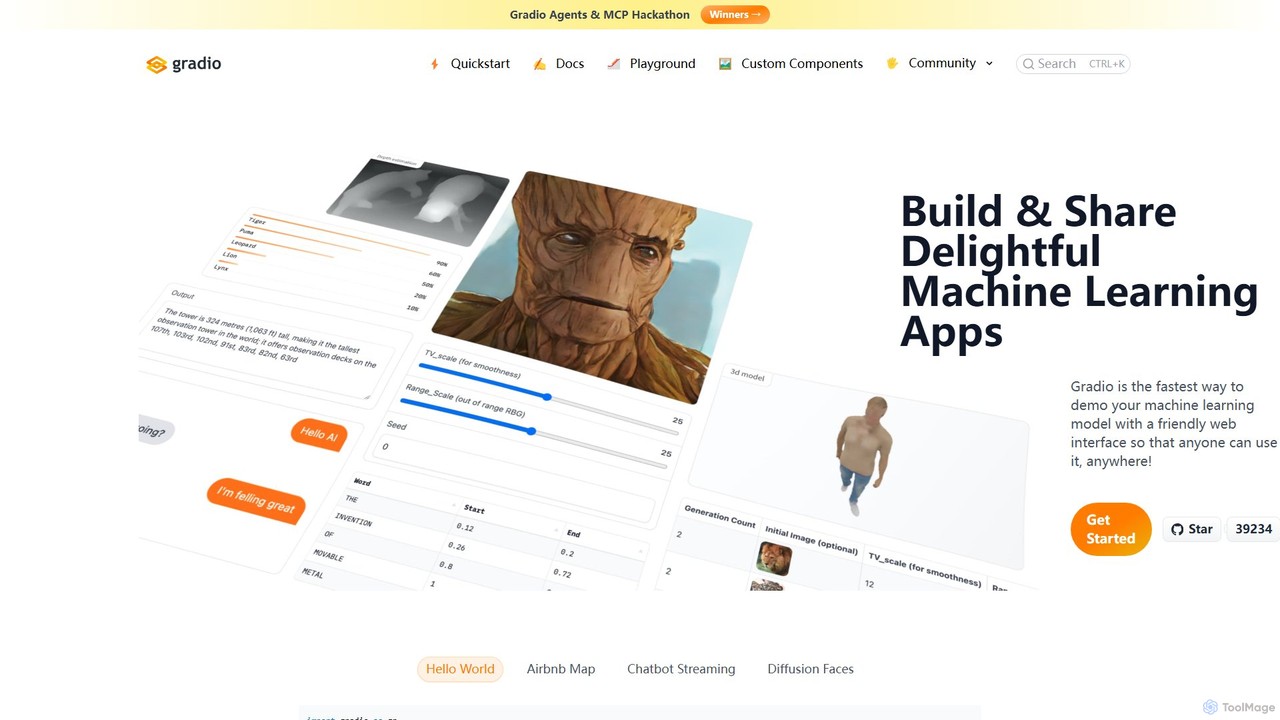
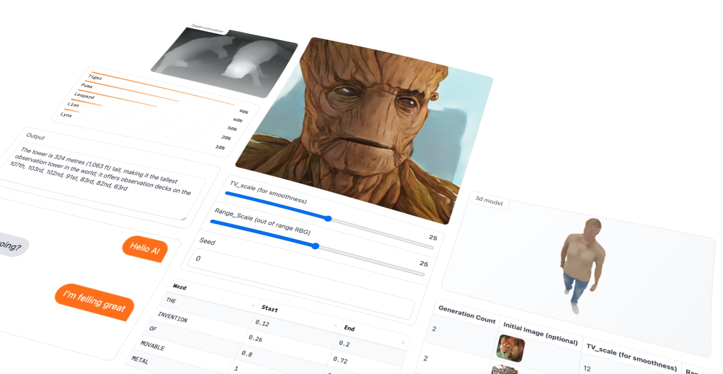
Gradio

Gradio is an open-source Python library that allows you to quickly build and share user-friendly web interfaces for your machine learning models, APIs, or any Python function. No web development experience is required.

Data Visualization
Visits 223KFavorites 120Likes 122
Freemium

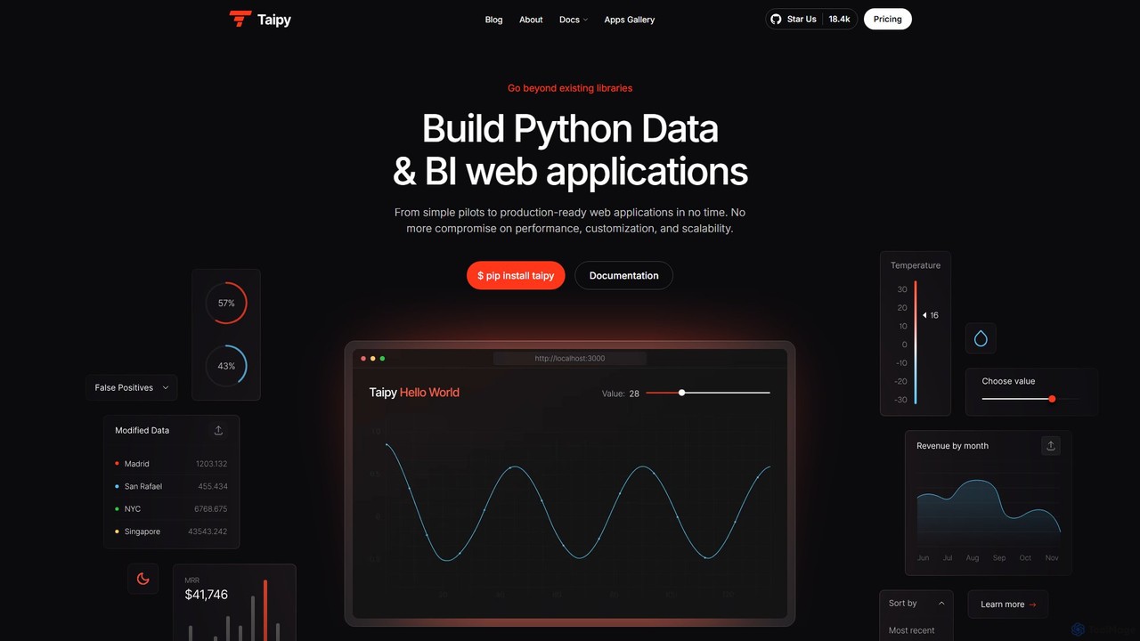
Taipy

Taipy is an open-source Python library for rapidly building powerful data and business intelligence web applications. It enables developers and data scientists to create everything from simple dashboards to complex, production-ready, multi-user applications with features like scenario management and performance optimization, all within Python.

Data Visualization
Visits 16.3KFavorites 127Likes 109
Freemium

prisms.ai

Prisms.ai is an AI-powered data analytics and visualization platform that transforms complex data into clear, interactive dashboards. It allows users to ask questions in natural language and receive instant, AI-generated insights, charts, and reports, making data-driven decision-making accessible to everyone in an organization.

Business Intelligence
Visits 4KFavorites 124Likes 141
Freemium

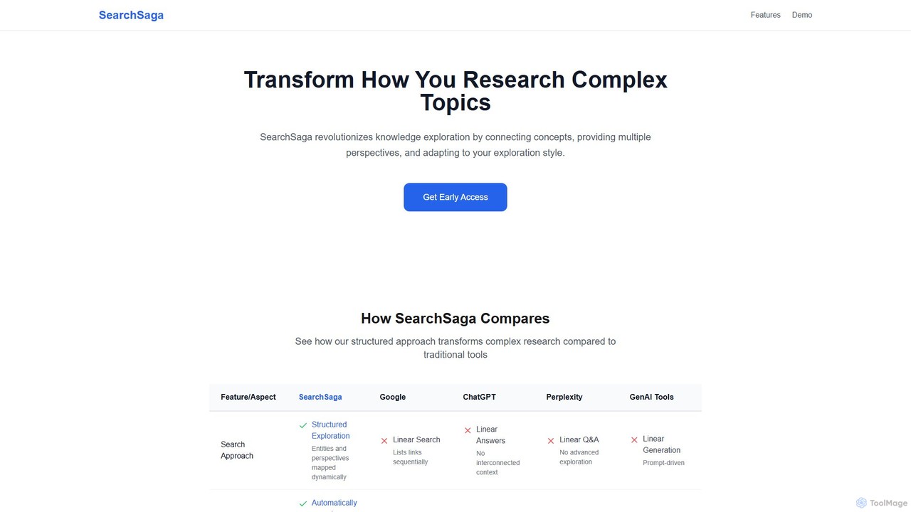
SearchSaga

SearchSaga is an AI-powered research platform that transforms complex topic exploration. Instead of linear search results, it creates dynamic knowledge maps, connecting concepts and allowing users to analyze subjects from multiple perspectives like technical, economic, and environmental. Ideal for researchers, students, and professionals seeking deep, structured understanding.

Data Visualization
Visits 4.1KFavorites 117Likes 113
Freemium

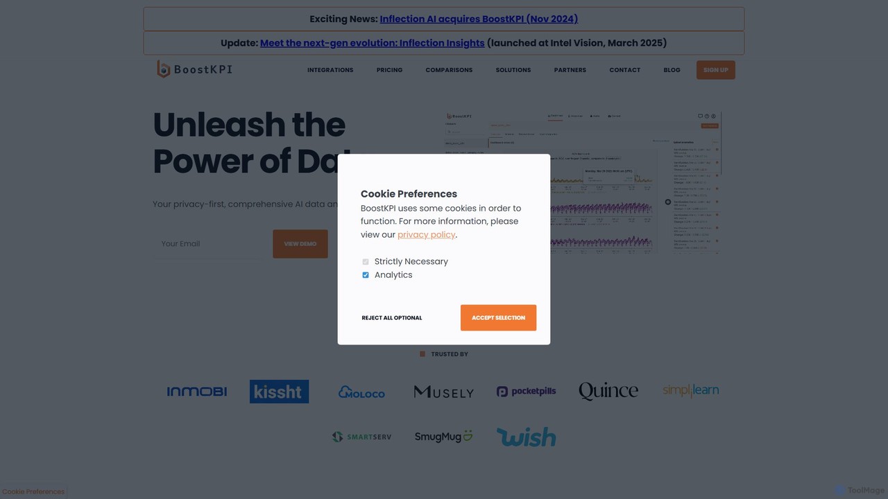
BoostKPI

BoostKPI is a privacy-first AI data analyst platform, powered by its AI assistant, ADA. It automates anomaly detection, root cause analysis, and data visualization, enabling businesses to quickly uncover actionable insights from their data. By connecting to various data warehouses or accepting file uploads, BoostKPI transforms complex datasets into clear reports, heatmaps, and drill-down analyses, making data-driven decision-making faster and more accessible for teams of all sizes.

Business Intelligence
Visits 4.6KFavorites 99Likes 103
Freemium

AiBiao

AiBiao is an AI-powered tool that instantly generates professional charts and diagrams from text descriptions. It streamlines the creation of visual data for presentations, reports, and online content, significantly boosting productivity by eliminating manual drawing processes.

Data Visualization
Visits 3.5KFavorites 111Likes 100

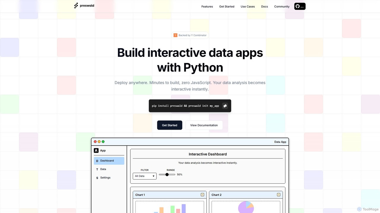
preswald

Preswald is a YC-backed tool that empowers data scientists and Python developers to transform their scripts into fully interactive web applications without writing any JavaScript. It generates fast, responsive, and deployable static sites that can run anywhere, even offline. Ideal for creating dashboards, reports, and AI-driven data exploration tools with ease.

Data Visualization
Visits 4.2KFavorites 130Likes 121

Synnax

Synnax is a high-performance data and operations platform for hardware engineering teams. It provides a specialized time-series database and a unified framework to manage real-time data acquisition from thousands of sensors, control actuators, and automate complex analysis workflows for next-generation hardware.

Data Visualization
Visits 4.6KFavorites 90Likes 90
Freemium

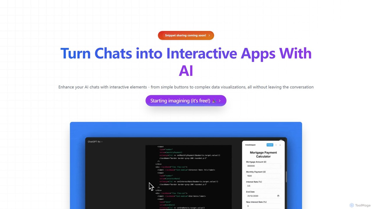
InstaSnippet

InstaSnippet is an AI-powered platform that transforms your text-based conversations with AI models like ChatGPT and Claude into fully interactive applications. Generate UI components, from simple buttons to complex data visualizations, directly within your chat interface, streamlining the process of prototyping and development.

Data Visualization
Visits 3.4KFavorites 94Likes 93
Freemium

Microsoft Power BI

Microsoft Power BI is a leading business analytics and data visualization platform that empowers users to connect to, model, and visualize their data. It leverages AI-powered features like natural language Q&A and automated insights to uncover hidden patterns, create interactive reports and dashboards, and facilitate data-driven decision-making across an organization.

Business Intelligence
Visits 53.6MFavorites 79Likes 81
Freemium

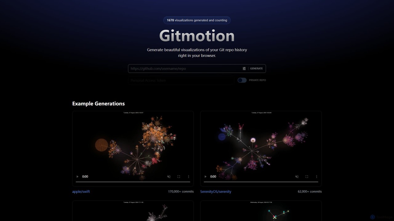
Gitmotion

Gitmotion is a web-based tool that generates beautiful, animated visualizations of your Git repository history. It transforms complex commit logs into dynamic and easy-to-understand videos or images, perfect for project analysis, presentations, and team onboarding. It supports both public and private repositories, offering a simple way to see the evolution of your code.

Data Visualization
Visits 3.5KFavorites 107Likes 102
Paid

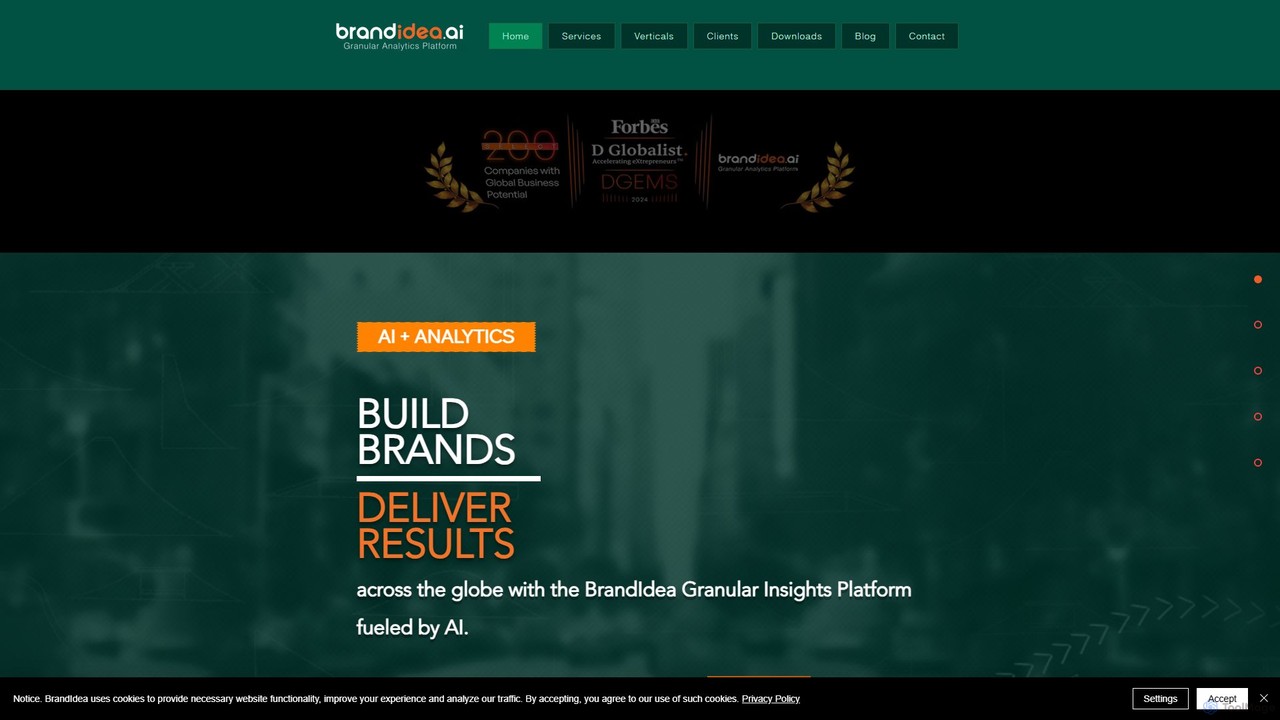
brandidea

An AI-powered granular analytics platform for sales and marketing. It transforms hyper-local data from markets like India into actionable insights, moving beyond traditional analytics to provide predictive and prescriptive guidance. It helps enterprises optimize strategies, enhance ROI, and accelerate brand growth through data-driven decision-making.

Business Intelligence
Visits 4.5KFavorites 98Likes 87
Freemium

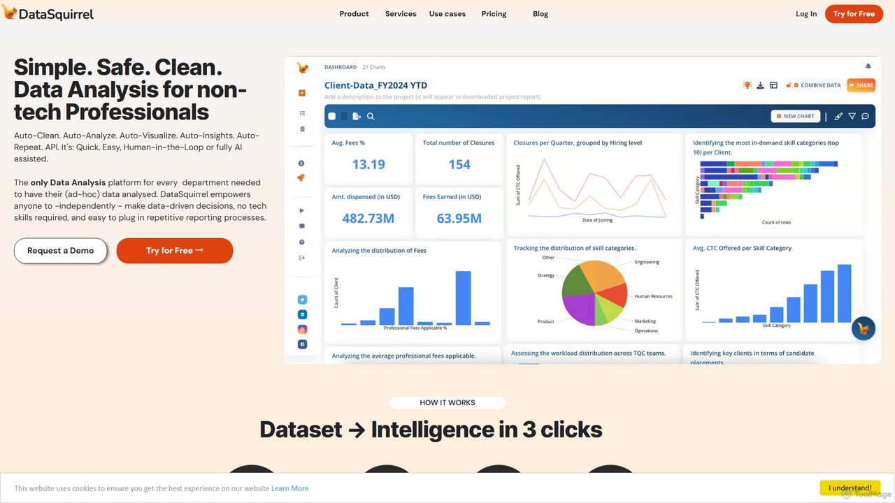
DataSquirrel.ai

DataSquirrel.ai is an AI-powered data analysis platform designed for non-technical business professionals. It automates the entire data workflow, from cleaning and analysis to visualization and reporting. Users can upload data via CSV, Excel, or Google Sheets and receive instant, actionable insights and interactive dashboards without writing any code or formulas, ensuring data security and compliance.

Business Intelligence
Visits 7.7KFavorites 99Likes 112
Paid

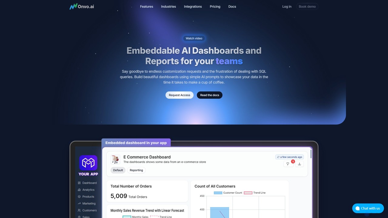
Onvo AI

Onvo AI is a powerful platform for building and embedding AI-driven dashboards and reports directly into your applications. It replaces complex SQL queries with simple natural language prompts, allowing both technical and non-technical users to create stunning data visualizations effortlessly. This solution saves significant engineering resources and empowers your teams and customers with secure, self-service analytics.

Business Intelligence
Visits 3.5KFavorites 112Likes 118
Freemium

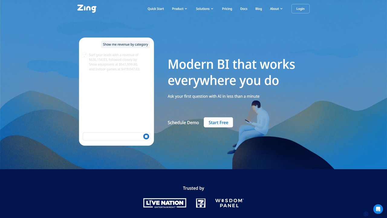
Zing Data

Zing Data is a GenAI-powered business intelligence (BI) platform that enables users to query data using natural language. It works across web and mobile, connecting to various data sources to create interactive visualizations and real-time alerts without complex data modeling, making data analysis accessible to everyone.

Business Intelligence
Visits 4.7KFavorites 107Likes 109
Freemium

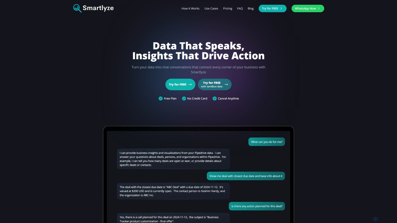
Smartlyze

Smartlyze is a conversational AI platform that transforms business data into actionable insights. Connect your data sources like HubSpot, Pipedrive, and Google Calendar, then ask questions in natural language to receive instant answers, charts, and visualizations. It democratizes data analysis, making it accessible to everyone in your team, regardless of technical skill.

Business Intelligence
Visits 3.4KFavorites 100Likes 102
Freemium

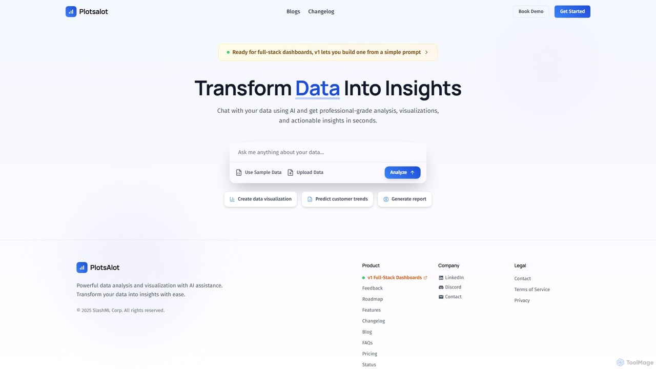
PlotsAlot

PlotsAlot is an AI-powered data analysis and visualization platform that transforms raw data into professional-grade charts, dashboards, and actionable insights. Simply upload your data and use natural language prompts to chat with it, perform advanced analysis, and predict trends in seconds.

Business Intelligence
Visits 3.5KFavorites 120Likes 105

About Data Visualization

Data Visualization tools are a class of AI-powered software designed to transform complex datasets into intuitive graphical representations. They leverage machine learning to automatically identify patterns, suggest optimal chart types, and enable interactive exploration through charts, graphs, maps, and dashboards. The primary value of these tools is to make data insights accessible and understandable to a wider audience, facilitating quicker and more informed decision-making. Many modern platforms also incorporate natural language processing, allowing users to ask questions about their data in plain language.

Core Features

  • Interactive Dashboards: Build dynamic, real-time dashboards that allow users to filter, drill-down, and explore data from multiple angles.
  • AI-Suggested Visualizations: The system automatically analyzes data and recommends the most effective chart or graph type to represent insights.
  • Natural Language Query (NLQ): Ask questions about your data in plain language (e.g., "What were the top 5 products by sales last quarter?") and get instant visual answers.
  • Anomaly Detection: Automatically identify and highlight unusual spikes, dips, or outliers in your data that might require attention.
  • Broad Data Connectivity: Seamlessly connect to a wide range of data sources, including databases, cloud warehouses, spreadsheets, and APIs.

Use Cases

These tools are widely used across various industries for business intelligence, financial analysis, and operational monitoring. Marketing teams use them to track campaign performance, sales departments monitor pipeline health, and researchers use them to communicate complex findings. They are essential for any role that needs to translate raw data into a compelling and understandable narrative.

How to Choose

When selecting a Data Visualization tool, consider the variety of data sources it supports and its integration capabilities with your existing tech stack. Evaluate the ease of use for non-technical users versus the advanced customization options for data analysts. Also, assess its AI-powered features, such as automated insights and natural language querying, and consider the platform's collaboration and sharing functionalities.

Featured tool rankings

Data Visualization use cases

1

Creating Interactive Business Intelligence Dashboards

A marketing manager needs to report on quarterly campaign performance to stakeholders. Instead of static spreadsheets, they use an AI data visualization tool to connect to Google Analytics, CRM, and ad platform data. The tool helps build an interactive dashboard with charts showing website traffic, lead conversion rates, and cost per acquisition. Stakeholders can then self-serve, filtering by date, campaign, or region to explore the data and uncover insights without needing the manager's assistance.

2

Analyzing Sales Performance in Real-Time

A sales director wants to monitor their team's performance against monthly targets. They connect their CRM (e.g., Salesforce) to a data visualization platform. The AI automatically creates a dashboard with leaderboards, sales funnels, and geographical heatmaps of sales activity. The system can also send automated alerts when a team member is falling significantly behind their quota or when a large deal moves to a new stage, enabling proactive management.

3

Visualizing Complex Scientific Research Data

A biologist has generated a large dataset from a genomics experiment. To identify significant gene expression patterns, they upload the data to a visualization tool. The tool suggests using a volcano plot and a heatmap to highlight statistically significant changes. The researcher can interactively hover over data points to get more information and easily export high-resolution graphics for inclusion in scientific publications and presentations, making complex findings clear to peers.

4

Monitoring Supply Chain and Logistics Operations

A logistics coordinator for an e-commerce company is responsible for overseeing daily deliveries. They use a data visualization tool to create a live dashboard with a map view. This map tracks the real-time location of their entire delivery fleet. The tool also visualizes key metrics like on-time delivery rates, average delivery time, and vehicle capacity. AI-powered anomaly detection alerts the coordinator to potential delays or unusual route deviations, allowing for immediate intervention.

5

Uncovering Customer Behavior Patterns

A product manager at a SaaS company wants to understand how users interact with a new feature. They feed user event data into a visualization tool to create user journey funnels and feature adoption charts. The tool helps identify drop-off points in the user flow and segments users based on their behavior. Using natural language query, the manager can ask "show me feature usage for users who signed up in the last 30 days" to get instant visual feedback for product iteration.

6

Streamlining Financial Reporting and Forecasting

A financial analyst is tasked with preparing a monthly financial health report for the executive team. They connect the company's accounting software and ERP system to an AI visualization tool. The platform automates the creation of standard reports like profit & loss statements and cash flow charts. Furthermore, its AI capabilities can generate predictive forecasts for future revenue based on historical data, highlighting potential risks and opportunities for the leadership team.

Data Visualization FAQ

What are AI Data Visualization tools?

AI Data Visualization tools are applications that use artificial intelligence to convert raw data into easily understandable visual formats like charts, graphs, and dashboards. Their key AI features include automatically suggesting the best visualizations, identifying significant patterns or anomalies, and allowing users to query data using natural language. They bridge the gap between complex data analysis and clear, actionable insights for business users.

How do I choose the right AI Data Visualization tool?

To choose the right tool, evaluate these four factors. First, check its data connectivity: does it support the databases, files, and apps you use? Second, consider its ease of use for your target users—some tools are for developers, while others are no-code. Third, assess the depth of its AI features, such as predictive analytics and natural language query. Finally, review its pricing model and scalability to ensure it fits your budget and future growth.

What's the difference between AI Data Visualization and traditional BI tools?

The primary difference lies in automation and intelligence. Traditional Business Intelligence (BI) tools often require users to manually select chart types, build queries, and search for insights. AI Data Visualization tools automate these processes. They use machine learning to recommend visualizations, proactively surface hidden patterns and outliers, and enable users to ask questions in plain language, making data analysis faster and more accessible to non-experts.

What are the key features of AI Data Visualization tools?

Key features typically include:

  • Interactive Dashboards: For real-time data exploration.
  • Automated Insights: AI algorithms that automatically find and explain trends or anomalies in the data.
  • Natural Language Query (NLQ): The ability to ask questions in plain text and receive visual answers.
  • Predictive Analytics: Using historical data to forecast future outcomes.
  • Wide Data Source Integration: Connecting to various databases, cloud services, and applications.
Who benefits most from using AI Data Visualization tools?

A wide range of professionals benefit from these tools. Business analysts and data scientists use them for deep analysis and modeling. Marketing and sales managers use them to track performance and strategy. Executives and decision-makers rely on them for high-level dashboards to monitor business health. Essentially, anyone who needs to understand trends, patterns, and insights from data, regardless of their technical skill level, can benefit.